On June 11, 2007 at Apple’s World Wide Developer Conference (WWDC), Apple announced, as it was called then, Mac OS X 10.5 “Leopard.” These were the days when Apple’s OS for the Mac was named after the big cats, and those OSes were still cutting their teeth in the elegant marriage of BSD UNIX, directory services, and the vision for an elegant, powerful GUI the likes of which had never been seen on UNIX.
SGI’s Irix notwithstanding.

One of the features introduced with Leopard was a way to quickly preview a file without the need to launch one of the apps normally associated with that file type and then open it. The most common way to invoke Quick Look is to select the file, and then tap the keyboard’s space bar. (But there are others. See below.) A preview window opens. Tap the space bar again, and the preview window collapses.
Here’s Apple’s guide on how to use Quick Look.

A Winning, Enduring Feature
I’ve been using Quick Look for so long, it’s virtually a part of my Mac psyche. I can’t believe it’s been around since 2007; it always seems fresh, accessible, and just brilliant. As part of my several workflows, I use it to preview:
- doc, docx
- txt, rtf, pdf
- mp3, m4a, aac
- webloc
- jpg, (including screenshots), png, tiff
The Wikipedia page for Quick Look has a complete table of the file types that are supported.
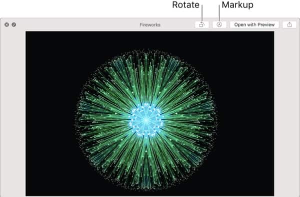
Somewhere along the way, I don’t remember when, Apple added the ability, with a button in the top right corner, to open the previewed file with the most relevant app—for further editing. In general, over the years, Quick Look has become more and more capable. For example, macOS Mojave adds the ability to rotate and mark up the image. (See Apple image above.)

This is testimony to the fact that Quick Look has become an integral part of my, and I would guess most user’s, macOS workflows. The tedious process of launching an app and doing a File > Open was merely the baby step of the early Mac days-before we learned how to become impressively productive. Looking at a file quickly, to inspect it, for whatever reason is a natural part of our Mac life.
Invocation
As much as I love Quick Look, I hadn’t realized that there are actually multiple ways to invoke it, beyond the space bar, until I did some reading.
- CMD-Y : alternative to space bar. Type again to collapse or use the Close button (top left of window).
- CTRL-OPT-space bar: open in full screen. ESC to collapse.
Things You Can Do in the Preview
Apple’s tech note has the complete list, but if you’re a tl;dr minded reader, I’ll document just a few more notable functions from Apple’s list.
- Resize the window: Drag the corners of the window.
- Zoom in and out of an item: Press Command-Plus (+) to make the image bigger or Command-Minus (–) to make it smaller.
- Rotate an item: Click the Rotate Left button or press and hold the Option key, then click the Rotate Right button. Keep clicking to continue rotating the item.
- Mark up an item: Click the Markup button . See Mark up files.
- Open an item: Click Open with [associated] app.
- Share an item: Click the Share button.
Final Look
Quick Look is burned into my mind as a Mac user. I can confidently say that I use it with affection every day. A simple blessing is in order.
Thank you Apple.

Quick View is one of those wonderful things that makes using the MacOS’s Finder delightful. I never realized just how delightful, though, until I started using Windows a couple years ago, when I bought a Surface Pro. I think i lasted eight months on Windows alone, before I couldn’t take it any more, and got a desktop Mac for “serious” work. And now, when I really need to work with files (finding, organizing, etc.) I either sit at my Mac, or VNC remote into it. Windows File Explorer is a terrible view port into my files, and useless to me for getting things done. Yes, there are ways to emulate things like Quick View on Windows, but nothing compares to the Finder. And yes, it does make working with files delightful. 🙂
It appears that should be: OPT-space bar: open in full screen.
Also: CMD-OPT-Y : alternative to open in full screen.
Quicklook is VERY cool – but it has glaring shortcomings – it can’t open a common .wmv file, nor a .mkv file nor a .ai Illustrator file yet it will open a ,pps photoshop file.
I think that exposé (even though Apple screwed it up after Snow Leopard as far as how it works and which keys invoke it) is an even better gimmick – to be able to see all windows open at once within an app – say if you have 30 images open in Photoshop – is VERY handy; and then to see ALL windows from Desktop as well – very handy. I just wish Apple would put the three choices back on the upper right F keys AND restore the volume controls up there too, but nooooo…..Apple tends to go backwards in their GUI as proven by John touting an OLD feature here. What’s new?