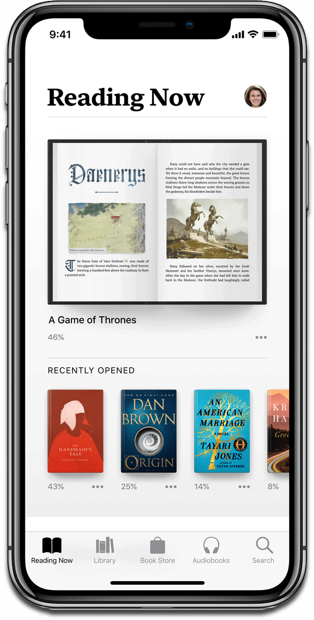
In iOS 12 and macOS Mojave, iBooks got a big redesign, as well as a rebrand. It’s now called Apple Books, and it has plenty of new features that should keep readers happy.
[It’s Time for Apple to Show iBooks Some Love]
Apple Books
Apple is slowly sunsetting the “i” naming scheme. Apple Books now matches Apple Podcasts, Apple Music, and Apple News.
The book store has been redesigned to match that of iOS 11. At the bottom, you’ll see new tabs: Reading Now, Library, Book Store, Audiobooks, and Search. It should make it easier to jump back into the book you were reading.
Reading Now gives you a live preview of the book you were just reading, as well as a section of recently opened books with a percentage showing you how much you’ve read.
The Library view displays your books differently, with bigger book covers in rows of two. If you have hundreds of books like I do, it will be a pain in the ass to scroll through, so hopefully search is more powerful. Audiobooks has a dedicated section now, to make it easier to find and listen to your favorite books.
Something else that is clearly noticeable is the new font. It’s a serif font that looks different than Apple’s sans serif San Francisco typeface. I wonder if it’s still part of the San Francisco family (hopefully) or a new typeface altogether.