Photography company VSCO announced on Wednesday a redesigned in-app studio experience for photographers. The company mentioned the update for “this week” so not necessarily today.
Dark Studio
First, using VSCO will be easier on your eyes with a new dark theme, as previously the app was bright white. Second, your camera roll is now the focus of the studio. You now can access all the content on your phone’s native photo app without the need to import them first. New photos and videos will automatically appear.
Third, there is a new Drafts tab in the studio where unfinished and in-process edits will live. A streamlined filter system means you can drill down to find exactly what you need, like edited photos, unedited photos, and favorites.
Blur & Text
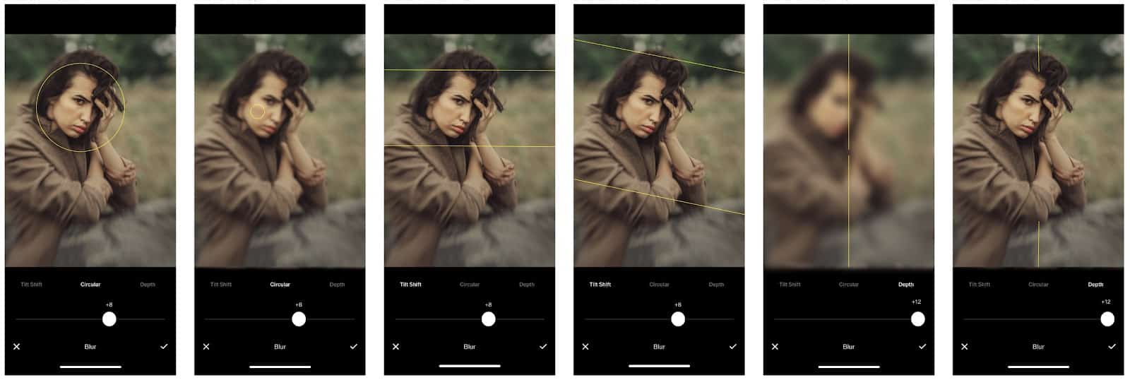
The new Blur tool will be available exclusively for VSCO X members. It lets photographers add circular and linear blurs to photos while changing their size, direction, and angle. In one of the screenshots VSCO provided, there is a Depth tap in the Blur tool, to blur the background in photos like Apple’s Portrait Mode.

The Text tool has been enhanced with new features, too:
-
New Font – Lyon: VSCO is opening more doors for you to express your creativity, now with the all-new font Lyon. Try it out today in the editor panel by selecting “Text” and selecting “Style” to toggle between VSCO Gothic and Lyon.
-
Text Color-picker: The color picker allows you to tap anywhere on your image to select any color within it. Immediately you’ll see your text change to the color you selected.
-
Alignment: Depending on what you want to create, members will receive more text alignment options, including Left, Right, and Center justification options.
