Praised by some, hated by others, a new search button was one of the additions to the Home Screen in iOS 16. It can be very helpful having a quick and easy way to launch Spotlight straight from the Home Screen. For some, though, it gets in the way. Here is how you can remove that new search button from iOS 16.
Apple’s New Spotlight Search Button in iOS 16
Before iOS 16, you had to swipe down from an empty space on your Home Screen to launch a Spotlight search. That functionality is still in iOS 16, but Apple has added another way to access Spotlight.
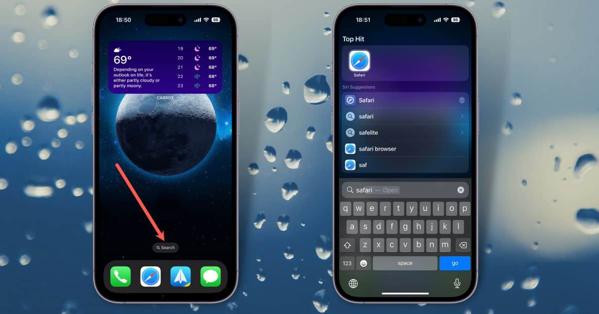
Enabled by default, you may have noticed the new search button on your Home Screen. It’s at the bottom of your display, marked by a magnifying glass icon and the word “Search.” All you have to do is tap that button, and Spotlight launches.

Once you’ve launched Spotlight, you can search for files, apps or even web pages. You can also drag and drop your apps onto the Home Screen or do various currency and measurement conversions.
It’s easier than swiping down from the top of the screen, yes, but many people find it a bit too easy. Much like how easy it is to accidentally enable Reachability on iOS, Spotlight is just a bit too quick to respond for more than a few people.
Turn Off the Search Button on iOS 16
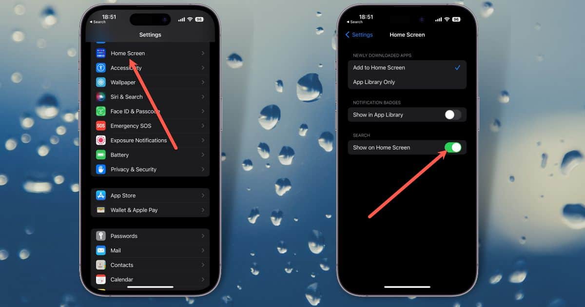
The search button is, fortunately, something you can disable. The toggle is found within the Home Screen section of Settings. Here’s how to get rid of that search button, if you want.
Just go to Settings > Home Screen > Search. You’ll see a toggle labeled Show on Home Screen, green if enabled.

Flip that toggle off, and the search button will disappear. If you decide you want it back, all you need to do is go back to that setting and turn the feature on again.

“Before iOS 16, you had to swipe down from the top of your Home Screen to launch a Spotlight search.”
It’s so easy to forget how things were before, but in iOS 15, swiping down from the top of the screen opened Notification Center. In iOS 16 the same swipe opens the Lock Screen. In both, the gesture to open a search was to swipe down from the middle of the screen.
Good catch! I’ve edited the text accordingly. You’re absolutely right…I’ve been using iOS 16 since June or July, and misremembered the “old” way. Thank you.