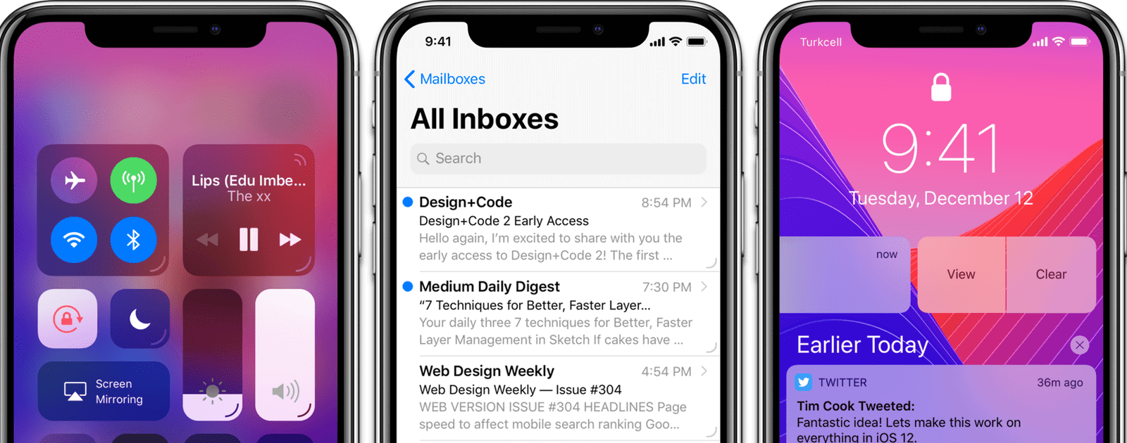
An article making the rounds over the weekend is from designer Eliz Kılıç, who wrote about how Apple can fix 3D Touch. She proposes that a UI indicator should be added to each 3D Touch-able element so people know exactly which elements can be 3D Touched.
I should start with the obvious. 3D Touch is broken! The user experience is far from great. Apple introduced 3D Touch and its new related interactions Peek and Pop in 2014. It’s been almost 4 years since its first introduction, yet people don’t know/use 3D Touch. Why would they? Even tech-savvy users don’t know which buttons offer 3D touch. Let alone regular users.
My solution is adding a line on bottom-right of things that can be 3D Touched. Let’s call them Force Decorators (with reference to Force Touch).
The Apple blogosphere seems to be in love with this. However, my non-designer, hyperbolic opinion is that this looks like crap. I agree that there’s a problem here, but I don’t want every single UI element to be scarred by these Force Decorators. It makes the UI look cluttered and just plain ugly. Maybe there can be another, subtle visual distinction, such as the use of shadows.
Check It Out: A Designer Shares Thoughts on How Apple Can Fix 3D Touch
