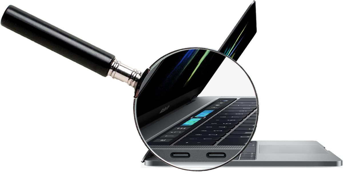
Apple’s revolutionary Touch Bar on the new, 2016 MacBook Pros required a lot of engineering development. It uses an ARM sub-processor and a variation of watchOS. But most importantly, it forms the basis for a new system architecture, according to Apple SVP Phil Schiller. It could create things heretofore not even envisioned. Particle Debris page 2 points to an exclusive C|NET interview with Mr. Schiller who explains why it took four years to develop.
Check It Out: The Secret Future for Apple’s Touch Bar

I think the Touch Bar is a nice add-on thing, and I think it has potential. As someone who dislikes having to learn and remember keyboard shortcuts for 10 different programs, I would welcome a Touch Bar displaying and changing things so I don’t have to remember tons of keyboard shortcuts.
However, there are two things that worry me. One, there is not a lot of incentive for app developers to put a lot of time and effort into supporting Touch Bar until it is standard on all of Apple’s keyboards, including the standalone Magic Keyboard.
Two, the reason a regular keyboard works so well and for such a long period of time is that people (once they learn it) do not have to look down at the keyboard because the keys are always in the same position. For example, I never have to worry that the “L” key is suddenly in a different place; my muscle memory knows where “L” is without having to really think about it.
With the Touch Bar, a person has to keep looking down at it because its content is dynamically changing. This means a person is moving their eyes away from the screen to see what is currently being displayed on the Touch Bar, and then bring their eyes back up to the screen over and over again.
On a laptop, with the screen being in a fixed position so close to the keyboard, it might not be so bad, but on a desktop there could be a couple of inches to a few feet between the screen and the keyboard.
For example, try looking at the middle of your screen and then keep glancing down to the function keys on your keyboard and the back to the middle of the screen a few times. I know when I do this I keep losing my place and it also breaks my concentration.
This could be a decent feature — time will tell. What really bothers me though Apple seems to have lost it’s way and what made them great. Apple has a lot of success and can certainly ride that for a while but to be perfectly blunt I consider Apple dead. No, no, not the company but the soul. As I said Apple can live for a fairly long time on the loyalty and the customer hope of a better day but if something doesn’t change they are just going to continue to rot from the inside.
Apple seems more enamored with engineering feats just to show off — not because they are good or what the customers want or need. A perfect example is the not so great butterfly keyboard. They just want to make things thinner for thinners sake. At least in a portable you can make an argument for it but enough is enough! It doesn’t help me to have the thinest lightest portable in the world if a loath using it because the user experience is worse for it.
Search on YouTube for “steve jobs on why xerox failed” It’s less than 3 minutes long and really seems to get at what’s going on at Apple these days. Here a link that hopefully will work: steve jobs on why xerox failed
Because the Strip Bar will inevitably end up embedded in monitors, touchscreens or that new Apple wristband coming up and probably a future Apple TV remote. Also standalone keyboards and the dashboard of the Apple Car.
A timid way to get into “robot arm” injuries? It really is a meaningless feature. Unless it reads my mind and sets up a clavioline like portamento strip for theramin sounds in GB, or quick scrubs in Final Cut, or volume ducking whilst in ProTools all smartly without configuring then it’s 4 years wasted imo.
The Strip Bar will inevitably end up embedded IN monitors, touchscreens or that new Apple wristband coming up and probably a future Apple TV remote – but again, why is this cool?
I think it is an important step in the user interface, smooth and clever, typical Apple. But…I’m not so sure that it’s going to be perceived as important in the marketplace, where the Surface-type combo units have gotten a lot of paid and free press, and the Touch Bar is going to be seen mostly as “so what?”.
I wish they’d used those four years to develop a decent, upgradeable iMac. I like Mac OS (heck I’ve been using some form of it for almost 30 years), but I dislike the sealed iMacs. I shall soon need to move on from my mid-2010 model (with upgraded memory), but I don’t see anything I like in the closed models.
That may very well be, but I don’t know that it matters if it’s stuck on such a compromised machine. The future may hold great innovations, but it would sure be nice to have something to use right now. :/