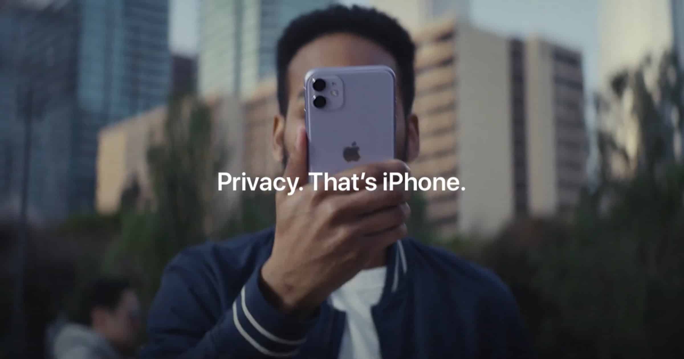
Apple’s new ‘Over Sharing’ video ad tries to be cute but ends up being cryptic and ignorable.
Watch it again. You’re amused. You laugh in spots. But does it provide any helpful ideas? Are there any practical take-aways?
I know ads like this try to avoid geting bogged down in corporate techno-geek-babble that just irritates and confuses. The goal is watchability, retention and fun. But why do an ad like this at all if it doesn’t alter customer behavior at least a little bit?
There needs to be a little nugget of video magic that the viewer remembers as a practical matter of course, not ridiculous vignettes. Like insulting a cubicle mate. Or standing in a park, yelling out one’s credit card number. The natural viewer reaction here is: “I would never do that.”
In contrast, the message should be: “Gosh that’s actually something I’ve been casually doing without thinking. I better stop doing that.”
Another thing even a short ad can do is reduce the examples, but show a tragic consequence. In Apple’s current ad, we are not led down the path of imagining the result of, say, blabbing one’s pet name on Twitter. And then having some hacker suspect that’s one of your passwords.
Instead, it’s left to our imagination to understand the point of the ad, but only experienced customers, who are already smart about privacy, can do that. Even from the silliness.
For the inexperienced: Show. Tell. Teach. And still be charming about it.

Not cryptic in the least. In fact clear and amusing.
disagree. But what I do agree on is Macobserver’s relentless use of Facebook and Twitter to support logins so that they can spy on you. for a Mac site, where’;s the sign in with Apple option. Instead, we let Facebook and Twitter control the login process. Shameful.
I don’t usually watch ads, even those that the Apple-centric press likes to highlight for whatever reason.
But after reading such a negative opinion of this ad, I did watch…and found it to do all the things that the author claims it doesn’t and convey the intended message in an amusing way.
“show a tragic consequence”. Like what? The digital equivalent of a deadly drunk driving accident or drug overdose? Seriously? That’s what you want Apple, or another consumer company to use to promote its products? Through dread and fear? Negativism? I don’t even have to imagine what kind of grade my marketing professor would have given me for producing such an ad, given the intended message, target audience, and context. Instant Fail.
People constantly do exactly this in public without realizing the embarrassment others around them feel. I think that this is why this ad resonates so well and why it is so effective. And yes, it’s clever and funny, too. .
“I would never do that.” Exactly, that’s why Apple was trying to say- if you would never do that, your phone shouldn’t either. Apple = Privacy. I think there is a rather clever semantic Message there; if one take what he/she see literally, one would find a hard time getting the message.
Ads either inform, persuade, or remind. Reminder ads are often mostly entertainment. The reminder is simple… Apple = Privacy. The situations in the ad, while ridiculous, are also reminders about Apple being clever and fun. They’re also making a point of persuasion thru ad absurdum, that risking your privacy with another company is as outlandish of a proposal as, yelling your person business/info to the world.
I generally hate almost every ad apple makes these days. This is one of the few that I think is great.
My guess is that John comes from the agitprop school of advertising 😉
I personally like this ad and the take away for me is PRIVACY and what to do and what not to do about it.