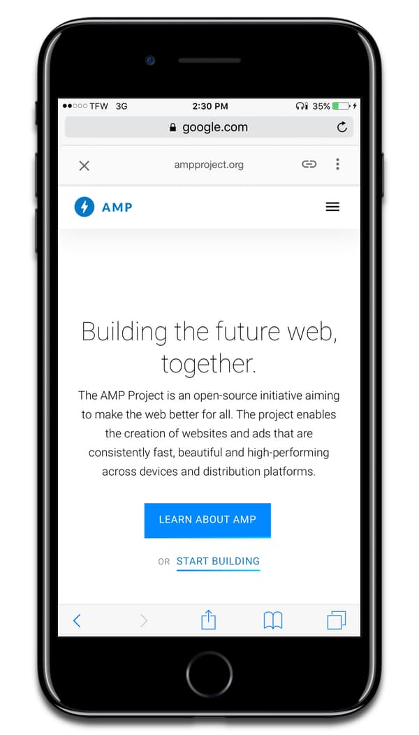
Over the weekend, an article from The Register laid out complaints of Google AMP and how it negatively impacts the web. Then, John Gruber of Daring Fireball linked to the article and added his own comments, such as how AMP pages scroll differently than the rest of Safari. The creator of Google AMP then explained the scrolling difference, and how Apple will change scrolling in Safari to be like AMP. But let’s go back to the beginning and explain what it all means.
What is AMP?
In 2015, Google launched the Accelerated Mobile Pages project, or AMP. It’s a special web format web developers and publishers can use to display their web pages and have them load quickly on smartphones.
While it sounds great at first, not many developers like the idea of giving Google control over their content. AMP strips out web analytics and special elements like interactive maps and photo galleries. Because of the way AMP is implemented, it even breaks certain features of Safari.
How AMP Screws With Safari
Google AMP breaks Safari Reader, the “tap status bar to scroll up” function, and Safari’s Find on Page extension. It also messes with Safari’s scrolling on iOS, which was John Gruber’s complaint. But Malte Ubl, the creator of Google AMP, explains:
With respect to scrolling: We (AMP team) filed a bug with Apple about that (we didn’t implement scrolling ourselves, just use a div with overflow). We asked to make the scroll inertia for that case the same as the normal scrolling.
Apple’s response was (surprisingly) to make the default scrolling like the overflow scrolling. So, with the next Safari release all pages will scroll like AMP pages.

Breaking it Down
User Om2 points out in response to Malte Ubl:
In current iOS Safari, webpage scrolling is inconsistent from all other scrolling on the system. This was an intentional decision made long ago. In addition, overflow areas are consistent with the rest of the system, and thus inconsistent with top-level webpage scrolling. This is semi-accidental. In reviewing scroll rates, we concluded that the original reason was no longer a good tradeoff. Thus this change, which removed all the inconsistencies: https://trac.webkit.org/changeset/211197/webkit. Having all scrolling be consistent feels good once you get used to it.
Throughout iOS and macOS, Apple implements inertial scrolling, also called momentum scrolling. It’s when you swipe to scroll up or down, and when you lift up your finger, the page continues to scroll on its own for a short distance. Most—if not all—apps use this, and it’s the reason why using an iPhone feels like such a fast and smooth experience.
If you’re a web developer, you’re probably familiar with the CSS property webkit-overflow-scrolling: touch. This lets you add inertial scrolling to overflow elements. If you add it to a fixed size element, then the content will also have inertial scrolling.

The problem is that very few web developers apply inertial scrolling. This is why, when you browse in iOS Safari, the web page will stop when your finger lifts off the screen. You have to put more effort into getting to the top or bottom of the page.
But the good news is that Apple plans to update iOS and bring inertial scrolling to Safari. This will make it consistent with the rest of the system, and should give your thumb less of a workout. We’re not sure when this will happen. MacRumors noted that inertial scrolling isn’t found in the iOS 10.3.3 beta, so it’s possible Apple will wait to bring it to iOS 11.

AMP blocks Safari Reader mode on iOS too, incredibly annoying. Many times i’ve had to edit the URL to get the original non-AMP URL, which is also annoying. iOS design team thinks we don’t need to see the full URL [at least as a user option], also the URL editing box on an iPhone is very small [it could easily show the full URL over multiple lines], then there’s the frustration of doing anything with a cursor on iOS [3DTouch helps, but jump to the beginning or end?]. All this because Safari won’t let me set a more readable default font with minimum size that is black [who thought tiny gray skiny fonts were a great idea?]. Now ask me why I don’t own an iPad?
I think Google needs to get rid of Accelerated Mobile Pages. While it does clean up some of the problems it has been known to hide content. And it makes sharing a royal pain in the rump. I hate it when big brother tries to tell me how I should view my content.
I’m confused. IOS 10.3.1 has inertial scrolling.