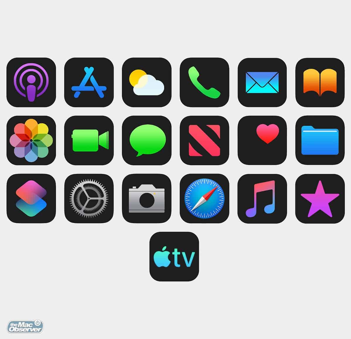
Rumors of a dark mode for iOS refuse to die, and the belief is that iOS 13 will finally introduce a system-wide dark mode. I’m certainly not the first to do this, but just for fun I created dark mode apps.
[AT&T Boss Contradicts Apple Over Data Privacy]
iOS 13 Dark Mode
Conspiracy theory: What if Apple changed the News logo to a big N to make it more legible in dark mode? What if the dark mode in Apple Books introduced in iOS 12 is a sneak peek?

Some apps, like Maps and Contacts, were a bit tricky. You would have to assign each UI element a darker color. Others, like Clock and Compass, are already dark. The ones in between with symbols were easier (and I’m not that great at Photoshop).
My inspiration came from that Apple TV icon as shown on this webpage. I don’t know if that will replace the current design, or if it’s just a singular design for that page.
We do have Smart Invert, but it’s just not the same as an official Dark Mode like on macOS Mojave. And it would be great if it could automatically turn on and off like Night Shift.
[Looking for Dark Mode Apps for your iPhone and iPad? Check Out this List]
