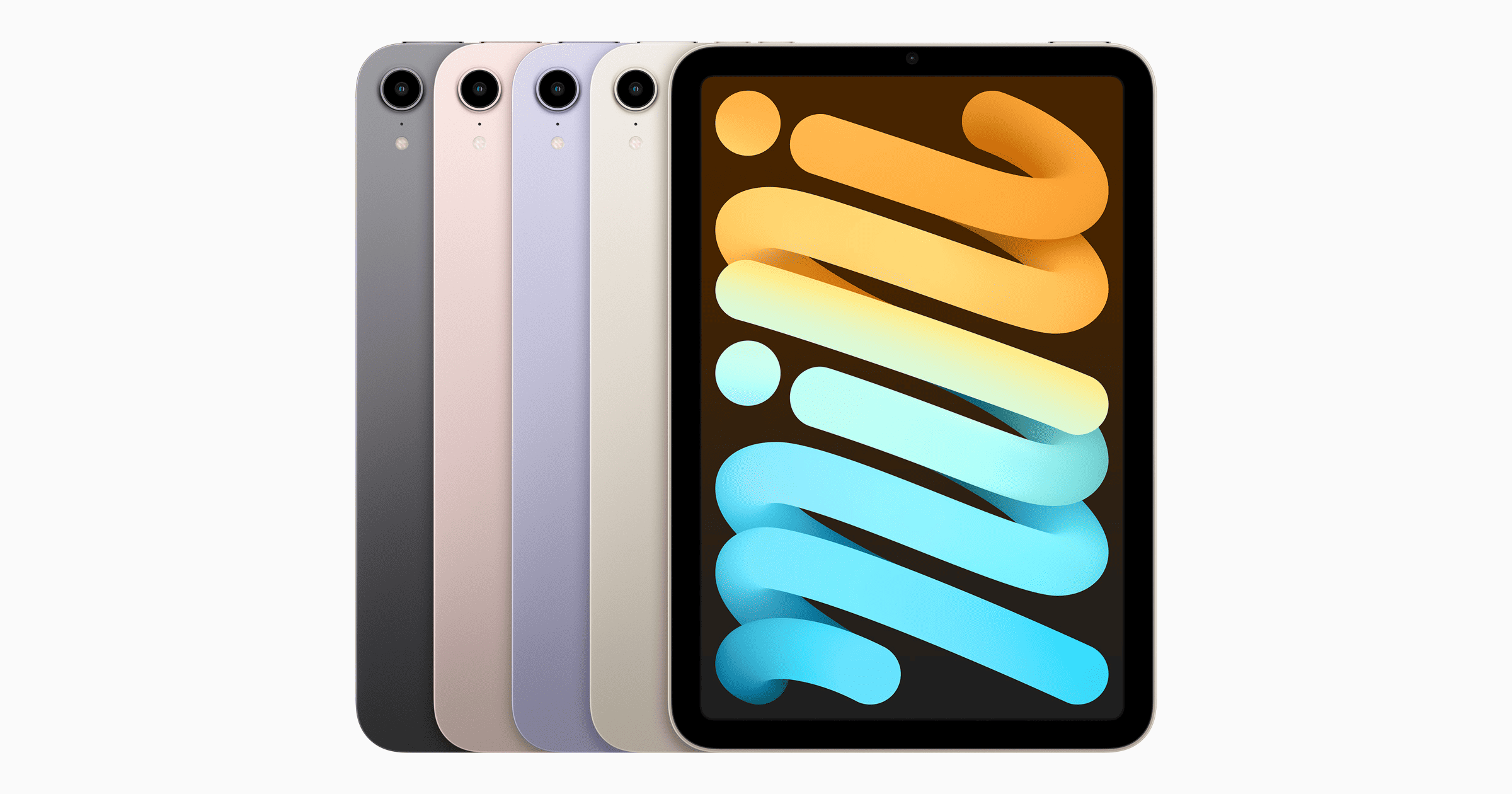
I’m a big iPad Mini fan. It’s my most personal Apple device. I’ve had the 2, 4, and currently the 5 model. So I was excited about the new iPad Mini 6, particularly its larger display – until I actually saw one in person.
At first glance the screen seemed smaller. How could that be? Upon further inspection, by placing my mini 5 next to the 6 in portrait mode, I saw that the actual usable side-to-side display width is at least a quarter-inch narrower on the 6. In landscape mode, that same quarter-inch deficit in height makes the screen appear scrunched. After years of viewing prior iPad Mini screens (all with the same dimensions), this difference is significant.
OK, but I’m getting a wider screen in landscape mode, which is where I do most of my viewing, I thought, trying to blunt my growing disappointment. True, and the display is great for video and movie viewing. However, a few usability factors became apparent after I spent 45 minutes or so measuring, testing and viewing:
- Keyboard typing: if you’re typing in landscape mode, losing that quarter inch of height means the keyboard takes up a much larger proportion of the screen. Too much IMO.
- Web browsing: also in landscape mode, what appears “above the fold” is less content than you typically get on prior Minis. Not a big deal, but noticeable.
- Home screen: this is where the iPad OS scaling to the Mini’s new dimensions misses the mark. That diagonal increase from 7.9 to 8.3 inches goes unused on the home screens, especially in landscape mode. There are conspicuously wide wallpaper margins on each side of your apps/widgets; and getting them to appear just so is quite an effort. Shifting from portrait to landscape mode also scrambles placement of app icons and widgets in an undesirable manner. Luke Miani has a good YouTube video that shows this clearly.
What about jelly scrolling, where one side of display content lags the other side when scrolling? I’ve had six LCD iPads in my household over the last 10 years. None of those screens has exhibited that behavior. My visit to the local Apple Store, inspecting five different iPad Mini 6s, also revealed no such problem.
As the iFixit teardown explained, this issue is not uncommon for such displays, but the build of the iPad Mini 6 seems to make it more prominent. I theorize that some LCD panels have this issue, but perhaps not all.
So, Apple giveth more diagonal width, rendering much of that space unusable in the home screen, taketh away another important dimension, and makes poor use of the usable display.
On all other fronts, now well-documented by others, I really like this new iPad Mini. But what I thought would be a slam-dunk purchase now has me waffling. Hopefully we will get a software update that will at least resolve some of the scaling and home screen issues.
Frank Cioffi is Editor & Publisher of Apple Investor News.

Thanks for this comparison. I have a mini 4 that I’m using mostly as an ereader and only occasionally for other things these days. The larger screen and better performance of the new mini sounded attractive but since I use the mini 4 in portrait mode I’d likely be very unhappy with the upgrade. Even after 6 years the only real performance issue that I have with the mini 4 is with the Kindle app. Perhaps moving away from that app is a better strategy for me for now.
great Point and write up! You’re the only reviewer to point this out. I don’t get why they didn’t make this mini the same size as the old mini just without bezel and button. The screen would have been around 8.5” and been bigger in every way.