It took two hours, but I finally got my original Apple Watch upgraded to watchOS 3. Here are some of the things I liked most about this version. Plus, I discovered a nice trick when it comes to changing watch faces with a swipe.

There are a lot of things to like about watchOS 3. Here are my favorites.
1. The Dock
It’s easy to ask why Apple didn’t create the Dock in earlier versions of watchOS. The likely answer is that, without the field experience of 10 million Apple Watches and 16 months of use, it was a judgment call on how to access apps in watchOS 1.0. But now that we have the Dock, it’s insanely great.
The dock is accessed with a single press of the side button. This replaces the previous clock-like list of favorites. Which, I take it, no one used. I know I didn’t. And when you only have two buttons, the side button and the digital crown to work with, each button really counts.

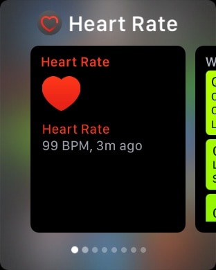
Once you press the side button, you’re shown a scrollable view of “live” watch apps. Tap to select. This is brilliant. (You can learn more about what’s new in watchOS 3 in Apple’s online User Guide.)
This is so sensible and so obvious that it will have new Apple Watch customers wondering how the rest of us survived for 18 months without it.
2. Fast Select of Watch Faces
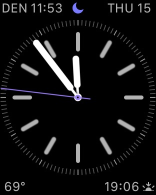
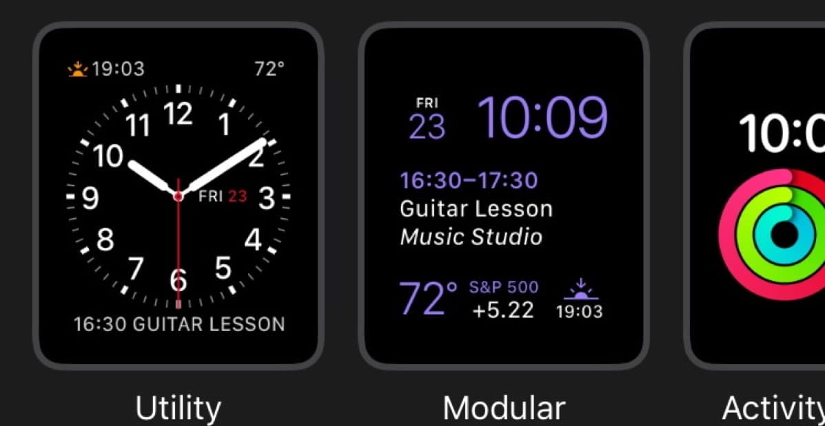
This technique is also a pleasing, new way of thinking by Apple. Instead of using Force Touch to enter the editing mode and also change watch faces, you can now just change face with a right-to-left or left-to-right swipe. This change is because Apple found that customers frequently changed watch faces to suit the occasion, either for fashion or utility. What started out as a concession to what people might prefer to stick with ended up being a useful, every-day operational function. It took time to learn this.

At first, I had trouble changing watch faces by just starting the swipe at the edge of the crystal. It would get confused and often bring up the Control Panel. Eventually, I discovered that the best technique is to start your finger on the side edge of the watch, then roll it up and onto the crystal and continue the swipe to the other side. This works reliably.
In the Watch app in iOS 10, you can use the My Watch tab to edit the order of the watch faces. I keep my favorite two next to each other on the “left” side of the list. This feature is breathtakingly cool because, as I noted, changing watch faces is now fundamental to our use of the Apple Watch. It’s not just a static preference or fashion/occasion thing.
3. Control Center
Just as in iOS, you access the Control Center by swiping up from the bottom. Clean. Elegant. Obvious. Convenient. Glances are gone, and his is the very best way to think about displaying the remaining battery power left.
Lots of Goodness. One Ouch
There are lots of other cool things in watchOS 3, including the SOS feature. But the three above are my favorites. They breathe new life into the original Apple Watch and provide a testament that Apple designed the original hardware with some growth potential and learning curve in mind. Only Apple’s early, extreme caution and conservative approach to preserving battery life shackled watchOS 1 and 2. With oodles of experience,, watchOS 3 has been allowed to flourish technically.
And watchOS 3 will be even nicer on the Series 2 Apple Watch with a faster, dual-core CPU. Here’s the comparison chart.
My only complaint is that after 16 months and our arrival at watchOS 3, there is only one built-in watch face that displays digital hh:mm:ss, and that’s Digital Activity, Not even the Astronomy watch face displays hh:mm:ss. O.M.G. I’ll keep complaining about this until my Apple Watch has the same facility as a US$20 Timex digital watch.
The watch face Activty Digital display hours, minutes, and seconds.
Not having seconds displayed on a digital clock face remains unacceptable. But I guess when you have BILLIONS of dollars in the bank, pennies don’t matter. And so seconds don’t matter to Apple either…