Apple’s new Steve Jobs Theater is…I’ve been struggling with how to finish that sentence since Tuesday’s media event. It first hit me during the livestream of the keynote when Apple’s camera briefly captured another camera. There was something about it that struck me, hard. The angles for the stage, the shots. The backdrop. It was all just so significantly better than any other keynote.
It was all so…Apple. Yeah, that’s it! Apple’s new Steve Jobs Theater is so Apple.
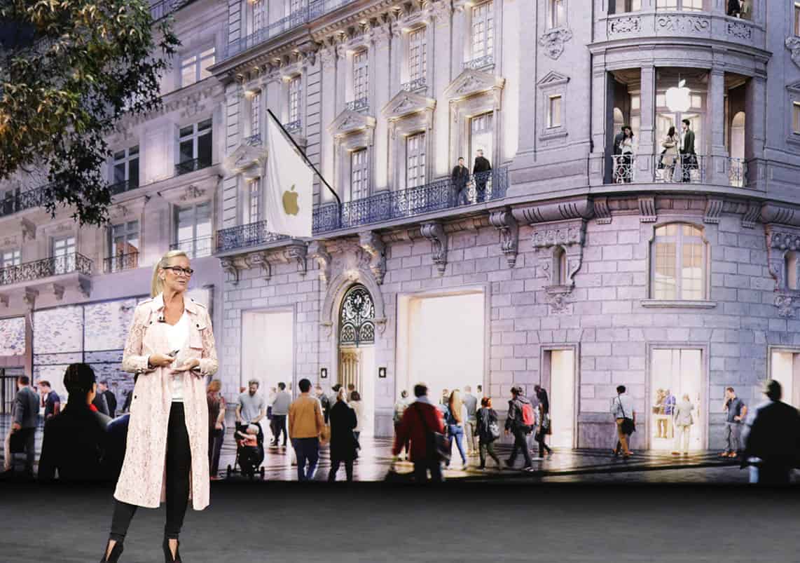
This idea has been bubbling in my head, but it crystallized for me when I saw this photograph from Apple.

Just look at that photo. Look at that backdrop. It looks like it could be a green screen, only without green screen artifacts—without green screen lameness. Instead, it’s a very high resolution projector (I think), but my point is that as careful as Apple has always been in putting together its keynotes, we’ve never seen anything like Tuesday’s “Let’s meet at our place” event.
Tim Cook addressed some of this directly when he said, “It’s the most state of the art, purpose-built theater ever, built for events just like this one.”
Steve Jobs Theater
That’s a broad statement, to be sure, one that isn’t just limited to keynotes. Steve Jobs Theater will likely be used for media events, company presentations, shareholder meetings, Valleywood movie and TV screenings, company concerts and parties, and who knows what else.
For each of those purposes, Steve Jobs Theater is probably going to be as perfect as any theater has ever been. For media events, we glimpsed a stage where everything is positioned just so for maximum effect. We saw sweeping camera panos, audience shots, and numerous angles of the stage itself. Every single thing was exactly where it needed to be for maximum effect, and that included all of the dedicated places for the cameras themselves to be.
In short, Apple has quietly rewritten the rules for media events and presentation yet again, and they’re doing very little crowing about it.
Show, Don’t Tell
Fiction authors have a mantra to “show, don’t tell.” That’s what Apple did with its blog post Highlights from Apple’s keynote event, and it’s what it did with the keynote film. The company showed us what the theater could do without directly telling us.
If you didn’t already watch it, I encourage you to do so.
+
It didn’t take my link so here’s hoping it gets through as plain text:
http://youtu.be/l2J72bub_CA
+
Here’s an example of Rush using s number of high res screens, including three main backdrop screens. Given the light show and concert fog, you can imagine just how bright these are to be seen through all of that. FYI, I’m guessing Apple is using similar technology.
+
Equally impressive is the lighting. That first pic of Tim Cook looks like he could leap right out of my iPad screen.
Regarding the rear visuals, maybe rather than high resolution projections it’s one massive high resolution screen? Bands like Rush use them. (Or should I say used to use them. #sniff #TheyTourNoMore). And granted, while Canada’s beloved trio of prog rock Gods is plenty successful, there’s no way they have even a fraction of the cash Apple has in its couch cushions. Meaning if Rush can afford such tech, Appple certainly could as well.
Finally, if Apple is using a projector it would have to be a rear screen projector, and the images look too good, too detailed, and too bright for me to think that that’s the case.