Apple unveiled iOS 11 earlier this year with plenty of fanfare and the promise that this is the biggest release since the first iPhone shipped with iPhone OS. Is it worth installing, assuming your iPhone, iPad, or iPod Touch supports it? The short answer is yes, but iOS isn’t perfect. Read on to see what we like—and don’t like—about iOS 11.

Compatibility
One of the most significant under the hood changes in iOS 11 is the final demise of 32-bit app support. Assuming the apps you use have already been updated for 64-bit you won’t notice anything has changed. If you’re still relying on some apps that haven’t been updated, however, you’re in for a bad surprise if you upgrade to iOS 11 because those apps stop working.
Apple has been popping up on-screen warnings about 32-bit support ending for some time when you launch apps that haven’t been updated. At first the warnings were along the line of, “Hey, just a heads up that someday this app isn’t going to work any more,” then progressed to, “Yo, Seriously. These apps are on death row. We aren’t kidding.”
Now the bell has tolled for those 32-bit apps. That means if you have a mission critical app that hasn’t been updated, and you haven’t found a suitable replacement, don’t install iOS 11. You can check to see if you have any problem apps by going to Settings > General > About > Applications.
Control Center
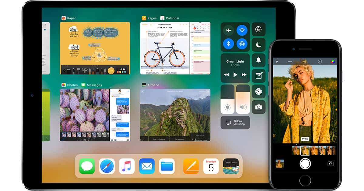
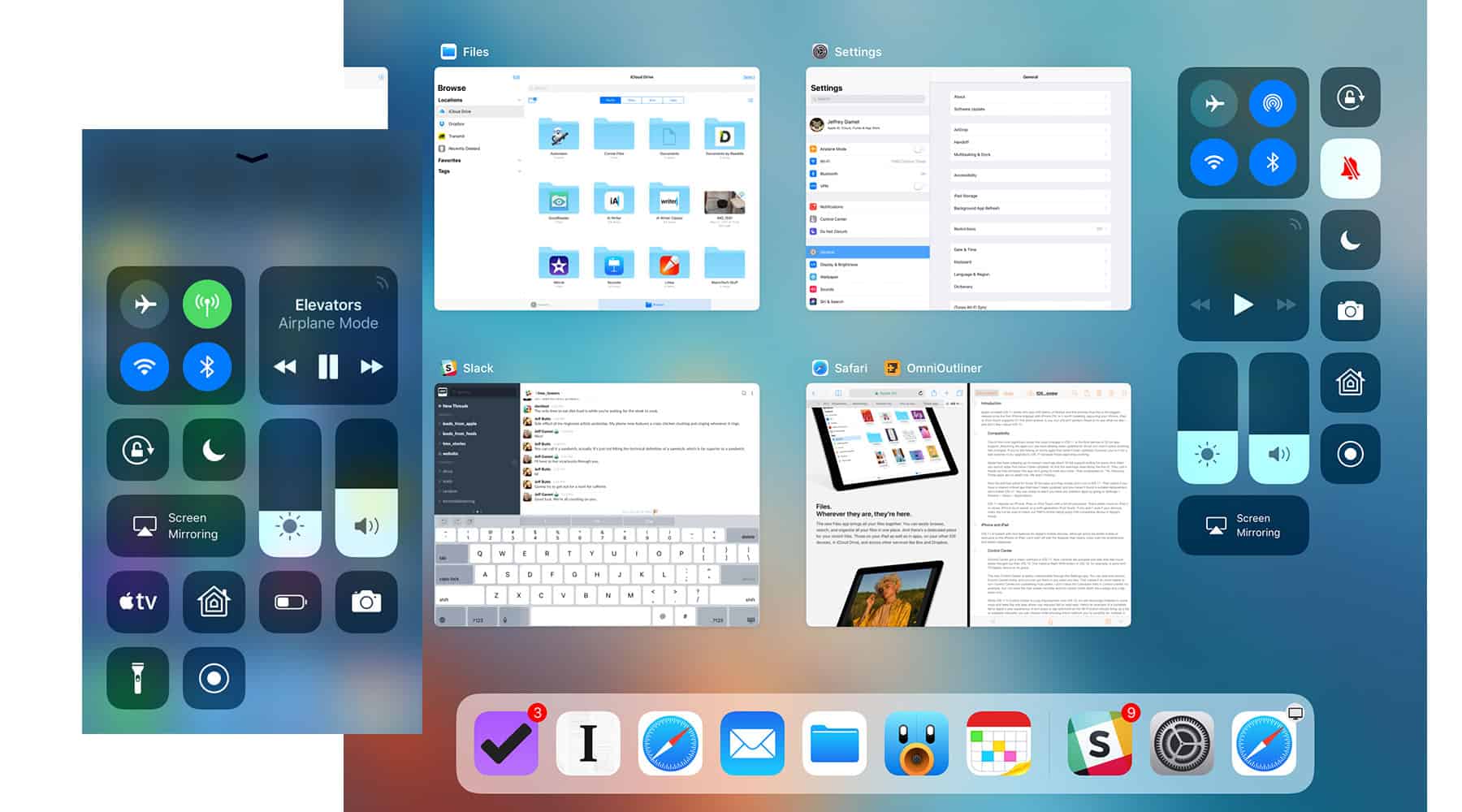
Control Center got a major overhaul in iOS 11. Now controls are grouped into tiles that feel much better thought out than iOS 10. The massive Night Shift button in iOS 10, for example, is gone and I’ll happily dance on its grave.
The new Control Center is easily customizable through the Settings app. You can add and remove Control Center items, and you can put them in any order you like. That makes it so much easier to turn Control Center into something truly useful. I don’t need the Calculator item in Control Center, for example, but I do need the new screen recorder and low power mode. Both are a swipe and a tap away now.

While iOS 11’s Control Center is a big improvement over iOS 10, it’s still stunningly hobbled in some ways and feels like one area where use requests fell on deaf ears. Here’s an example of a complete fail in Apple’s user experience: A firm press or tap-and-hold on the Wi-Fi button should bring up a list of available networks you can choose while showing which network you’re currently on. Instead, it expands the connections tile where can see which network you’re on (that’s an improvement), along with connected Bluetooth devices, and controls for toggling Airplane Mode, AirDrop, and Personal Hotspot on or off.
Switching Wi-Fi networks still requires a trip to the Settings app. Maybe Apple’s engineers don’t hop Wi-Fi networks all the time, but the rest of the world sure does.
While Control Center is a big improvement over what we had before, it’s frustrating because it feels like Apple is unnecessarily hobbling what could be an amazingly powerful feature in iOS 11.
Lock Screen and Notifications
Notifications are now unified, meaning alerts and missed notifications are grouped together. I like this much better than the old style of swiping between the two views because from my perspective everything that shows up there is something I want to see; it doesn’t matter if it’s an alert for an incoming text message, a missed call, or a solar flare alert. I just want to see my stuff, and that’s what Notifications in iOS 11 does.
Clearing individual notifications is where I stumble in iOS 11. A right-to-left swipe clears them, but you have to run your finger off the left edge of the screen and that’s much easier said than done if you use a case. Sure, you can swipe and tap the Clear button, but I’m all about economy of motion and two gestures where one will do doesn’t make me happy.
Still, I like that I can swipe down from the top of the Lock screen, or swipe up from anywhere, to see my notifications. I use both gestures regularly depending on how I’m holding my iPhone. On my iPad I always swipe down from the top of the screen. They’re different use devices so having choices for gestures here makes sense.
Is Notifications perfect in iOS 11? Nope, but it’s a big step in the right direction.
Siri
When Apple first introduced Siri I was amazed at how real the voice sounded. When Apple updated the voice I was amazed at how much more realistic it sounded. And now here comes the new Siri voice in iOS 11 and it sounds so real that it’s almost creepy.
At the risk of unwittingly becoming the subject of psychoanalysis, I really like the creepy Siri voice. Not because it’s creepy—that was a short lived feeling because the voice quality was such a dramatic change—but because it’s so much easier to understand. That applies to all the voices, and not just the default US English female voice.
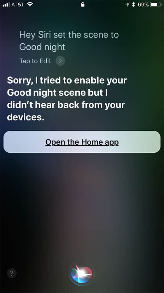
I still have the same problems I experienced in iOS 10 where Siri occasionally stops responding even when I’m on my office network’s 120 mbps connection, although that doesn’t seem to happen as often now. Siri isn’t, however, as robust as I’d expect with HomeKit. Siri refuses to initiate HomeKit actions as reliably as I expect, and sometimes responds with blatantly wrong information about an action I just invoked.

Telling Siri to activate my Goodnight scene works as expected nearly all the time, but I often get a response back telling me my HomeKit devices aren’t responding even though I just watched all my lights change and my thermostat switch to night mode.
I’m surprised that Siri isn’t sophisticated enough yet to handle more complex commands like, “Siri, set the living room lights to 30%, turn off the office air conditioner, and turn down the temperature.”
Yes, I get that we’re living in a future where I can talk to a glass slab almost as if it’s a human, but it feels like Siri should be more robust by now. Maybe I’m expecting too much from my technology because I grew up watching Star Trek where the computer figured out what everyone was saying and everything just worked.
Still, I’m pleased with the improvements we’re seeing in Siri and I like how it’s smart enough to sort out what I’m saying instead of expecting me to learn the exact words and phrases—like Amazon’s Alexa.
Alexa’s advantage right now is that I can talk to the air and my lights turn on or off. Once Apple’s HomePod ships this December and takes away Alexa’s advantage I expect I’ll be using Siri even more.
Next up: iOS 11 Augmented Reality, iPad Features, and More
Does Apple’s AR push remind any of us of QuickTime VR push from 15 years ago (or so)?
Yes, it does. I’m still not sold on AR, personally (I already don’t use SnapChat and though I enjoy games, the novelty would wear off pretty quick), just as I never gave Quicktime VR more than a backward glance at the time.
I have begun to notice bugs – at times when switching apps (on my 7 Plus), the home screen just disappears and is no longer accessible without backing out through the home button (how is that going to work for folks with no home button?), for example. The upgrades to the iPad are rock solid, the iPhone less so, it seems like a pretty standard update, to me. It runs great, and I’m grateful for all that’s under the hood, but take away the novelty of AR and the iPad specific features, and you’ve pretty much got what amounts to an incremental update. Nothing wrong with that, of course, but my world is not exploding in a million different directions of ecstasy or anything.