After releasing its first browser over 25 years ago, Opera has released several versions of its browser. The first time I used an Opera browser was in 2007 with Opera Mini, and it quickly became an indispensable part of my browsing activities. However, in 2016, I switched to Chrome, which has been my default browser ever since.
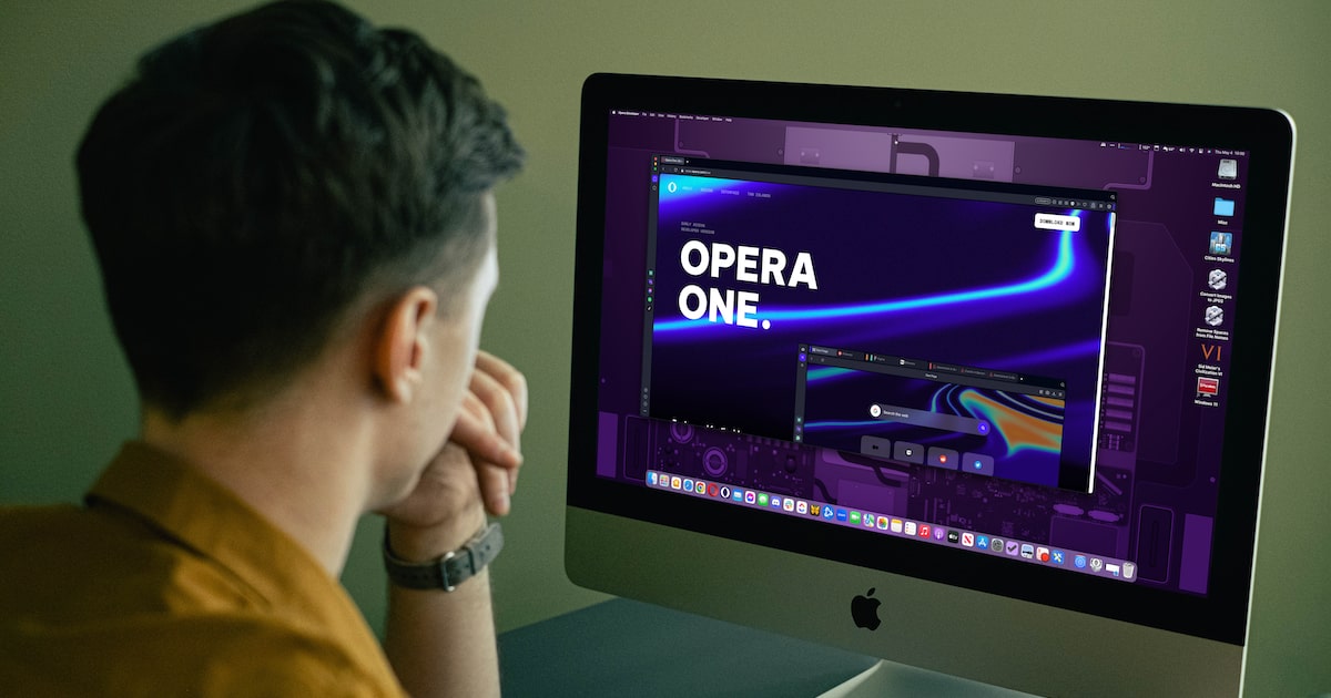
I recently heard the news that Opera had released its new browser, Opera One, and I felt the need to test it out and compare it with Chrome. During my testing, I assessed the browser based on features such as modular AI design, security and privacy, user interface, screenshot capabilities, search field, tabs, PDF support, performance, and extensions.
Getting Opera One on Your Device
Opera One is now available for download on both Mac and PC. To get your copy, simply visit the app’s web page. Click on the “Download Now” button located at the top right corner of your screen and wait for the download to complete. Once the download is finished, click on the installation file and follow the onscreen instructions. The entire process should take no more than three minutes to complete.
A Modular Design for Current and Future Technologies
It has always been Opera’s practice to design its browsers in a way that reflects trending technologies. In 2019, it released Opera GX, a game-centered browser. And in 2022, it provided public access to Opera Crypto, a browser specifically designed for cryptocurrency use.
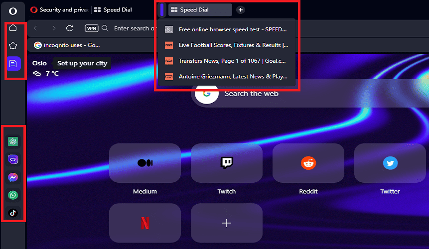
On Opera One’s Side Bar, I found that it has been designed for users to enjoy AI in one click. The design is modular, allowing various features to be replaced, exchanged, or modified. I was able to hide the AI tools and manage special features. Additionally, there is easy access to social media platforms. By default, social media platforms including WhatsApp, Facebook Messenger, and TikTok are just one click away on the side bar.
Chrome does not have a modular AI design, nor does it have a sidebar, but perhaps these features will be added in future updates.
Tab Islands: Context-Based Tab Grouping
Tab implementation in Opera One is excellent. Both Opera One and Chrome have a similar basic tab design, with tabs visible at the top of the window. However, Opera One has gone a step further. The most amazing feature of Opera One is the creativity infused into the way its tabs were designed.
An innovative tab organization feature called “Tab Islands” groups similar tabs together to avoid taking up unnecessary space. This is useful because unrelated tabs will not be grouped together, making it easier to organize tabs.
With Tab Islands, there is no need to close tabs that are still in use. You can simply minimize tab groups that are not yet in use, and maximize them when you need to use access them again. Chrome has nice tab functionality, but Opera One’s Tab Islands feature is unique and solves a lot of organizational problems.
One feature Chrome has but Opera One lacks is the ability to create independent tabs by dragging them out to the desktop. However, both Opera One and Chrome offer a feature that helps to pin and unpin tabs.
Exploring Opera One’s Security & Privacy
In terms of security and privacy, Opera One boasts many groundbreaking features.
Websites with addresses starting with http pose security threats, and every reliable browser should be ready to deliver the most secure experience for users. After testing, I realized that when it comes to alerting users to be wary of browsing and submitting sensitive information to websites without certificate SSL, both Opera One and Chrome are doing a great job.
As a lover of anonymity, I appreciate having easy access to a virtual private network (VPN). This feature built in to Opera One is creative, especially considering I can access my VPN with just one click. If you are looking to ensure that no logging servers cannot track your IP address while browsing online, this extra layer of confidentiality will secure your workspace online.
Chrome does not provide a VPN that is one click away from the home page, unlike Opera One.
I prefer browsing without leaving my browsing history in public spaces. I always look for ways to avoid intruders from checking my browsing paths online. The “Privacy Windows” feature is available on both Google Chrome and Opera One. However, it’s not easy to find on Opera One. Unlike, Google Chrome where the feature is easily located. To open a new privacy window on Opera One, I had to use the command Ctrl + Shift + N.
One Click Built-in Ad Blocker
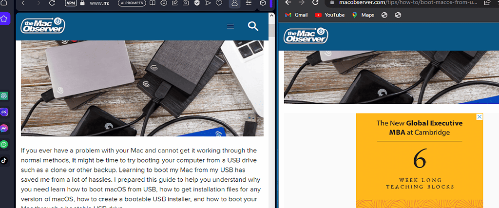
I used Opera One’s built-in ad blocker and enjoyed it. As someone who had never used an ad blocker before, the experience enhancer worked like magic. I browsed a website with loads of ads flying all over the screen, and the ad blocker wiped them off within the twinkle of an eye. I also tested it with macobserver.com and it blocked the few ads on each page.
The beauty of Opera One is the accessibility of the ad blocker: simply click on the hexagonal menu icon towards the top right corner labeled Privacy Protection and toggle the switch. Chrome does not have an easily accessible ad blocker like Opera One. The fact that Chrome’s ad blocker is in a hidden place in the browser suggests that it’s not a feature Google wants users to explore.
A Unique Multithreaded Use Interface
The multithreaded design of Opera One takes the user interface of web browsers to an entirely new level. Its unique capacity to display advanced animations and intricate designs is impressive. You can create several workspaces and switch between them with ease. This feature is especially useful when you have a lot of pages to open. Opera One’s user experience is top-notch and stands out among all other browsers. Chrome does not have these features, so there is no basis for comparison.
The search box in Opera One may be less prominent compared to Chrome, but it is still easily accessible and functional. Both browsers have a horizontally running address bar at the top of the window, which is user-friendly.
Opera One’s PDF support is impressive, allowing users to view PDF files without the need for a separate PDF Reader. The intuitive toolbar allows for scrolling through the table of contents, downloading, fitting to page, printing, zooming, and rotating pages, providing users with most of the functionality of a traditional PDF reader. Chrome also has PDF support, but Opera One’s implementation is equally impressive.
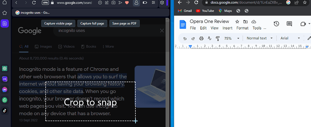
Opera One‘s screenshot feature is a great addition to the browser, allowing users to capture visible pages, and full pages, and even save them as PDFs. The feature also includes cropping, giving users the ability to snap any portion of the page they desire. Chrome does not have a built-in screenshot feature like Opera One.
Exploring Opera One’s Performance and Extensions
Google Chrome boasts over 180,000 extensions, whereas Opera One has fewer extensions. This may come as a surprise to those expecting a healthy number of extensions on Opera One. However, considering that Opera One has just been launched, it is only fair to expect that extensions will be added over time. After clicking on Manage Extensions > Get More Extensions you will see several other extensions.
Before clicking on Manage Extensions, the extensions currently available on Opera One are the Opera Ad Blocker and Opera Wallet. I decided to give Opera Ad Blocker a try, and it was very easy to use. All I had to do was click on Enable Extensions. We can therefore expect that future extensions on Opera One will be equally easy to install, enable, and use. The Opera Ad Blocker worked well on all the tests I performed with it.
According to Speed Battle Tester statistics, which take into account a range of variables to calculate browser speed. Google Chrome is slightly faster than Opera One. Speed is a crucial aspect of a great browser. In my personal experience using Opera, I can attest to its exceptional speed and performance.
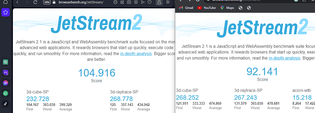
Although Google Chrome quickly became the most popular browser in the world, it did not emerge as the top performer. In fact, after combining various WebAssembly ratings and JavaScript benchmarks scrutinizing each browser’s ability to handle a wide range of advanced workloads and coding styles, Opera One proved to be a better performer.
After taking the mean of every score derived on Jetstream, it is clear that Opera One outperformed Google Chrome by a whopping 12 points. Opera One had a performance score of 104.916, while Google Chrome had a performance score of 92.
Final Thoughts, Is Opera One the Best?
I wouldn’t say that Opera One is way ahead of the pack when compared to other browsers like Chrome, Safari, Firefox, or Microsoft Edge. However, due to its unique ability to protect users’ privacy and deliver a great user experience, it does have an advantage over other browsers. I find Opera One to be my browser of choice due to its outstanding tab management feature for conserving space and organizing tabs. Its innovative AI sidebar feature is sublime. However, the fact that it’s not as fast as Google Chrome and doesn’t have as wide a range of extensions is still a downside for me.
To admins; the main page of this site shows some article titles with “Add Comment”, even when they have had comments for several days, like this one, which showed like that today. Only after I replied today, it showed “3 Comments”. In other words, the number of comments is not updated in real time. Using Safari 16.4 (18615.1.26.110.1) on macOS 13.3.1 (a) (22E772610a) Ventura on Mac (Intel).
Hello Macsee – thanks for the heads-up, we’re currently working on a new website theme for TMO which will address problems as such.
So the choice is between one where you KNOW Google is going to mine everything you do and sell it and the other that is owned by Chinese Crypto Bros?
I’ll stick with Safari thanks.
Sure. That is what I meant when I said “Best for me for its Command F and Command G search interface, among other features”.
Oops! This site destroyed all carriage returns, so made a mess of my posti above. I have reported that months ago to no avail.
Apple’s Safari Again Overtakes Microsoft Edge as Second Most Popular Desktop Browser
Chrome 66.13%
Safari 11.87% <– Best or me for its Command F and Command G search interface, among other features
Edge 11%
Firefox 5.65%
Opera 3.09% <– There you are with Opera
IE 0.55%
Source: https://www.macrumors.com/2023/05/02/safari-overtakes-edge-popular-browsers/