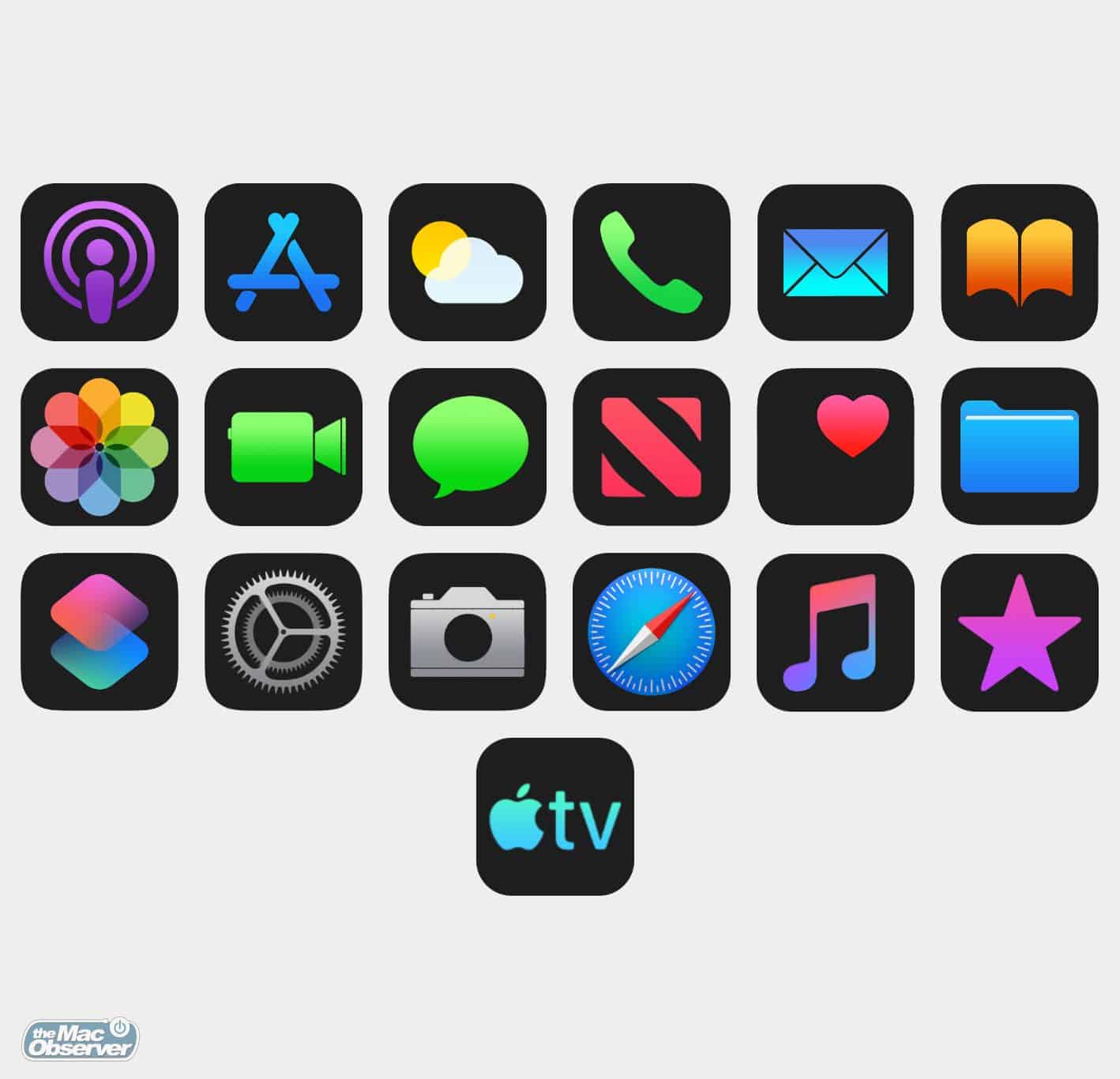
Users who like dark mode regularly complain that their favorite iOS app does not support it. On Cult of Mac, indie developer Graham Bower explains why it takes time.
The problem is that while some parts of your user interface — like the background — automatically switch to dark, others do not. Some text becomes unreadable because it’s black-on-black. Headers with white backgrounds look too bright and annoying. Illustrations and icons designed for a light background look terrible. Yes, if the app had been built using Apple’s default buttons and styles, maybe it wouldn’t have looked so bad. But in reality, life is never that simple. Even Apple’s built-in apps often deviate from the default user interface elements these days.
Check It Out: Why Adding Dark Mode to an App Takes Time
