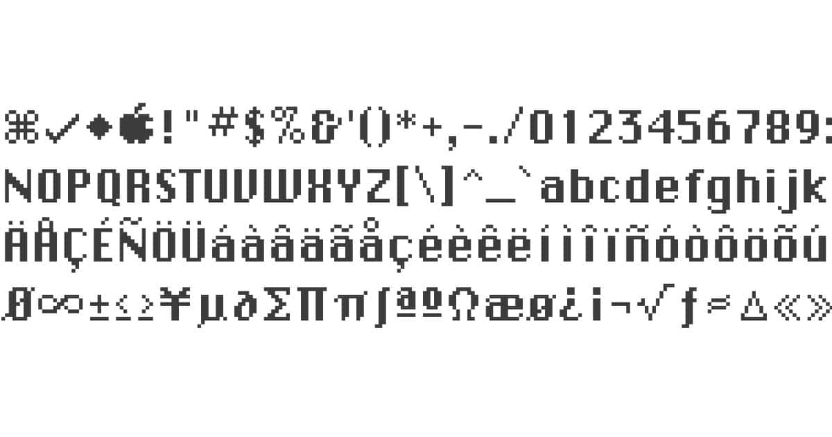
Check out this great piece by Ben Zotto at Medium. It’s about how he used an original Mac to study Susan Kare’s Chicago, Geneva, New York, and San Francisco fonts. He was looking to better understand the magic that was Chicago, the original proportional font on the Mac. What he found, though were sheep. I don’t want to give it away because it’s a good read, but here’s a snippet:
So what was that thing about the hidden sheep, anyway, you ask? Well, the deconstruction of the original Mac font resources revealed something puzzling: in several of the fonts — though not all of them — there is an unexpected secret character hidden alongside all the normal ones.
