
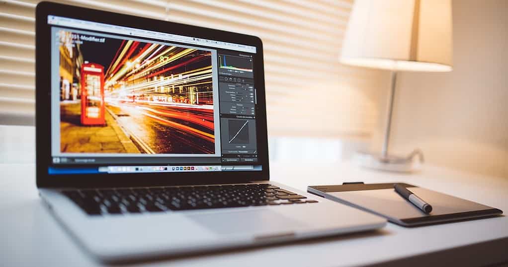
It isn’t by chance that iMac and MacBook are quite popular among professionals in the creative industry. Apple embeds the best color profiles on macOS, and the screens on Mac devices are unmatched in their categories.
If you work with visual content, like graphic designing and video editing, having a display properly calibrated is paramount. If you just want the screen to show punchy colors, it’s important to do so without blowing out the whites. And Macs have you covered in both cases. Here’s everything you need to know.
What Are Color Profiles?
In short, color profiles are “instructions” for a monitor to display a specific set of colors. They exist because different screen panels are able to display different sets, and these sets have specific functions. You may need more accurate colors, ones that pop out of the screen, or even dull tones in some cases.
If you have ever compared a cheap monitor with a Mac screen (or any flagship display) you’ve seen the difference. Mac devices can output a wider range of colors more accurately than most panels. They have to produce palettes that suit various types of creative assets, and that’s what color profiles do.
Best MacBook Color Profiles for Design and Illustration

People working with design and illustration often have one of two goals: print their work or display them online. Such cases require different color profiles.
For physical pieces, you need to adjust your screen’s color to what printers can output. If you’re creating mainly to display it digitally, you’d want the smallest possible color difference across devices.
For Print: sRGB
For printing, sRGB is likely the best color profile for your MacBook screen. It is the most reliable way to design and illustrate while keeping your work compatible across devices. That’s because sRGB has a smaller color gamut than most color profiles — even smaller than what most printers can output.
While you’re limited in usable colors, it’s worse to use colors you can’t print. Using non-printable colors yields unpredictable results, but it means the print will look way different from on-screen colors invariably.
There are exceptions, however, like printer models and ink brands that allow for wider color gamuts. Just note that they’re not easy to come by, and you’d need to configure your printer with custom settings. Using sRGB ensures a higher compatibility level regardless of where your work is printed.
For Digital: sRGB or DCI-P3
Similarly, it’s better to aim for the lowest common denominator to display your work on numerous devices. The difference is whether you want to optimize your output for web or mobile viewing.
That’s because most people’s laptops and monitors can’t display much more than the sRGB color space — sometimes, not even that. Most current phones, on the other hand, have screens capable of showing the DCI-P3 gamut. That even applies to intermediate-level devices and some entry-level models nowadays.
As a general rule, go for sRGB if you’re making something that most people will see through their computers. But if your audience primarily consists of mobile users, DCI-P3 is a safe enough bet.
Best Color Profiles for Photographers
Now, this is a heated discussion—photographers tend to be very protective of their preferred color profiles. You can see that in debates such as which camera brand to use, analog versus digital photography, or whether a starter should invest their limited money on study or on gear.
Things aren’t very different regarding color profiles. In the end, it comes to three aspects:
- print or digital
- self-expression or audience-oriented
- accurate or punchy
Print Photography: Adobe RGB
For the most part, graphic designers don’t have much control over where their work will be printed. If they work for an ad agency, there may be some leeway about that. Those working for other companies, however, will depend on their employers’ decisions, while freelancers are usually restrained by budget.
On the other hand, photographers often have more liberty and are advised to be stricter about it. They either partner with a reputable print shop, or print the photos themselves. In both cases, the important is to have some agency in the process.
Because of that, there’s no need to use sRGB, as with graphic designers whose work is printed. Compatibility may be either configured on your printer or negotiated with the print shop.
That’s important because, while Adobe RGB has a significantly larger color gamut, it’s not as widely used. In this case, Adobe RGB is best as a color profile for your MacBook Air. It allows you to have more colors to work with, resulting in more vivid pictures. You’ll also have a wider margin to edit the photos.
Digital Photography: sRGB or DCI-P3
For digital photography, the advice is similar to graphic design: depends on your audience. Using sRGB means focusing on computer viewers, while DCI-P3 presents more colors, but is not as widely available as on mobile phones.
Wider Audiences Versus More Authentic Photos: ProPhoto RGB
The above applies only if your intent is to maximize your audience. As a photographer, you may prioritize having more colors to work with, regardless of how they’ll appear on incompatible screens.
If this is the case, the best option for your MacBook is the ProPhoto RGB color profile. Just bear in mind that no third-party or Apple monitor can display this color space fully. Even if there were any, some parts of ProPhoto RGB aren’t even visible to the human eye.
Punchy or Accurate Colors for Photos?
The last debacle regards more lifelike or more vivid colors. Again, I’d recommend you go for DCI-P3 and sRGB here. However, I also suggest checking your edited photos with both profiles, regardless of whether you prefer punchier or accurate photos.
If you go for punchier, there’s a risk your photos will have blown colors on screens more lifelike rendering. But they may look dull for people using their displays with vivid settings if you choose accurate colors.
Color Profiles for Video Editors
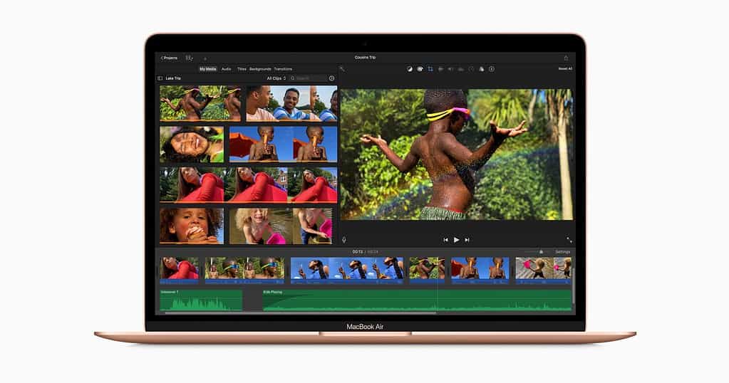
When working with video editing, your priority when defining a color profile should be making your colorist’s life easier. Your team doesn’t include a colorist? Well, someone will need to do the color grading. Might as well be you. Make your life easier, then.
Also, there’s no “best” color profile here, as MacBooks, powerful as they are, aren’t the best tool for the task. Unless you use an external monitor, which will require its own color profile setup.
Another thing to consider is that you’re likely creating for a specific screen: a movie theater’s. Differently from media used by photographers and visual artists, the specifications of these don’t vary much. There’s streaming, but this is a whole different point.
Color Profile for Video Editors: Rec.2020 or DCI-P3
Simply put, you won’t get full Rec.2020 support on a MacBook Air. Like the ProPhoto RGB, no commercially available screen can display 100% of this color space (though some get pretty close). More recent Airs, though, do support DCI-P3 (or Apple’s version of it, Display P3).
Rec.2020 is a next-gen color space, so choosing this color profile, while not completely compatible with your MacBook’s screen, helps to future-proof your work. And you can always connect your Mac to a monitor that supports it.
If you’d rather keep things simpler, DCI-P3 is still good enough. It delivers reasonable (great overall, but “reasonable” regarding professional video editing) color rendering and is more widely compatible.
Consider Purchasing a Monitor Colorimeter
Being interested in the best color profile for MacBook Air screens, I assume you want to level up your imaging game. To really do that, a colorimeter is a must-have.
These tools help you calibrate the colors on your screen so that it better reproduces the targeted color space. They’re not exactly inexpensive, costing a good $300 for some models. But they add an undeniable advantage to your MacBook’s screen accuracy.
Not a Power User? Don’t Worry Much About Color Profiles
It doesn’t hurt to play a bit with display settings. However, only professionals are likely to need to tweak their Macs’ color profiles. If you’re not doing any work that requires highly accurate colors, there’s little reason to worry about that.
Apple’s displays aren’t factory-tuned to the highest extent like the manufacturers do on monitors that cost thousands of dollars. But they’re far from bad too, and the default options are more than enough for the vast majority of users. If you just want to enjoy movies and TV shows, just keep the out-of-the-box settings.