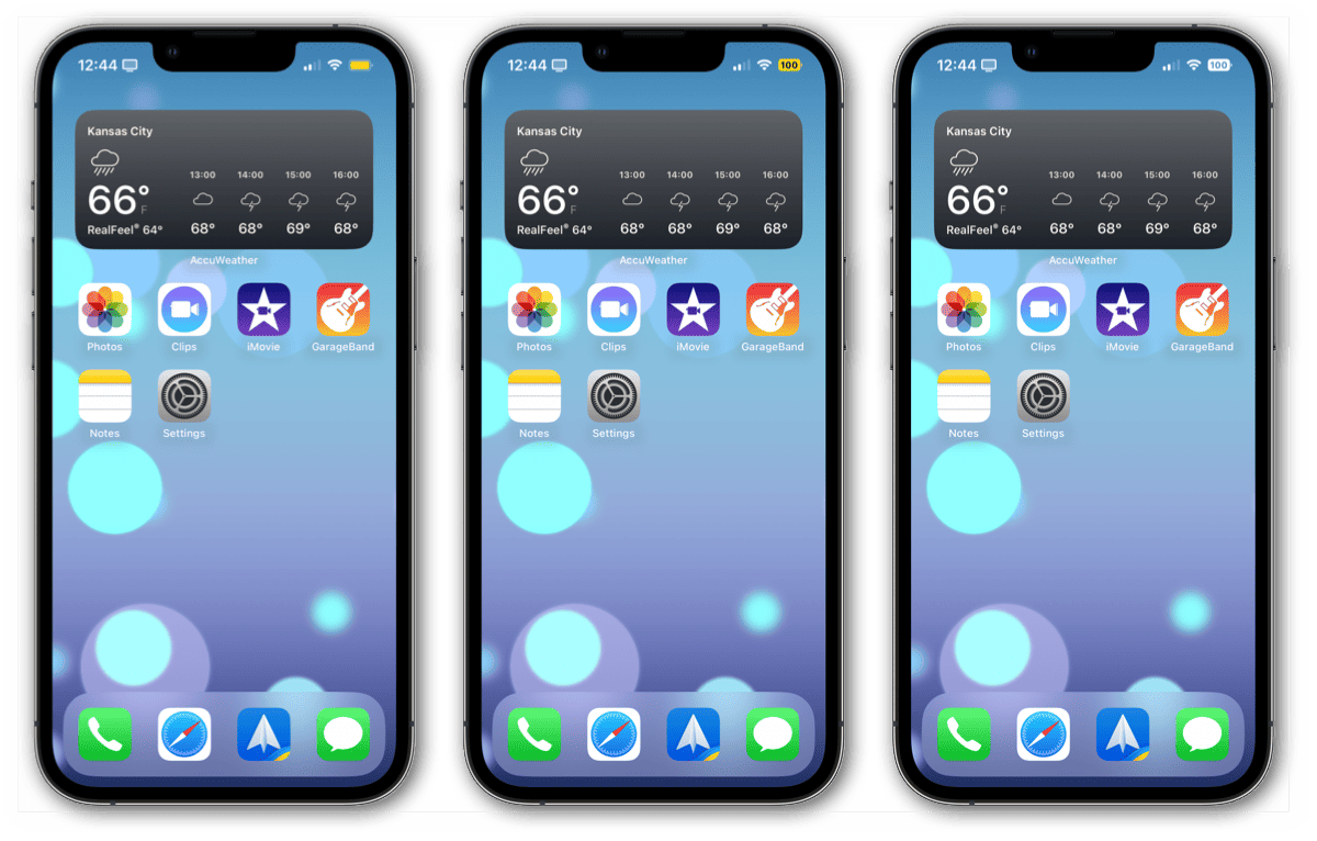
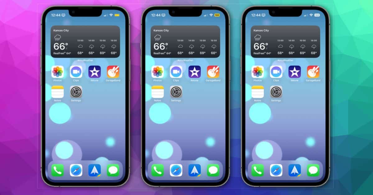
With the installation of iOS 16 developer beta 6 (and public beta 4), users gained more control over the battery indicator on the Home Screen. Previously, the percentage would show up in Low Power Mode even if it was disabled elsewhere. Apple has changed that, but many think the indicator itself could stand to be better designed.
Low Power Mode No Longer Shows Battery Percentage By Default
When Apple introduced the battery percentage indicator back to the Home Screen in iOS 16 developer beta 5, it was your choice whether it was on all the time or not. However, if you placed your iPhone in Low Power Mode, the percentage remaining showed up regardless of the setting.

With the latest beta, that’s changed. Now, when you disable the battery percentage indicator, it’s gone all the time. Even when your iPhone is in Low Power Mode, there’s no percentage shown in the battery icon. It definitely adds more consistency to the setting, but many folks feel the overall design could be better.
Apple Aficionados Offer New Battery Percentage Indicator Designs
The two major complaints are with the icon itself when battery percentage is enabled and the lack of the “%” symbol in the readout. Both are fair criticisms, especially since the battery percentage indicator in the Control Center view does include the symbol.
Another complaint is that the battery logo no longer changes based on the level, at least until it drops to 20%. At that point, the indicator turns red and empty. Some say this may confuse you into believing your battery is still full, at least until you read the numbers.
Twitter user Brian Michel offers one new take, with a video demonstrating the change in fill within the icon. It’s a rough take, and the numbers become slightly blurry when the fill surrounds them. However, that could be an artifact of the video or just the fact that it’s not a vector animation.
Just recreating the battery indicator pic.twitter.com/cK8PZDe9Y5
— Brian Michel (@brianmichel) August 9, 2022
Mikael Johansson, product manager for Updog Marketing, offered his own alternatives. In his comparison, he shows Apple’s version along with three possibilities for offering different amounts of fill based on the remaining battery life.
Nothing wrong with what Apple released but I think I might’ve preferred something like Alternative A for the battery indicator pic.twitter.com/a44879RIFk
— Mikael Johansson (@michaelnevernot) August 10, 2022
How Will Apple Finalize The Battery Percentage Indicator?
Clearly, those paying attention to the beta development have their own design aesthetics. So does the team at Apple working on the iOS 16 beta software. While many have praised the iPhone maker for bringing back the percentage indicator, it’s also generated plenty of controversy. Many wonder why certain iPhone models are left out in the cold.
Apple may not be done refining the battery percentage indicator. We could still see it arrive on devices it’s still absent from. We may see Apple redesign the icon, add in dynamic fill, or even offer the percentage symbol. It’s a waiting game at this point.
Of all the options shown for the battery icon design, which is your favorite? Let us know in the comments.
