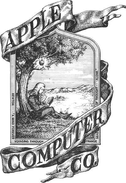
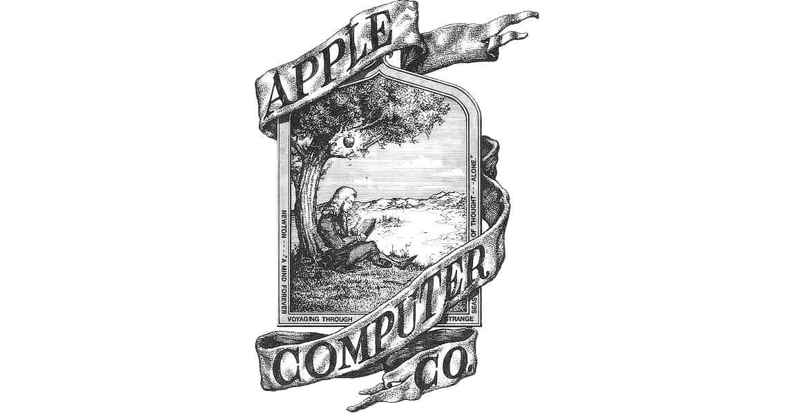
Remember Apple’s original logo? Not the rainbow-colored Apple, the one with Newton sitting under an apple tree. It was designed by Ron Wayne, Apple’s oft-forgotten third cofounder. In an interview with Vice‘s Motherboard, Mr. Wayne discussed where the idea for the logo came from, and said he knew at the time that it was old-fashioned.

Ron Wayne
Mr. Wayne had a 10% stake in Apple, but sold it back to Steve Jobs and Steve Wozniak for $800 because he’s highly risk averse. Had he kept them (and everything somehow worked out the same way), they’d be worth some $67 billion today. In the interview, he talks about not having any regrets about that decision, something he notes every time he’s asked.
That Newton Apple Logo
What is new in this interview—to me—is his thinking on that Newton logo. Look at it. It’s busy. Not at all the clean, iconic logo eventually made for Apple. But Apple needed something to get those Apple I units delivered, and that logo is what Mr. Wayne came up with.
Here’s the bit in the interview discussing the issue:
I knew at the time it was not a legit 20th century logo, it was a 19th century logo, but it was fun. Everything we did in the beginning was for fun.
I knew I was standing in the shadow of giants with these kids. I was 20 years older than them. And so I did this pen and ink sketch. I was trying to capture Newton and the apple, all the sudden a great idea is born. He was essentially an analyst of the natural sciences. He delved into optics and gravity. He built a text on the explanation of the mechanics and mathematics, why cannonballs behave the way they do, etc. The direct correlation is Newton and the apple triggering the idea. Woz and Jobs were participants in a hobbyist group that were taking business computers to scale down to personal computers. And Woz focused on a design of an ultra simple circuit. Jobs insisted on the word Apple, and I made the connection to Newton’s apple.
I was supposedly the adult in the room watching these kids play. I thought it was totally appropriate, it wasn’t a modern logo. A modern logo is like GM, it hits like a shot, its simple. I have seen that logo in so many places. I get fan mail from all other the world. They send me copies of the logo to autograph and I do it. I have an embossment seal, I use that as kind of certification.
Ron Wayne Talks Old Times
Mr. Wayne is 83 and lives in a small house in Nevada. He’s never owned an Apple device and doesn’t have a smartphone today. You can read more in Motherboard‘s interview.

Here I thought we were talking about the PDA’s icon the whole time… I was like, why is he commenting on that?
I love the original Apple logo and do not own a smartphone. Perhaps there’s a connection…