Apple’s macOS Mojave is the most interesting, capable and stable release in years. Here are my brief observations.
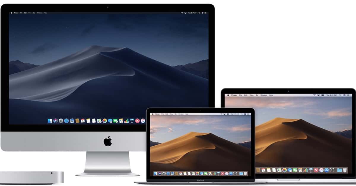
macOS Mojave Introduction
This is Apple’s 15th formal release of macOS, version 10.14, released September 24, 2018. (Cheetah was 10.0, released on March 14, 2001.) Throughout the years there have been some stellar releases and some duds. On the positive side, Jaguar (10.2), Tiger (10.4), Snow Leopard (10.6), Mavericks (10.9) and Sierra (10.12) were notable in my mind for being well-conceived and well-received, adding valuable features and technical refinements.
Not so well received were Lion (10.7), Yosemite (10.10), and High Sierra (10.13), notable for its disastrous root access vulnerability snafu and the reintroduction of graphics hangs on the 2013 Mac Pro. In the other releases, features were introduced of dubious value—ones that I wasn’t enthusiastic about adopting or saw no real value in.
I installed Developer Preview #1 of Mojave on my 2015 MacBook right after WWDC, and right away I developed a lot of confidence, as I worked through the betas, right up to the last DP/Public Beta 11. While I’m not a developer and haven’t technically stressed Mojave the way some developers do, I’ve developed a feel, from a user’s point of view, that this release is well thought out and offers real world features for my workflow that I think will be valuable.
Apple is both paying more attention to how we work as well as what we’ve come to expect after years of working with iOS on our iPhones. Tangible benefits come from this approach.
macOS Mojave Compatibility with Older Macs
Along the way, Apple has gotten a lot better at the visual design, thoroughness, and content of it support documents. This is most welcome. A great place to start is: “Upgrade to macOS Mojave.” The first thing to check is whether your Mac supports Mojave. For ease of reference, here’s Apple list.

To Update or Not?
The real litmus tests for a new macOS are: 1) Can it be installed with confidence? 2) Is it compatible with all mission critical apps—assuming they’ve been properly updated, and 3) Are the new features compelling?
I should add here that, over and above the previous list, it’s usually true that each release of macOS introduces important architectural changes designed to deal with nasty internet threats discovered by Apple and others. Assuming your mission critical apps are good to go, it’s usually wise to proceed with the upgrade fairly soon rather than hang back (or skip entirely) out of fear of change.
Notable New Features of macOS Mojave
I am particularly enthusiastic about this crop of new features. They have the look and feel derived from a refined understanding of how macOS users work. Let’s walk through the more significant ones that deserve commentary.
1. Dark Mode. This feature is the darling child of the technogeeks. Those who fell into early dark mode apps like Photoshop or Discord are enthusiastic. Apple has tapped into a sensation and made a big fuss about Dark Mode, as they often tend to do, because it’s upfront, dramatic and visual. It also punctuates Mojave’s dynamic desktop.
In the end, however, it’s a matter of visual taste. Plus, there are optical side effects. Dark Mode will open your eye’s pupil a bit more, and that tends to emphasize any of the eye’s optical problems such as spherical aberration or astigmatism. So older users may find Dark Mode a bit blurrier. Plus all the kinks aren’t worked out in a consistent way, especially in the Mail.app. My take: I’m glad it’s there, it’s cool, but I don’t feel pressured into using it. Personal, visual taste still rules.
2. Finder – Metadata Preview. One of the things Macs are frequently used for is web development. A lot of work is done with graphics: sizing, orientation and markup. The number of times we have to use Get Info nowadays is ridiculous. (One way around this is to use the brilliant app Path Finder with its Info pane always open.) The Mojave Finder introduces the Preview mode in conjunction with the Gallery view. Use View > Show Preview. You’ll see a lots of useful info there that was previously locked up in Get Info.
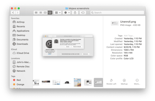
3. Finder – Actions. Related to the above, at the bottom of the Preview pane (see above) are some icons that trigger Finder Actions. Where have these been all my life? Of course, these tools can’t always replace the functionality of a full-blown graphics app, but they’re there in a pinch when time is critical. Very nice, Apple.
4. Finder – Screenshots. Mojave screenshots work the same as before, but there’s a new option: CMD-SHIFT-5. Apple has a terrific write-up on this new functionality. Plus, if you don’t like the default behavior, like iOS, of a Floating Thumbnail, you can turn that part off.
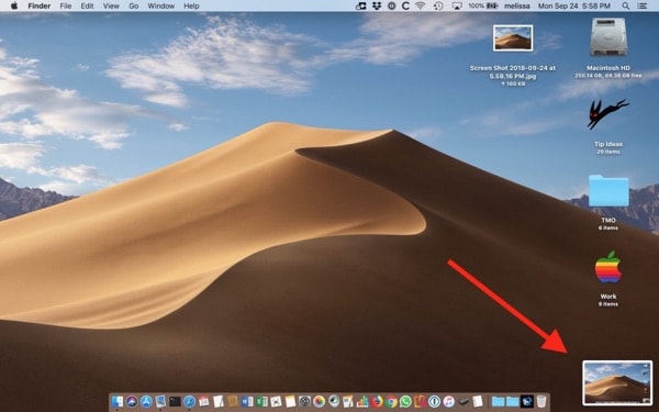
I have done that because when I take screenshots, it’s typically snap-snap-edit-edit with my favorite graphics app. Not snap-edit-snap-edit with markup.. I hate the lag. However, I may change my mind in time.
My take is that the Floating Thumbnail will annoy long-time Mac users at first, but once the feature is explored even a little, the real value will become apparent. Bottom line: gone are the days when screenshots were a rudimentary feature of macOS that had to be augmented by some third party utility.
5. Finder – Stacks. I am a bit more circumspect about Stacks. It seems like a solution looking for a problem. As Apple describes them, “When you choose Use Stacks, all the files on your desktop are gathered into stacks along the right side of the screen.” Activate with View > Use Stacks.
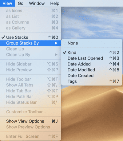
Right off, I found Stacks a bit difficult to use with Quick Look. Isolating an item in the stack is an annoying first step in doing a Quick Look. I’d rather have immediate access to my desktop files than worry about tidiness. Speed counts. Orderliness doesn’t. Clean up when the job is done.
6. Finder – Quick Look – Markup. Markup augments the functionality of Quick Look. I have a mixed reaction to this. I think I’d rather mark up in the Finder or in Preview. Quick Look seems like the wrong place to edit. It’s just fluff to me, but others may find it more compelling.
7. Finder – Dock – Recent Items. This has been brought over from iOS. There’s now a third section in the Dock that’s reserved for recently used apps, ones that haven’t been placed in the dock previously for easy access. This is very nice addition to the Dock. However, if you don’t like it, you can turn it off. However, I recommend staying with it. At the very least it’ll tell you which apps deserve a permanent home in the Dock.

Beyond the Finder
8. Apps – Continuity Camera. This is another splendid example of Apple thinking about how users work with both a Mac, perhaps MacBook, and an iPhone. Here’s a link to Apple’s tutorial. This is a brilliant new feature. Unfortunately, I couldn’t get it to work with my MacBook/Mojave and iPhone X/iOS 12 combo. No picture would appear at the insertion point in any of the many Apple apps I tested with. I’ll update if I find the problem.
9. macOS Updates. After a long, lonely trek in the desert wilderness, Mojave moves the macOS update functionality back to System Preferences—where it darn well belongs. Because reasons of history and Right Thinking. That pref replaces the App Store preferences which are properly in the App Store’s app preferences. They were duplicated in High Sierra.
Sanity has been restored.
10. iOS Apps. Via the Marzipan project, Apple brought four iOS apps to Mojave. It’s a precursor of many more to come. The only one I have heartburn with is Voice Memos. Not the iOS Weather app? Seriously? I can only surmise Apple didn’t want to step on developer opportunities, but hey. A simple weather app woulda been cool.
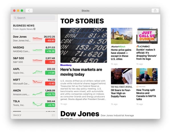
Bad choice there.
11. APFS – Fusion Drives. I have read in several places that Mojave’s APFS file system is now supported on Apple’s Fusion drives, but I don’t use Fusion drives and cannot verify. I think it’s wise to listen to the feedback of other users to see how this is going before diving in.
Final Words
As with any macOS release, there are many technical subjects to explore. But I’ve gone on long enough with this short review. My goal has been to give you an overall feel for macOS Mojave and why you should think seriously about upgrading. Apple, of course, has a splendid overview of all the new features.
Previous macOS upgrades may have been optional for some. However, with today’s internet threat environment combined with the stellar new features of Mojave, you will have ample reason to upgrade. I have read of no show stoppers as of this writing.
I think Mojave will be one of the most fondly remembered macOS versions.
Regarding #7 (new Dock area) my dock looks like this:
(dang, no pictures allowed? ; please imagine)
I turned off the new area of recent commonly used apps (it just takes up valuable space), preferring to use a “recent apps” stack instead. Recent items stacks can be made by the following terminal command as one line:
defaults write com.apple.dock persistent-others -array-add ‘{“tile-data” = {“list-type” = 1;}; “tile-type” = “recents-tile”;}’; killall Dock
# do not use sudo
and then control clicking on the new dock item to assign its nature.
In fact, I also have other stacks of related apps formed by just dragging apps on top of each other in the right-hand side of the dock. There is a way to maintain such stacks using scripting but I won’t go into that here. In addition, there is a way to change the active apps indicator dots to your own design (which I’ve also done). It all has to do with terminal commands like the one shown above.
I am enthusiastic about updating myself, considering the confidence in how stable Mojave is reported to be. But, as usual us Filemaker users have been advised to wait for an update in November or December. the update that will iron out any incompatibilities.
Following, my feedback to Filemaker and tcook:
It always amazes me that every time there is a Mac OS update that it takes Filemaker several months to release an update to make it compatible. Have they not heard of the Apple Developer programme? They should. Apple owns Filemaker!
It means having to wait to update OS.
___
Any way I have been informed that due to the special nature of Filemaker development that they prefer to avoid all the changes if APIs, dropping of features etc.. inherent in all the beta updates.
Thanks John. Gives me more confidence about Mojave. I will probably update my iMac 5K 2017 this weekend. I have been delaying it because of my concern about APFS and the Fusion drive. I’ve not yet seen much reporting about Fusion Drive and Mojave.