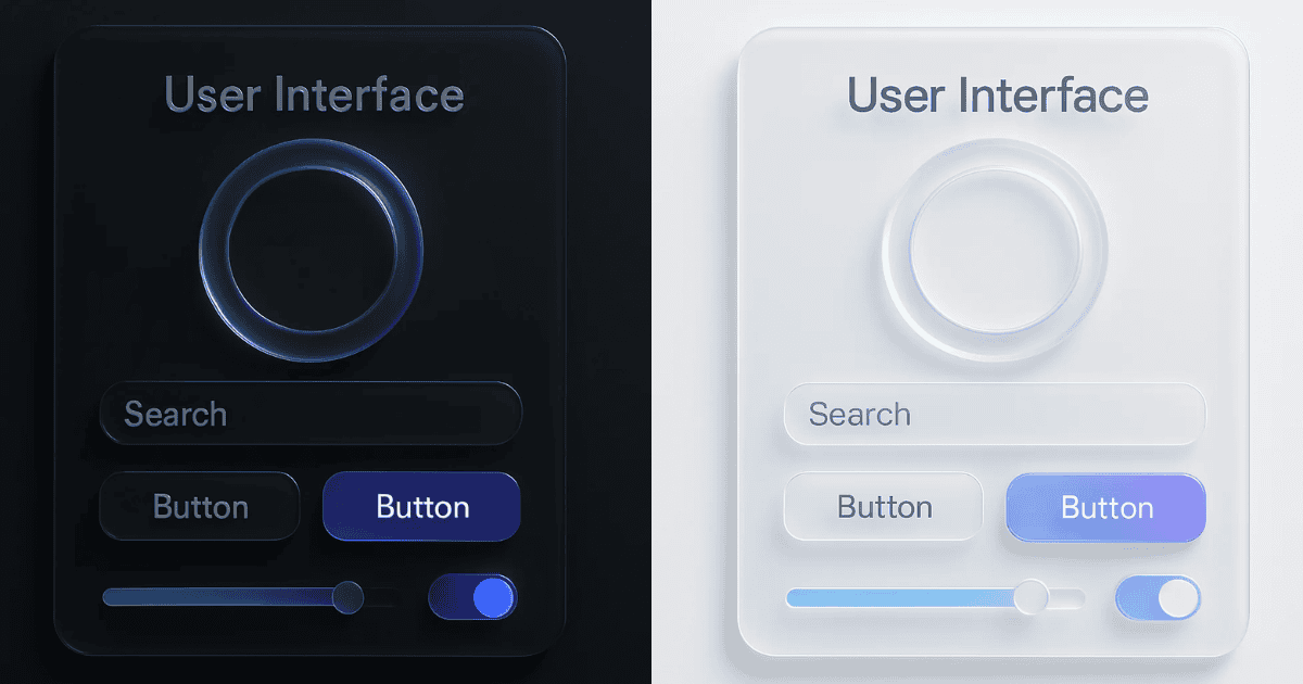
Apple’s latest user interface concept, as shown in two striking images, is drawing attention for its modern design approach. The visuals depict a translucent, glass-like aesthetic paired with soft gradients and subtle lighting effects. This design style, often referred to as “glassmorphism,” evokes a sense of elegance and depth and contrasts sharply with the flat design trends that have dominated recent years.
The light mode version emphasizes clarity and brightness, while the dark mode variant offers a sleek and futuristic look. Both versions incorporate elements such as search bars, buttons, sliders, and toggles, all designed to resemble frosted glass surfaces. The interplay of light and shadow adds a dimensional quality to the interface, making it visually appealing.
Online discussions about this design have been lively, with opinions ranging from excitement about a probable shift in Apple’s aesthetic direction to concerns about usability. Some users have likened this style to Apple’s earlier “Aqua” design language used in macOS, while others see it as reminiscent of Microsoft’s Fluent Design System.
Critics have pointed out potential challenges with accessibility and functionality, particularly regarding contrast levels and distinguishing between interactive elements like buttons and text fields. Meanwhile, fans of the concept appreciate its premium look and hope it signals a broader redesign across Apple’s platforms.
