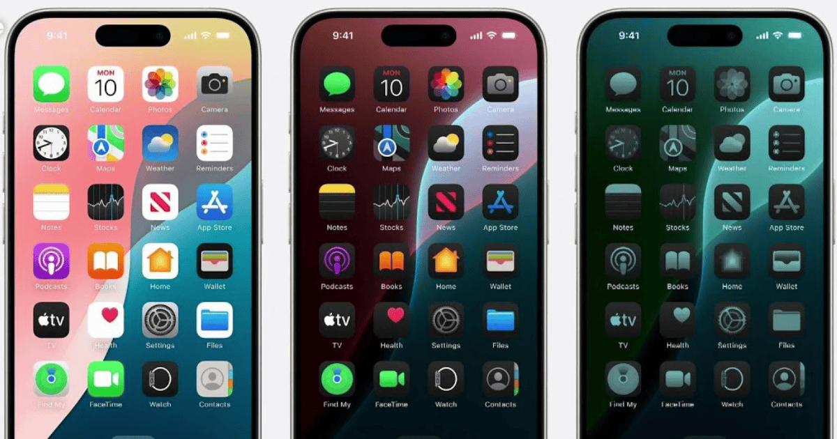
iOS 18 introduces a new feature that automatically adjusts app icons for dark mode. Hence, developers need to create separate dark mode icons to ensure a more consistent user experience. Apple must be doing something with its AI, right? Wrong.
Contrary to some initial assumptions, this functionality does not rely on complex machine learning algorithms. Instead, the system analyzes the colors within an app icon using a set of mathematical thresholds. These thresholds help identify the icon’s foreground and background colors.
In case you’re curious, I’ve checked the implementation for icon segmentation in iOS 18 to see how they’re generating the dark icons. There’s no ML/AI involved, it’s all just clever math. IconServices extracts the foreground and determines whether it should be tinted with the background color or left as-is, and there are configurable thresholds for when the results are not acceptable, which is when it falls back to just darkening the icon. Looks like it uses ARM Neon instructions for speed
Gui Rambo@[email protected]
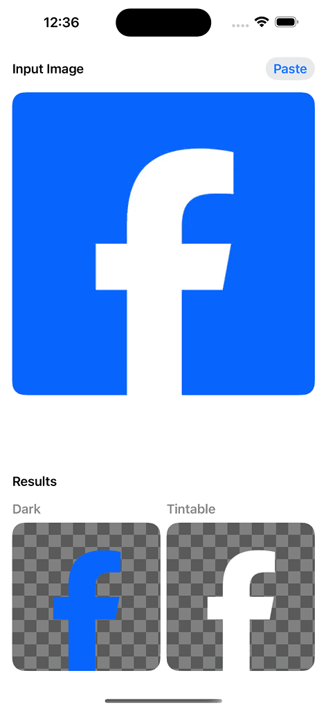
Icons with a clear difference between foreground and background, like those with a single-colored logo on a white background (Facebook, for example), may undergo a big change. This could involve inverting the colors entirely, making the background dark and the logo light. In some cases, the primary color itself might be adjusted to better suit the dark mode aesthetic.

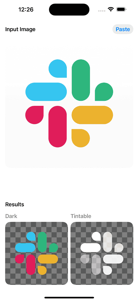
For icons with a more intricate mix of colors, such as those featuring gradients or multiple prominent hues (Slack, Google), a simpler approach is taken. Here, the system applies a dark tint while preserving the original colors within the icon. This ensures the icon remains recognizable in dark mode and retains a consistent appearance.

You can test tint icons dark in iOS 18 now as the iOS 18 public beta is finally out; here’s how to install it.
