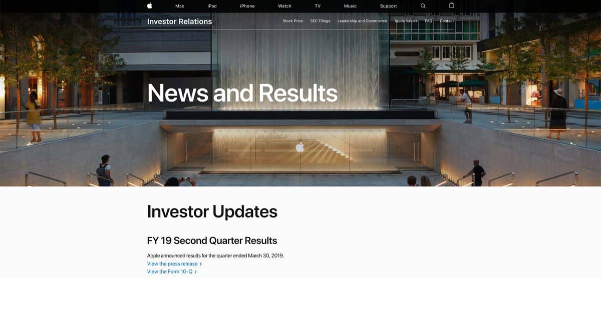
Investor Relations pages are not typically the most fascinating parts of a company’s website. Apple gave its an overhaul on Thursday, in an apparent attempt to make it a bit more accessible.

Investor Relations Page Given Clarity And Newsroom Integration
The new-look Investor Relations page now has much more in common with the rest of the Apple website. It has a big, bold, banner image at the top, with links to the recent releases below. At the bottom of the page it is now easy to go back into the archives and find financial reports from previous years, should you wish to do so. It also has clear integration with the main press release page – a one-stop-shop for information. As I said, these pages are not typically the most interesting part of a firm’s website for most people. However, if simplifying the design helps make Apple a little more transparent, that can only be a good thing.
