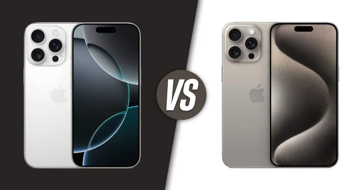
Users are reporting that the new iPhone 16 Pro, despite its larger 6.3-inch screen, is displaying less information than its predecessor, the iPhone 15 Pro, which has a 6.1-inch screen.
Multiple users have taken to social media platforms like Reddit to express their disappointment, noting that the increased screen size has not translated into more visible content. Instead, they’re encountering larger text and icons, resulting in less information being displayed across various apps and widgets.


“This is my first iPhone, came from Samsung. I have to agree though, there is sooo much under used space. The icons are SO huge.”
“That’s how Apple treats a larger display. They rather stretch things out instead of making room for more content.”
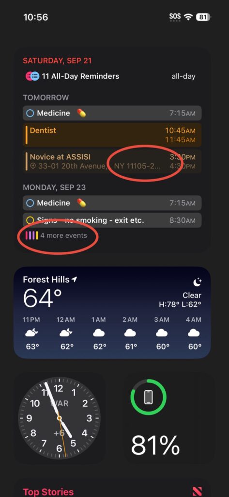
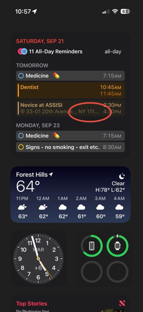
One user pointed out that the calendar widget on the iPhone 16 Pro fails to show appointment times, which is clearly visible on the iPhone 15 Pro. Email previews and podcast titles are also reportedly truncated earlier on the new model.
“iPhone 16 Pro screen is 0.2 inches larger than iPhone 15 Pro, but don’t expect to see more content. In fact, in many instances I see less content. Text in widgets is way too large, so I see shorter message previews in the mail widget, and I see fewer upcoming events in the calendar widget. Long podcast titles are cut off sooner in the podcast widget. I see fewer calls in call history in the phone app. There’s issues like this scattered all over the OS.”
The issue persists even when users attempt to reduce the font size in the settings.
“The font size is set to 100% on both phones, but even when I reduce the font size, I still can’t see the time for the dentist appointment.”


Apple has yet to comment on these reports, leaving us, the users, to speculate whether this is a software glitch or an intentional design choice.
This situation has left many questioning the value of the screen size upgrade, with some users even considering switching to the non-Pro version of the iPhone 16, which has the same screen size as its predecessor.
You can read more about what users have to say about it here and here.
