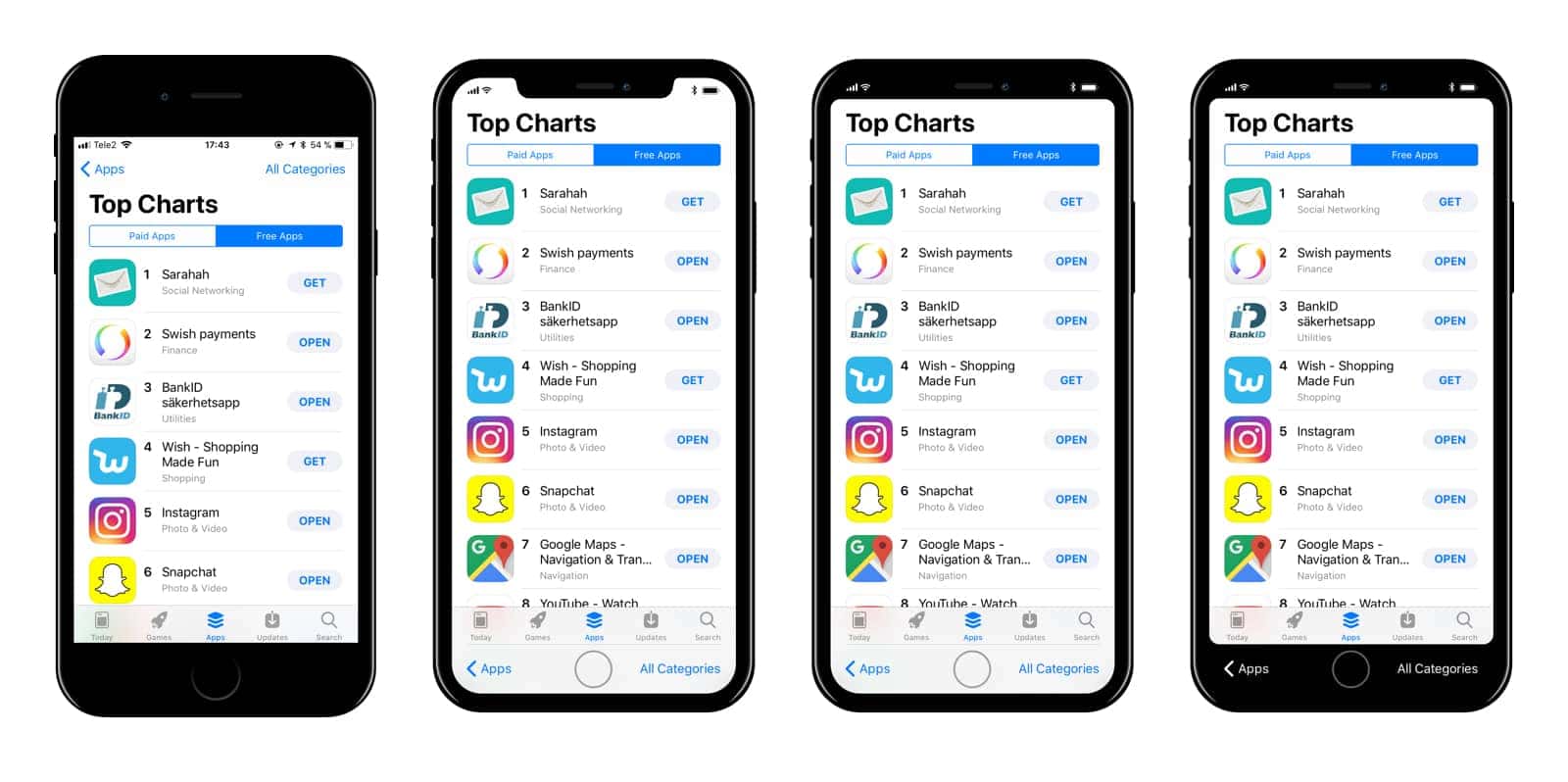
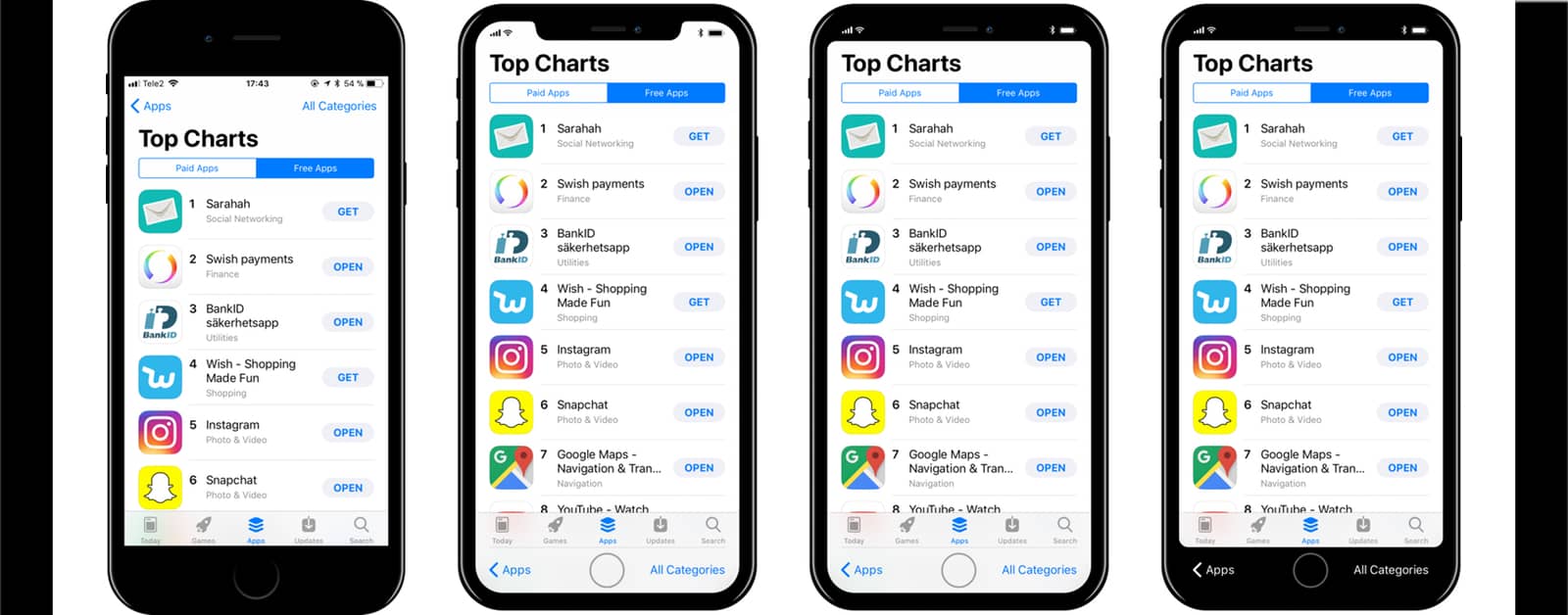
Designer Max Rudberg created a great iPhone 8 UI concept that imagines how Apple could hide the notch we’ve been seeing in the iPhone 8 rumors. The concept reimagines the top and bottom navigation bars based on the iOS 11 UI, with new ways of interacting with content on the screen.
iOS 11 Design Hints in iPhone 8 UI Concept
In the iOS 11 betas, there is a large amount of white space at the top of the screen in Apple’s default apps. This suggests that iOS 11 is meant to be debuted on a taller screen than current iPhone models.

As you can see, Apple could intelligently hide the top notch. Alternately, the company could introduce new forms of navigation at the bottom, if the iPhone 8 screen is OLED. This would let the screen display true, deep blacks where the UI and bezel seamlessly blend together.
Or, as this iPhone 8 UI concept suggests, the notch could be embraced, and the UI wouldn’t generate software bezels. It will be interesting to see which direction Apple goes, or if the company heads down an entirely different path.

Anything that gets rid of the time is a bad design. You can move the Bluetooth icon and battery icon to the left side of the screen, by turning the battery icon so it is positioned vertically. That would leave Space for the time on the right. People will be in howling protest if the time is taken off
I’m kind of partial to the third from the left.
Of course, with some of the iPhones having a white front and edge, they could also blend the mostly white screen with the white rim as well. But I usually go for the block fronts, so that wouldn’t matter too much for me.
Of course, they could have a full wrap around display that allows every surface to change color.
A “Mood” iPhone that changes colors with your mood. 🙂 (unlikely, but someday who knows…)