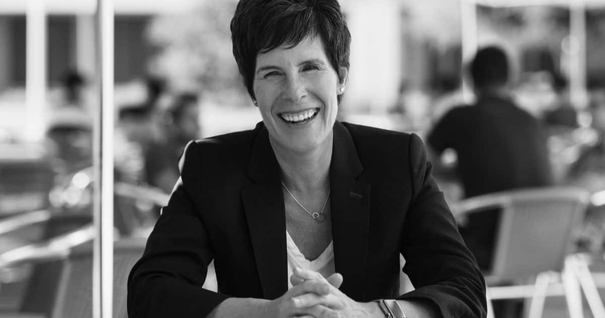
Apple’s head of retail, Angela Ahrendts, left the company in April. Deirdre O’Brien is the new SVP of Retail + People, and she’s changing Apple retail to be more straightforward (via 9to5Mac).
Apple Retail
The changes Ms. Ahrendts brought to Apple retail involved minimizing logos and signs, while promoting the idea of Apple Stores as public spaces. Ms. O’Brien seems to be focused on function over form.

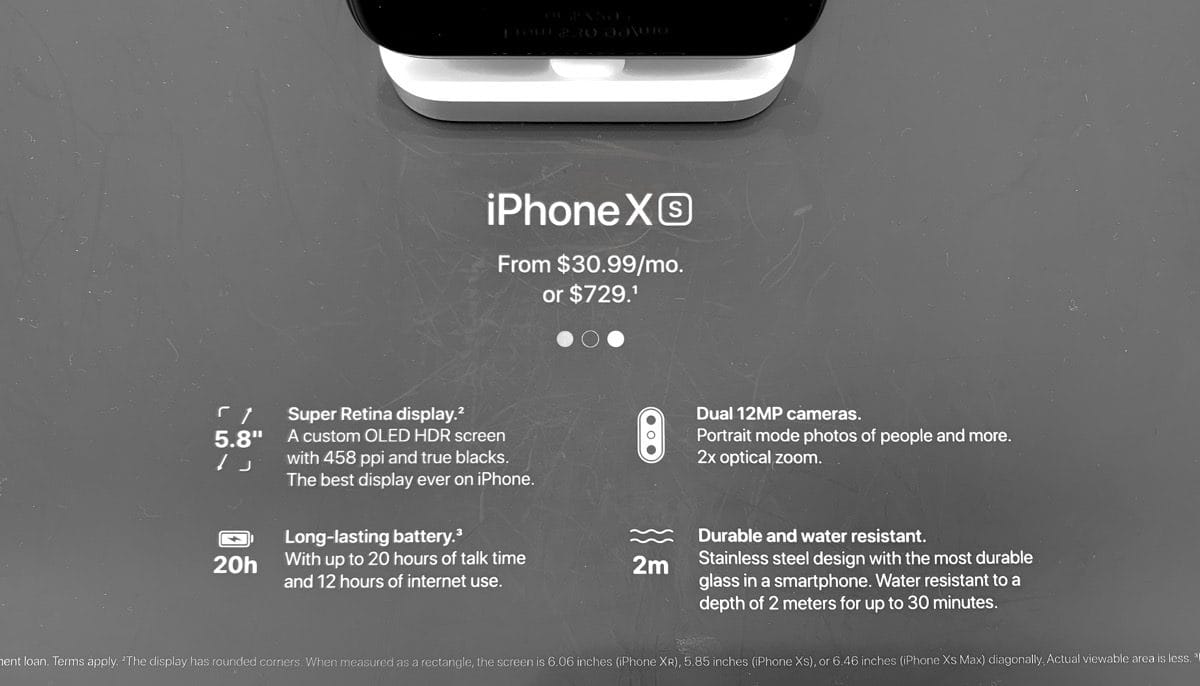
At San Francisco’s Union Square store, new signs are placed in front of Apple products on display tables. They show some device specs to make differences between each iPhone model more clear. There is also a Pricing app on the models.

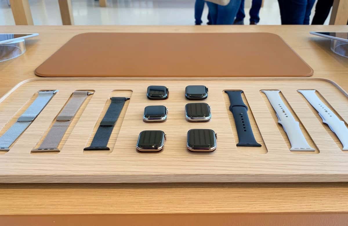
Display tables for Apple Watches are also changed. They make it easier to try on different watch bands and explore the different models. In some Apple Stores in the U.S. and Canada, there are express checkout signs to pay for accessories like headphones, cases, and cables.
Further Reading:

And so Apple will become Compaq. There is no way this MBA non-designer retail professional will do anything other than flatten any nuance from the experience of the Apple Store, and further, the Apple sensibility. Yecch. No sense of design. Design is the D in Apple’s DNA. The end began with the Apple Executive team wearing those neatly untucked polyester open collar shirts. I liked it back in the day when Phil Schiller was the neatest dresser.
Sorry, I don’t see the egregious violation of your design sensibility here. Besides, several years ago there used to be tasteful pricing and configuration signage next to some of the computers on the counters, so this is not a new concept. No matter what, the Apple stores have to function as retail spaces, and accommodate the needs of retail customers, such as pricing and configuration information.
I love designers (used to be one) but this ain’t fine art, it’s functional.