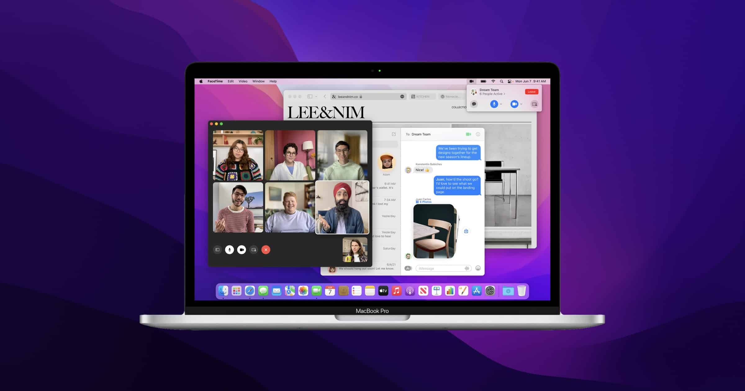
Apple has released macOS Monterey public beta 1 on Thursday, a day after seeding betas for iOS 15 | iPadOS 15 and watchOS 8.
macOS Monterrey
You can sign up for the beta on Apple’s website. Here are some of the new features that users can expect:
- Safari redesigns the browsing experience with a new tab bar that lets users see more of the page as they scroll. It takes on the color of the webpage and combines tabs, the tool bar, and the search field into a single compact design. Tab Groups offer a new way to easily save and manage tabs.
- Shortcuts arrives on the Mac to help users automate everyday tasks and achieve peak productivity. Just like on iPhone and iPad, Shortcuts on Mac lets users quickly accomplish tasks with the apps they use the most.
- Notes help users stay organized, collaborate, and create notes from anywhere. Quick Note is a new way for users to jot down notes on any app or website systemwide. Notes with tags to quickly and easily find them in the new Tag Browser and in tag-based Smart Folders.
- Focus helps Mac users can stay in the moment by automatically filtering out notifications unrelated to their current activity. Users can signal their status to let others know when they are focusing and not available.
- SharePlay is a powerful set of system features that enables users to have shared experiences while on a FaceTime call. Users can share their favorite music, TV shows, movies, projects, and more with friends and family in real time.
- Universal Control lets users work with a single mouse and keyboard and move between Mac and iPad for a seamless experience, with no setup required.

Anybody else totally OK with Safari redesign? Probably not my choice, but seems to work well enough. Cleaner, quite functional, can’t understand the complaints. Yes, I have lots of tabs open. And no, I’ve never used the tab groups. Not really interested, but can see the utility. If anything, the new design encourages me to have no more than 10 tabs per window. Not a bad thing in my opinion.
I like it. I’m glad they tweaked it in the latest Mac beta so the tabs aren’t smooshed together, but otherwise I like both the Mac and iOS redesigns.