As happens with every new update to iOS, we’ve got some great new features to look forward to. Apple is making some hefty changes to Messages, widgets, and how you organize your apps. We’re also going to get a new way to translate text and picture-in-picture on more iOS devices than just the iPad. Without further ado, here are the top new features in iOS 14.
New Features in iOS 14 Make Messages Even More Useful
When you’re in a group iMessage conversation, it would be nice to be able to tag individual participants. We’ve been looking for more usefulness in Messages for group chats. With the new features in iOS 14, we’ll get that.
When you tag a person in a group iMessage conversation, they can directly reply. This creates a thread within the conversation. You’ll get their attention, which makes it more likely that they’ll reply soon enough to be useful. Just type the @ symbol, then the person’s name, and they’ll be tagged.
Another issue we’ve had with Messages is threads getting lost in a busy shuffle. With iOS 14, you’ll be able to pin conversations. That means they’ll always be at the top of your window. You won’t have to scroll through a long list of messages to find your favorite ones. To do this, all you’ll have to do is swipe to the right across any thread.

Getting Translations Straight from Apple
Right now, if we want to translate from one language to another, we need Google’s Translate app. As one of the new features in iOS 14, we’ll have a native, built-in Translate app to do it for us.
The new Translate app will help you convert text and even entire conversations into a different language. At first, it will support English, Mandarin Chinese, French, German, Italian, Japanese, Korean, Arabic, Portuguese, and Russian.

Using the Translate app, you can either type the text you want translated, or tap the microphone icon to use voice-to-text. Got an ongoing conversation you want to translate? Just turn your iPhone to landscape mode, and away you go.
Among the Top New Features in iOS 14: A More Organized Home Screen
The more apps you install, the more cluttered your home screens get. Sure, you can organize them in folders, but sometimes you might want a bunch of seldom-used apps available when you need them without the clutter.

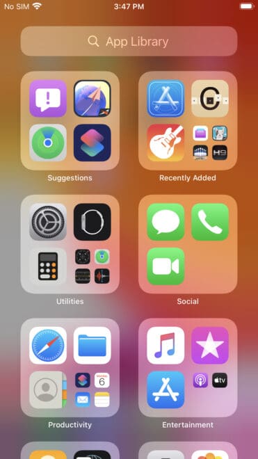
With the App Library as one of the new features in iOS 14, your organization problems are solved. A new screen to the right of your last home screen, App Library automatically arranges your apps in folders. Used along with another new feature that allows you to hide entire screens of apps, the App Library is much like the App Drawer found in Google’s Android.
Widgets Get Much More Useful
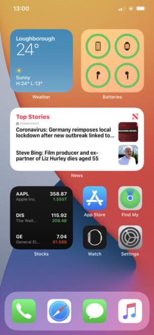
In iOS 14, widgets become much friendlier for you. You can view them all in Today View, just like before, but you can also drag them to one of your home screens. You can also tap the + sign in the top-left corner of your Today View screen to pick from the widget gallery.

The Smart Stack widget is another useful new addition, giving you information from multiple apps when it seems appropriate. You might see your weather widget, then your calendar when you get up in the morning.

Finally, Picture-in-Picture for the iPhone
For a few years, we’ve had the ability to play a video in picture-in-picture mode on the iPad. Along with the new features in iOS 14, we’ll have picture-in-picture on the iPhone, too.
The new feature creates thumbnail image of the video, which continues to play while you’re in another app or screen. This is vital when you need to switch to another app, but want your video to stay visible for you.
To use it, just swipe to go back to the home screen while you’re watching a video in one of the supported apps. You can drag it around on the screen to put it right where you want, adjust the size using pinch and zoom, and then tap the X when you’re finished with it.
Picture in Picture will work using FaceTime video calls, as well as a bunch of other supported apps. These include Apple TV, Podcasts, Safari, iTunes, Home, and any third-party app that already supports the feature on iPad.

I hope the new “Home Screen” is more customizable than suggested. On my current home screen I have my apps organized the way I want them.i use Files, Safari, Messages, phone, and Calculator! The most. From the look of your example, these would be put into separate groups. That wouldn’t help me at all.
New uses for widgets and PnP on iPhone?
Those are great but I think my favorite feature will be the fact that phone calls will no longer take over the whole screen when taking photos or playing a game.
I can’t tell you how many photos have been ruined due to incoming calls from Telemarketers / ‘spam’ calls.
“Right now, if we want to translate from one language to another, we need Google’sTranslate app”
Or use Safari and a webpage. I don’t Google.