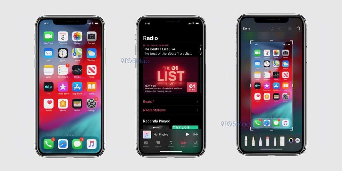
Today we’ve gotten a look at some iOS 13 screenshots. They show Dark Mode, new UI in Markup, a redesigned Reminders app, and more (via 9to5Mac).
iOS 13 Screenshots
For Dark Mode there is a screenshot of the home screen and Apple Music. Nothing changes on the home screen except for a darker dock. In Apple Music, the background is white, with a gorgeous dark translucency in other elements.

Markup is also different. When you take a screenshot now and open it in Markup, the background is light gray. In iOS 13 the background is a translucent view of your wallpaper. The tools also look more lifelike on a rounded tray at the bottom.

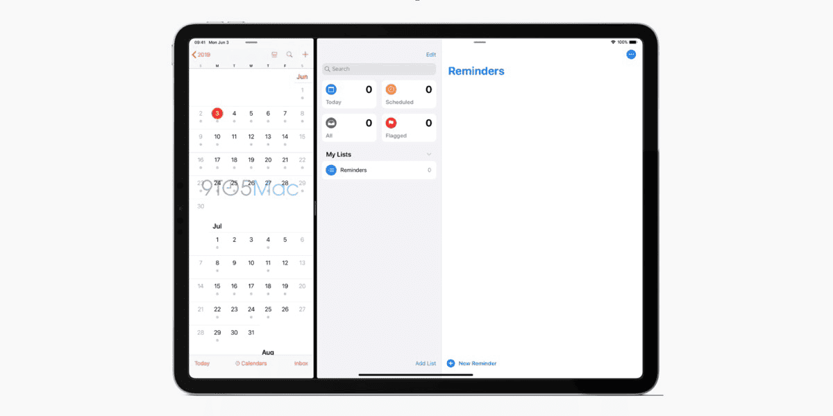
Reminders is getting a redesign in iOS 13. Here, we see how the app looks on the iPad. There are separate areas for “Today,” “Scheduled,” “Flagged,” and “All.” It also uses the San Francisco Rounded font introduced in iOS 12 in Wallet.

Finally, as was previously reported, Find My Friends and Find My iPhone are being combined into a new app called “Find My.” The app displays a map with an area listing the locations of your family, friends, and devices.
Further Reading:
[WWDC 2019 Nears, so Here’s my iOS 13 Wish List]
[News+: What Kind of an iPad Homescreen Redesign Will iOS 13 Bring?]
