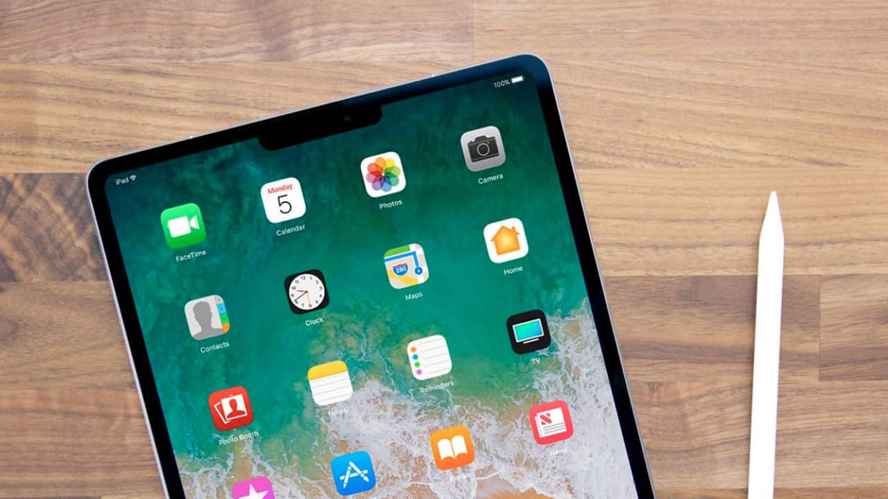
Many analysts and Apple watchers are expecting updated iPad hardware to land later this year, and based on Apple’s recent product cycle that’s not a risky bet. But the launch of the iOS 12 beta this week indicates that we’ll see more than a simple performance upgrade to the iPad, with several changes in the operating system pointing to a new design that looks a lot more like the iPhone X.

While anything is possible until Apple makes an official announcement, here’s a look at some of the changes pointing to a new iPad that ditches the home button but adds Face ID and, yes, the notch.
Relocated Status Bar Clock
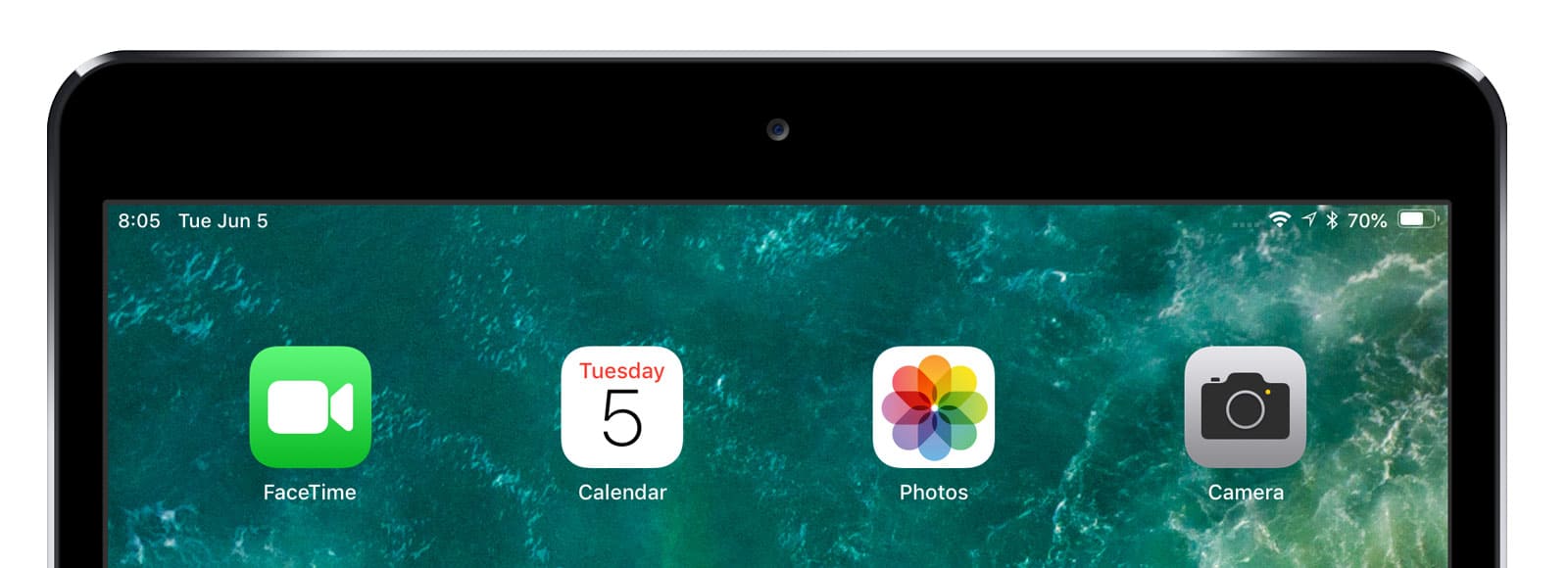
In iOS 11 and earlier, the iPad’s status bar clock was located directly in the center, just like pre-iPhone X models. In the iOS 12 beta, the iPad’s status bar has been rearranged. The clock and now the date (handy!) reside at the far left side of the status bar while the network status icons, location indicator, bluetooth, and battery are positioned at the far right side of the bar.

What’s in the middle? Absolutely nothing, paving the way for a nice camera- and sensor-housing notch to take its place.
iPhone X-Like Gestures
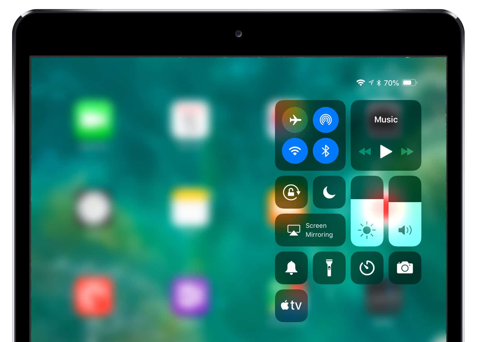
When Apple killed the home button for the iPhone X, it had to come up with new gestures to replace its functions. For example, instead of pressing the home button to go back to the home screen, iPhone X users swipe up from the bottom of the screen. This of course necessitated a change in how Control Center is activated, so iPhone X users now swipe down from the top-right corner to access their Control Center widgets.

Well, in the iOS 12 beta, both of these gestures are present on the iPad. While the “swipe up for home” gesture is redundent on current iPads, it would be a necessity for a potential future model that shares the iPhone X design.
Multi-User Face ID?
An interesting tidbit from the WWDC keynote and accompanying info released by Apple is that iOS 12 supports what Apple calls “Alternative Appearance” for Face ID:
In addition to continuously learning how you look, Face ID can recognize an alternate appearance.
So Apple is positioning this initially as a way for a single user who may have two very distinct looks to still use Face ID in cases where the technology’s adaptive learning may have trouble. But the practical result is that Face ID in iOS now has the capability to support two separate users.
This wouldn’t make much sense for the iPhone, which is clearly a device intended for an individual user, but many families and groups share iPads, and having the ability to have two or more users unlock the device via Face ID would be a significant improvement.
It’s possible that all of the changes mentioned here are Apple’s attempt to adopt a more consistent UI scheme across its device line, or this may all be a mistake present in an early beta that will be removed over time. But it’s clear that Apple loves the iPhone X design, and it wouldn’t be shocking to see Tim Cook & Co. take the stage later this year to announce a significantly redesigned iPad.
Not a fan of the Notch…. It’s the one of the things that has prevented me from getting an X. All it does is allow Apple to claim a bit larger screen…. The notch pretty much renders that part of the screen useless. Would much prefer a cleaner larger border that doesn’t impinge on screen space.
FaceID is very exciting technology. Unfortunatly my iPad is a year and a bit old and my iPhone two, so I won’t be getting anything with it for a while. But I’m looking forward to more screen, and less chin.