A new iOS Reddit client is here, and it’s called Apollo. The developer, Christian Selig, is a former Apple intern who wanted to build a Reddit app that closely adhered to Apple’s design guidelines. The result is an app that feels as if Apple itself built it. I spent a week using the app and it’s now my new favorite Reddit client.
Apollo’s Design

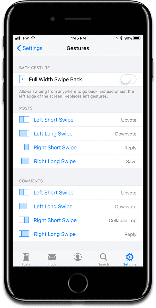
To start, Apollo’s design feels completely aligned with iOS. Christian didn’t try to impose his own design standards on the app. There are no unnatural user behaviors or UI elements. Using Apollo is intuitive, and doesn’t require a lot in the way of interaction. The app is built around gestures. Examples:
- Upvote: Left short swipe
- Downvote: Left long swipe
- Collapse Top: Right short swipe
- Reply: Right long swipe
These are the swipe gestures used for posts, comments, profile posts, profile comments, and inbox messages. If you want you can go into the app settings and customize each gesture.
Design was a big reason why Christian made Apollo:
Apollo was built due to simply not being content with any of the existing Reddit apps on iOS. Other Reddit apps for iOS don’t follow iOS design guidelines well, and look quite out of place as a result, creating an unfamiliar experience for users that doesn’t mesh well with the rest of the iOS ecosystem…I took what I learned from working at Apple…
Appearance

Each post with images, GIFs, or videos are displayed wide and edge-to-edge. In settings you can switch between the large view and the compact view, but Apollo was made for the large view. Media elements are also loaded right within the app. For example, tapping on a photo hosted on Imgur doesn’t rip you out of the app to open Safari. Articles load using the Safari View Controller, not a custom in-app browser.
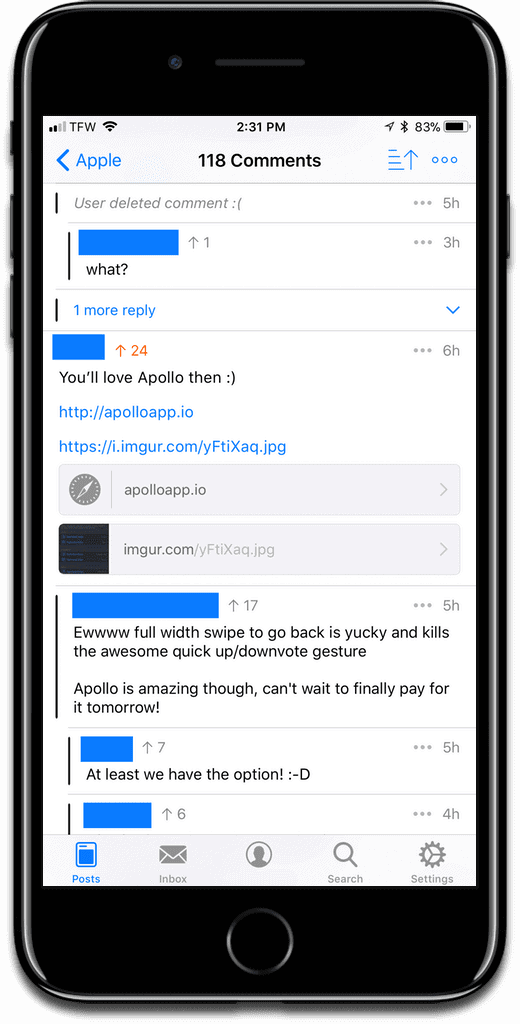
One of my favorite features is seeing an inline preview of content in comments. If a person links to media, Apollo displays each link in a nice-looking tab.
Markdown
Speaking of comments, another great feature is the Markdown editor for making posts and comments. Reddit uses basic Markdown formatting, like italic, bold, and website for in-line web addresses.
Veteran Redditors will have these commands memorized by now, but if you’re new, having an editor that applies formatting by tapping an icon is helpful.
Additionally, Apollo lets you upload photos from your camera roll into a post or comment, which is something I haven’t seen in other Reddit clients.
Other Customization Options
I like the fact that Apollo lets you lock down the app with Touch ID and a passcode. I think all apps should have this capability. There is a Low Data Mode setting to prevent GIFs from auto-playing over cellular. And speaking of GIFs, when you’re viewing one, you can scrub your finger back and forth beneath it to go forward or backward. I’ve never seen that before, in ANY app, not just other Reddit clients. Videos, sure, but not GIFs.

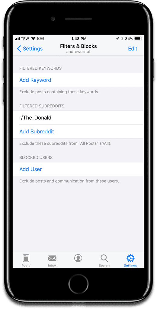
You can set filters and blocks in the app settings. You can add keywords to exclude posts that contain the keywords. Sick of certain subreddits showing up? You can prevent them from showing up in r/All. Finally, if there are certain users you don’t like, you can block them too.
Cost
So what does all of this awesomeness cost you? Well, the app is free, but you can buy the Pro version with an in-app purchase. Buying Pro is pretty much required, because you can’t submit posts without it, only comments. But Pro gives you other stuff:
- Multiple accounts
- Auto dark mode
- Custom app icon
- Touch ID & passcode
- Customize gestures
- Keyword filters
- Comment color themes
- Default subreddit to load
- GIF scrubbing
If you’d like, you can buy Apollo Pro at different levels, as a tip. The lowest tip is US$2.99, so you can think of that as being Apollo’s price. But you can also give a tip of US$4.99, US$9.99, or even US$19.99. There are no ads, and Christian is an indie developer, so the tip will fund Apollo’s future development. And he already has big plans for the future. You can download Apollo today here.