TMO Managing Editor Jeff Butts and Ken reach into the Mailbag for thoughts on A.I. and Apple without a Chief Design Officer. Come for the talking, stay for the rest of the talking! And drop your thoughts in the mailbag: [email protected]
Design
Leading Design Without a Design Lead? - TMO Daily Observations 2023-02-06
TMO managing editor Jeff Butts joins Ken to talk over reactions to Apple’s Q1FY23 earnings call. Plus would/will the general consumer miss an industrial design lead at Apple if Apple ends up without one?
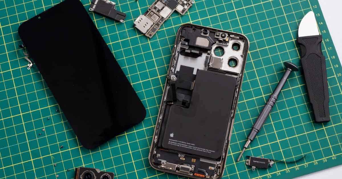
iPhone 14 Mod Features Transparent Glass to Show Internal Design of Phone
With the new iPhone 14 being more repairable, one user has created a mod that adds a transparent back glass to the new device.
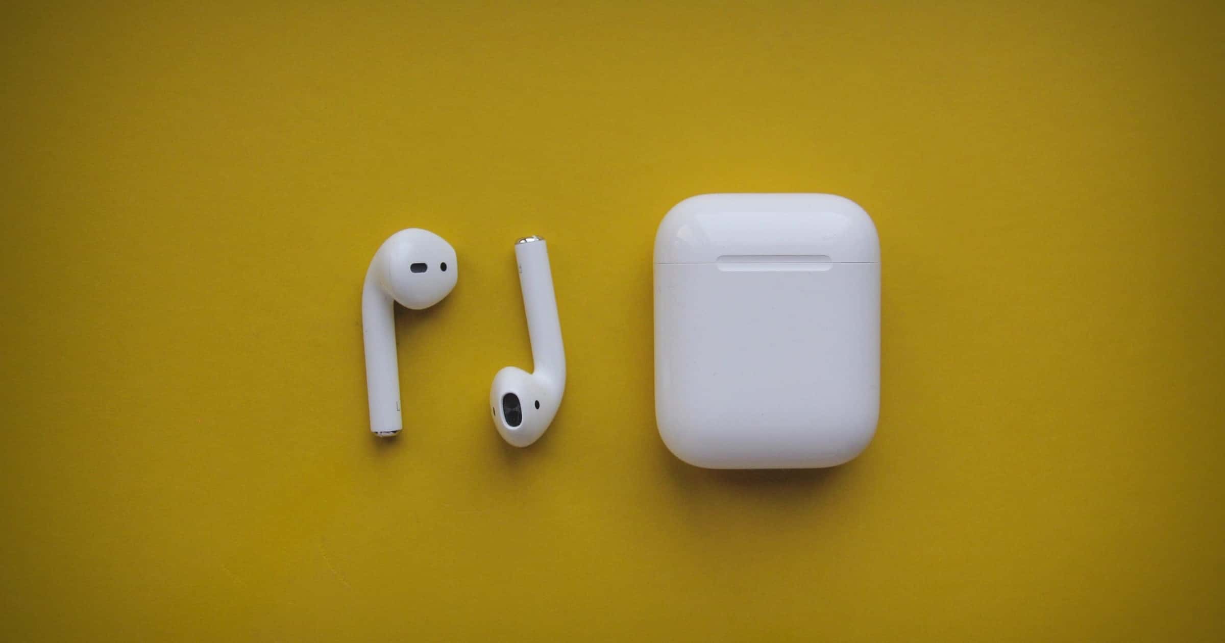
A Designer's Perspective on AirPods Annoyances
UI designer Philip Ardeljan wrote a blog post on AirPods annoyances and how they don’t fit Apple’s mantra of “Just Work.”
Annoyance 1: If you have 2 devices, say iMac and iPhone connected to AirPods, when you are using your iMac and unlock your iPhone to check something, sometimes, the AirPods switch to the iPhone. But you didn’t want them to. I get that Apple is trying to be clever and anticipate your moves, which I genuinely appreciate, but when it gets in the way it’s annoying.
This one in particular annoys me too.
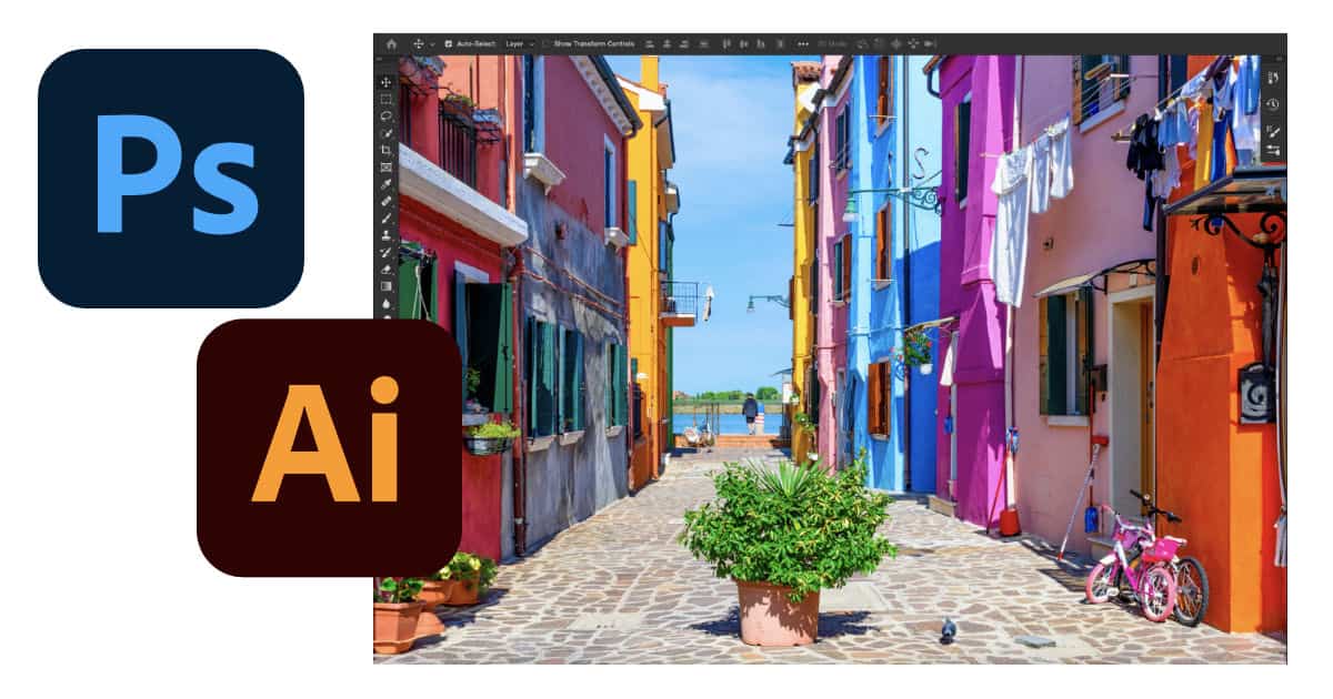
Adobe Ramps Up AI-based Editing, Intros Web-based Photoshop for Creative Cloud
Adobe unveiled new versions of its Creative Cloud apps at Adobe MAX on Tuesday. The updated creative design apps rely more on AI and machine learning for editing, Photoshop and Illustrator for iPad get some new features, and now you can use Photoshop in a web browser.
Behind the Design of ‘Sky: Children of the Light’ Game
“Sky: Children of the Light” is an iOS game with some beautiful visuals. Apple shared the story behind the design in its latest developer update.
Early on, it was clear that Sky would be an ambitious title for Chen and the creative team. This would be their first game for a mobile device, the first that relied on touch instead of console controllers, and their first attempt at an online multiplayer experience — one that celebrated connection over conflict. The team ultimately worked for seven years before bringing Sky to life, with more than 70 people contributing to the game over its creative development.
PowerBook Origin Story – TMO Daily Observations 2020-07-08
Bryan Chaffin and host Kelly Guimont chat about an interview with a designer of the original PowerBook and their own Apple Portable histories.
macOS Big Sur and the Return of Whimsical Design
Designer Michael Flarup writes about how macOS Big Sur will bring back “fun in visual design.”
With this approach Apple is legalising a visual design expressiveness that we haven’t seen from them in almost a decade. It’s like a ban has been lifted on fun. This will severely loosen the grip of minimalistic visual design and raise the bar for pixel pushers everywhere. Your glyph on a colored background is about to get some serious visual competition.
I don’t miss pre-iOS 7 skeuomorphism, but I don’t think I’ll mind some of that era’s icons coming back (just without the gloss). I also wonder if we’ll see them on iOS, or just macOS.
macOS 11’s Design Language is Meant for Augmented Reality
Jack Koloskus wrote about an emerging design language called neumorphism. Some of the new icons in macOS 11 are part of this design, like the Messages bubble that looks 3D. He believes we’ll be seeing more of this, while I am of the opinion that Apple, with this design, is laying the foundations for an AR/VR user interface. Of course an AR interface looks a bit odd on a 2D screen.
When you boil it down, neumorphism is a focus on how light moves in three-dimensional space […] What sets neumorphism apart from its progenitor is that the focus is on the light itself and how it interacts with a variety of objects in a purely digital space. The light simulations in neumorphism are more complex, and are focused on how light from one object could affect another, or the function of the object itself.
What Will The Next Ten Years of Apple Design Look Like?
“The next decade of Apple design has nothing to do with its most popular product of all time (so far)” is a weird stance to take. Author Sophie Charara seems to only make two points in favor of her argument.
Lisa Jackson […] has said that Hankey and her colleagues “ask tough questions” on sustainability; critics are looking for substantive progress that will require Apple’s new design chiefs to adapt some core principles while maintaining their aesthetic standards.
One possible cultural challenger to the new Apple duo is Ivy Ross […] Ross is a proponent of softer colour palettes and warmer materials, as seen in Google’s Pixel and Home product lines, and believes that aesthetics are less about making devices look pretty than “enlivening your senses”.
Apple critics always looking for the next big thing are not and have never been a source of design inspiration. I wouldn’t look to Google for that either. The final sentence: “And we haven’t seen the end of Jony Ive’s contributions just yet: Tim Cook says that Apple will be one of LoveFrom’s primary clients.”
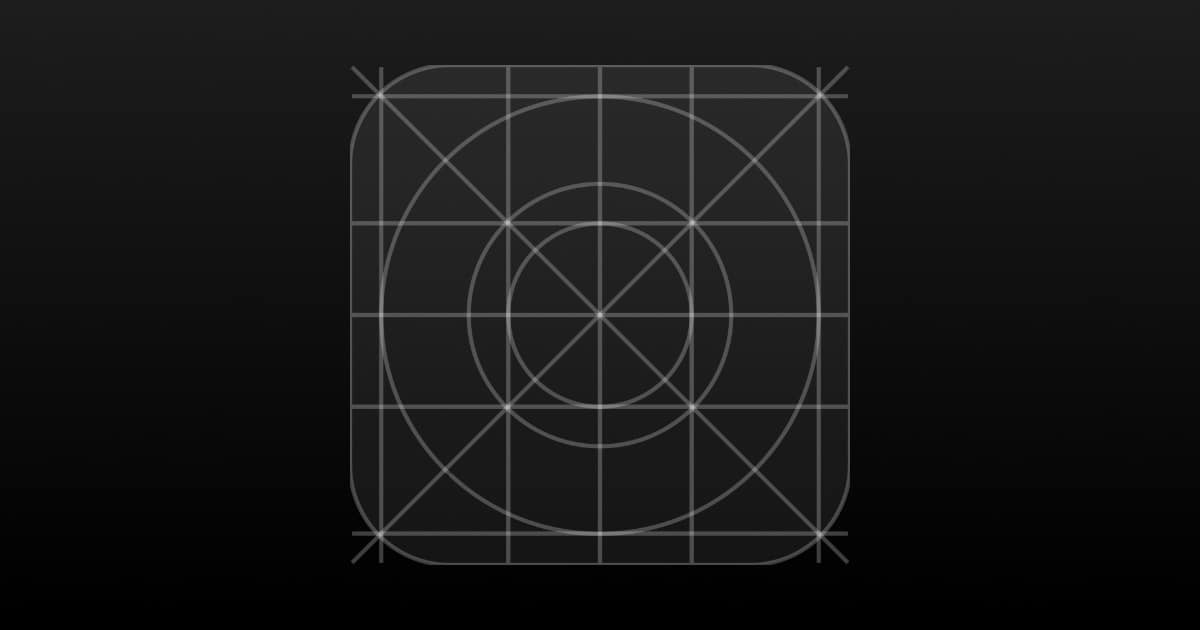
Apple Updates Human Interface Guidelines With New Resources
Apple has added new design resources in its Human Interface Guidelines collection, like Apple Pay templates, Apple Health icon, and more.
Is Dark Mode Technically Better? No, But That's Not The Point
Since Apple introduced Dark Mode in iOS 13 we’ve had a wave of people arguing that dark mode isn’t better for legibility, it could made reading worse on your eyes, et cetera et cetera. But I think they’re missing the point. I’m sure it’s subjective but staring into a searing white screen is worse than staring into a dark screen at night, and I don’t care how many “experts” pull a “well, ackshually.” Speaking of searing white screens, using as much white space as possible in web design has been popular for the last several years and it’s probably a reason why everyone wanted dark mode in the first place. Some web designers tend to prize aesthetics over readability. I’m looking at you Jony Ive.
So yes, you can have the Wednesday Adams aesthetic on your phone interface too. But at this point, it seems to be just that—about the looks.
Pixelmator Pro 1.5 Supports macOS Catalina, Sidecar, and Mac Pro
Pixelmator Pro 1.5 Avalon adds support for macOS Catalina, Sidecar, and enhancements for the Mac Pro and its Pro Display XDR.
Adobe Announces New Creative Cloud Desktop App
Adobe has redesigned its Creative Cloud desktop app for macOS Catalina. It makes it easier to access and manage your content.
As It Turns Out, Yahoo Isn't Actually Dead Yet
In today’s weird news, apparently Yahoo is still around. I only know this because they recently created a new logo, and now the media is reporting on it. Which, of course, was the point. This is Yahoo’s God’s Not Dead moment.
The new logo keeps the purple and the exclamation point, but it ditches any remnants of the company’s many previous marks. Instead, the Pentagram-designed identity is crisp and friendly, with thick and curvy letterforms. Its main surprise is its exclamation point, which is slanted like an italic. To be exact, that slanted angle sits at 22.5 degrees—and it recurs throughout the new branding.
The new exclamation mark is rebellious yet familiar—and definitely masculine, as if Yahoo is wielding it like a club to beat out of your head the knowledge that Yahoo Mail was the biggest data breach so far.
People are Putting Their Apple Cards Through a CNC Mill
Some people are customizing their Apple Cards with CNC milling machines in an effort to improve Apple’s minimalistic credit card.
As Wiegand showed on his Instagram account, he loaded his card into one of these computer-controlled cutting machines to customize the white finish with the filigree you’d find on the back of a 19th-century-era Bicycle playing card.
Neat stuff. We’ve already seen wallet cases specifically for Apple Cards. I wonder if some companies will create Card skins.
MacBook Pro Changes, iPhone Design Leaks – TMO Daily Observations 2019-08-05
John Martellaro and Bryan Chaffin join host Kelly Guimont to talk about changes to the MacBook Pro lineup, and iPhone designs vs Nexus leaks.
Twitter Web Redesign Rolls Out For All Users
A Twitter web redesign is rolling out for all users, simplifying navigation, a sidebar, profile switching, and more.
The update is designed to make it easier to move around Twitter. Before, you’d have to click on your Profile icon to access features like Lists, Themes, Settings, and other options. Meanwhile, getting to Moments was available both in this Profile dropdown menu and in the main Twitter navigation at the top of the screen, next to Notifications and Messages.
Rico Zorkendorfer Left Apple to Join Bumblebee Spaces
Rico Zorkendorfer left Apple in April where he worked in the industrial design team. He recently joined startup Bumblebee Spaces.
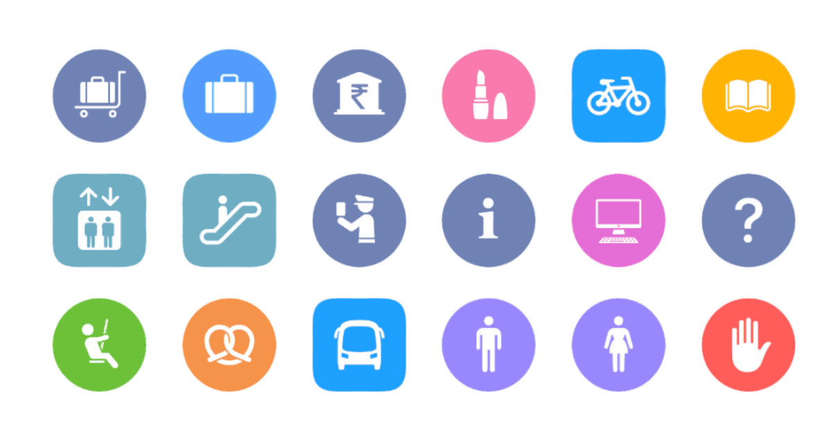
How Apple Maps Iconography Has Grown Over the Years
Mercury Intermedia dived into Apple Maps iconography to give us a history of it, and how it has changed over the years with each iOS update.
Sir Jony Ive Will Leave Apple to Start Design Company LoveFrom
In surprising news, Apple just announced that Sir Jony Ive will leave the company later this year to start his own design company.
22 Years of Apple Website Design History Visualized
The Version Museum has a visual history of 22 years of Apple website design history, starting in 1994.
Version Museum is devoted to showcasing the visual history of popular websites, games, apps, and operating systems that have shaped our lives.
The biggest change is the evolution of that tab bar at the top of the website, going from light to dark.
GQ's History of Cool Examines White Apple Earbuds
Johnathon Heaf writes how Apple’s white earbuds changed the industry forever. It all started with the iPod.
The “silhouette campaign” ads, which I’m sure many of you remember more than the early hardware, focused on the white earbuds that came with each iPod – a design feature that Ive has since stated was pure serendipity.
When he first saw the ads, Steve Jobs was worried the iPod wasn’t visible enough. Yet they were popular because they were fun and emotive.
#10YearChallenge: How iOS Apps Have Changed
Here’s a 10 year challenge I can get behind. Valia Havryliuk demonstrates how iOS apps have changed.
Just last year App Store celebrated its 10th birthday. In 2008 it launched with 552 apps and some of them are still live inside your iPhones. Time has passed and design trends have changed dramatically. #10yearchallenge is a good opportunity to see how fast the evolution is and notice changes in the oldest iOS apps.
iOS 7 was definitely the biggest visual overhaul to iOS. iOS 11 introduced UI changes but it was more along the lines of refinement.

