iOS 10 makes some nice changes to the music player app. Unfortunately, the Repeat and Shuffle buttons no longer appear at the bottom of the Now Playing screen. Where’d they go? They’re still there, but slightly hidden.
_______________________
iOS Music Player Changes
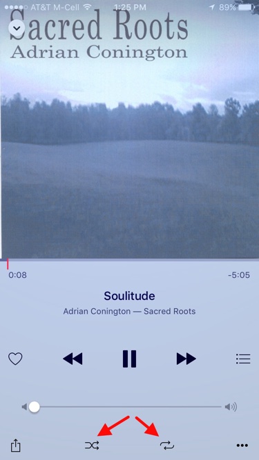
In the music player in iOS 9.x, the the Repeat and Shuffle buttons were at the bottom of the Now Playing screen. It looked like this.

For iOS 10, Apple revised the operation of the music player a bit. I think it’s better because the type, layout and operation are cleaner and simpler. For a full discussion, see David Chartier’s: “Music for iOS 10: A Tour of the Big Changes.”
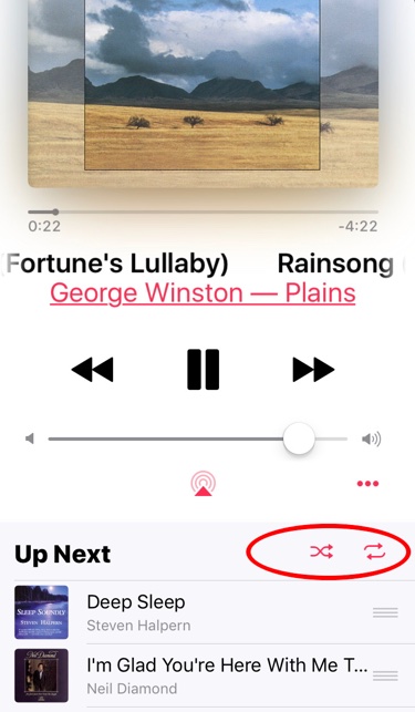
In short, with the new music player, all you need to do is swipe upwards on the Now Playing screen. That reveals a second screen “below the fold” as David describes it. The Repeat and Shuffle buttons are now at the top of the Up Next screen. It looks like this. (I only did a partial scroll).

Why did Apple do this? My theory on why the Up Next screen is a swipe instead of a button push is that it’s easier to swipe when running or walking. Locating and pressing a small button to see Up Next is not as easy.
But you still have to tap the Repeat and Shuffle buttons. Why not leave them where they were? That’s a mystery to me. Perhaps only the mind of Apple SVP Craig Federighi knows why they had to be hidden on the screen below.
But now you know too.

Thanks for explaining how to switch shuffle & repeat on/off!
What utter half witted idiotic moron thought this was a good intuitive user interface?
You actually have to swipe sideways from right to left
Hahaha Lee.
“Am I just old and resistant to change or is this a silly change for the sake of change?”
In my case I think that it is both 😀
A very confused mind decided that the Repeat burton for the current song belongs on the Up Next special invisible window that you don’t realize is there.
Horrible design change. The only justification for a change like that is that it sort of follows the controls-are-in-slide-up-screens. But even that logic is questionable as swiping up from the bottom should bring up controls for the device, not the app running – unless that is changing too. I’d personally like the device controls there on a swipe up, and all the controls for an app either showing or accessible with the gear wheel icon. Am I just old and resistant to change or is this a silly change for the sake of change?
It is a clunky setup Hagen.
If you look closely, you’ll notice that the Now Playing window is actually a drawer of sorts, with a scroll bar on the right side that quickly disappears. That’s about your only cue that there’s something below the music.
For lyrics, Apple has made a distinction between Custom Lyrics and those supplied by iTunes Music. While my songs on iTunes correctly grabs one or the other (based on a song’s Get Info -> Lyrics -> “Custom Lyrics” checkbox), the same songs on the iPhone apparently won’t pick that up until something changes and forces a song update.
Also where are the lyrics? I have them on the track on my iMac, but when the song goes to the iPhone they lyrics seem to disappear.
So before I posted this I did some research and here is a fix. Wether it is permanent or not remains to be seen. In iTunes on your Mac go to the Get Info of a track that has custom lyrics and add a blank line to the lyrics. Now synch your iPhone and the lyrics should appear in Music. Now do it for all your tracks that have custom lyrics, is there an easy way to do that.
It was very brave of him to this.