If you just installed macOS Mojave, then you may have noticed that your Dock became a little bit more complicated:

Before Mojave, you had one dividing line there, which separated apps (on the left) from folders, files, minimized windows, and the trash (on the right). But now you’ve got two lines, and the space in the middle of them is taken up by recent apps; these are programs that you’ve launched recently but haven’t specifically chosen to keep in your Dock.
On the surface, this is kind of cool, especially for the less tech-savvy folk who may not know how to find a program if it’s missing from the Dock. But I find this annoying as all get-out! I like to control my Dock myself, darnit, and when it switches up on me without my say-so, I find it disconcerting.
Or maybe it’s just that I’m an old fart who doesn’t like change. Yeah, that’s probably it.
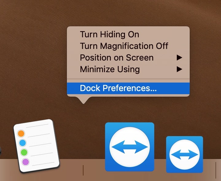
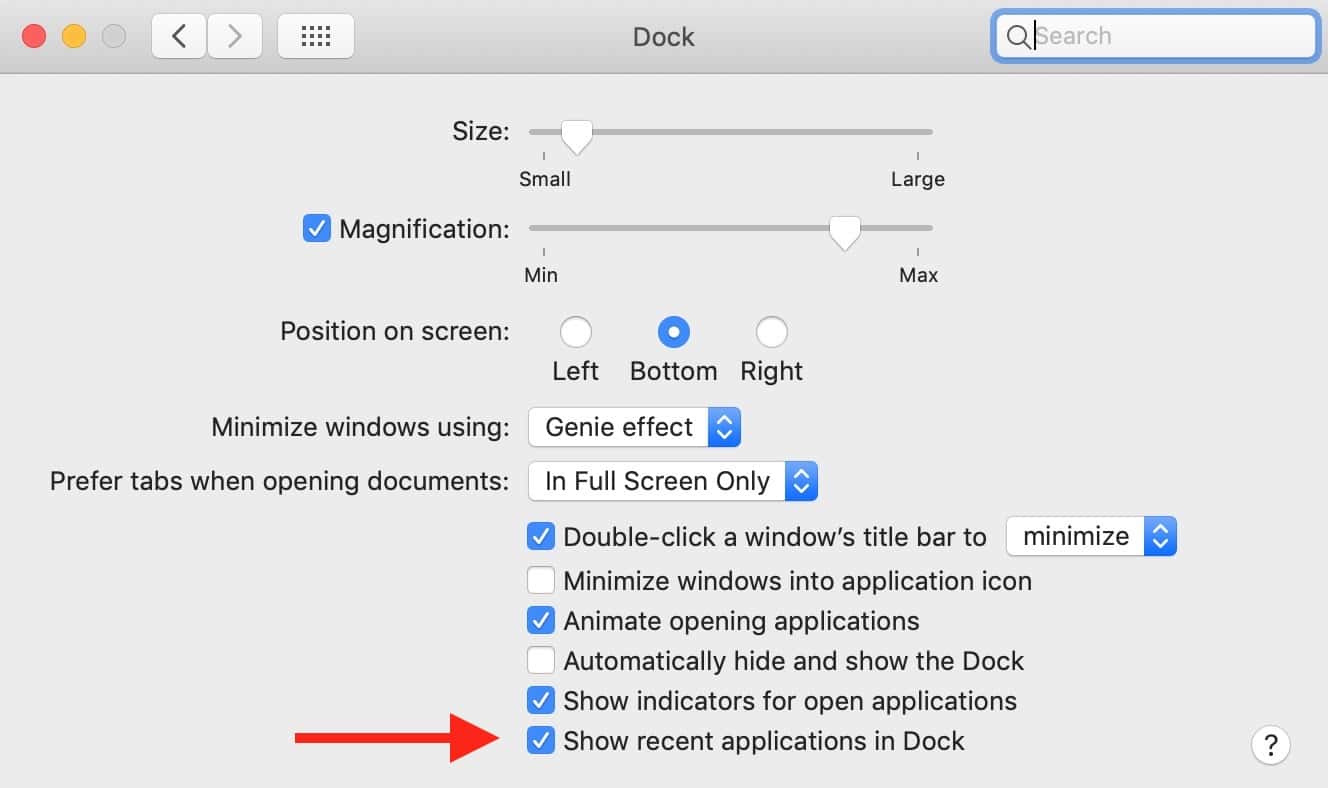
In any case, if you’re an old fart like me, you can change this Dock behavior back to the way it worked under High Sierra (and earlier). To do so, either click on the Apple Menu at the upper-left corner of your screen, choose “System Preferences,” and then click on “Dock,” or right- or Control-click on one of those aforementioned lines on the Dock itself:

If you pick “Dock Preferences” from that contextual menu, you’ll be taken to the same place. Either way, you’ll deselect “Show recent applications in Dock” when you get there.

Then your Dock will once again be a place of sanity. Control. Predictability. And you won’t have things like the 1Password updater stuck there (see my first screenshot) or two instances of TeamViewer (see my third). God, Apple, sometimes you make it so hard to love you.

Thank you so much! I constantly had to go up to “Preview” or another app and hit “Remove from Dock” even though it didn’t belong on my Dock. So appreciate this information. Love the updates, but would really appreciate that Apple would allow us to make our own decisions what we want changed. I totally with you, I think it’s age, we are set in our ways 🙂 . Again thanks for the instructions.
Thanks for this! I was confused/frustrated by this.
Now that I understand it, I’m going to try and leave it. I like this behavior on my iPad, I’m going to try and embrace the change on my Mac.
Yes, thanks Melissa. I upgraded my iMac to Mojave early today and was annoyed by this … until I found this quick tip!
Old UNIX Guy
You’re very welcome! Thanks for reading. 🙂
Thanks for this. As soon as I found out how to kill this annoying behavior in iOS I did. Good to know that it can be eliminated from macOS as well.
Right? It was the very first thing I noticed after I installed Mojave. Irritating!