The new Dynamic Island feature on iPhone 14 Pro models is set to become even more versatile. I’ve been playing with it in the iOS 16.1 beta since receiving my iPhone 14 Pro, and a few new gestures have surfaced to allow more interaction with the feature. Here’s how they work, at least so far.
Dynamic Island Gestures Allow You to Change What’s Displayed
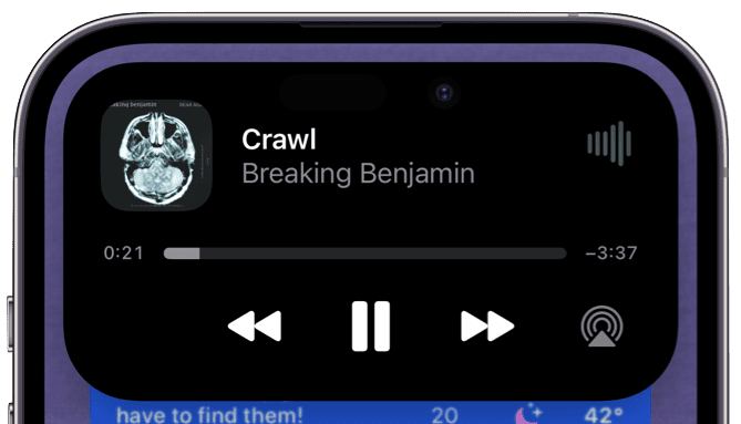
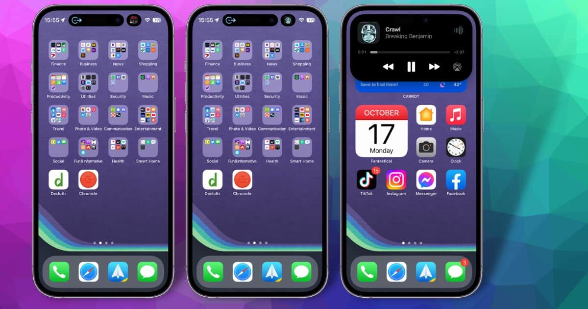
As first reported by Jason Snell in SixColors, the newest iOS betas add more functionality to Dynamic Island. Already, users can long-press the app in the Island to open a larger control interface. For example, if you have music playing, such a press opens a larger window to skip or rewind, play or pause playback.

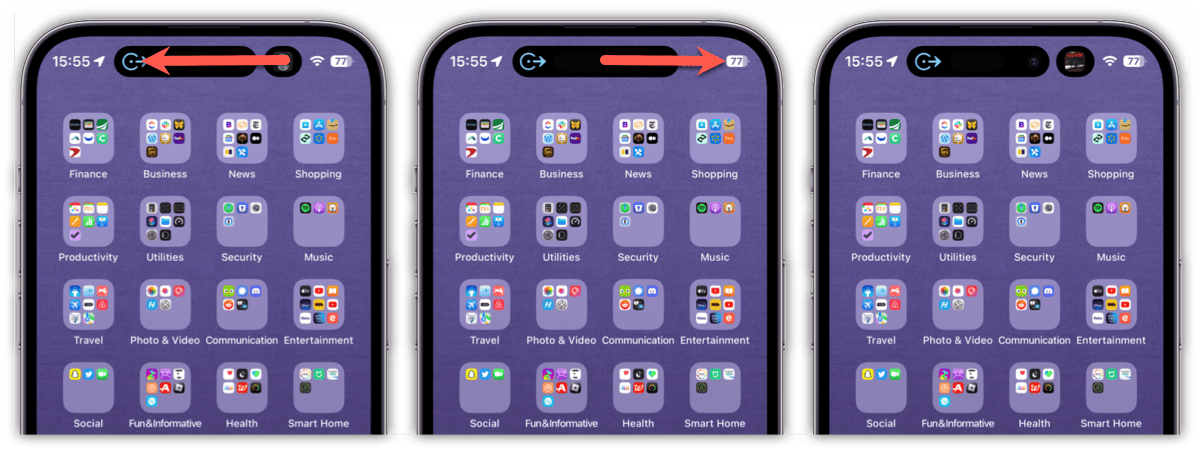
When you swipe inwards across the Dynamic Island while it’s displaying your music playback, for example, the “widget” disappears. Another swipe, from the middle to the outer edges, on the other hand, brings the player back.

When you have two items in the island, the gestures, in the current iOS 16.1 beta, change functionality. Let’s say you have Apple Maps directions in the main and music playback in the smaller space. Swiping from the right across the smaller item causes it to disappear. This gives the entire Dynamic Island space over to the main item. Swipe from the middle towards the right, and your secondary item reappears.
A Feature Still in Flux
What I would truly like to see here is a gesture that allows me to change which app takes the primary spot in Dynamic Island. I thought I saw that working in an earlier beta, but the functionality seems to have changed. This is still a beta issue, of course.
Also, some apps seem to respond differently to the gestures. Swiping across the music player in the main space into a timer, for example, does almost what I want: it moves the timer into the main Dynamic Island space, but removes the player from the island.
The final implementation should be more refined and consistent. Apps should, I hope, react the same way to gestures and make controlling what’s displayed in the former notch area simple and seamless.
