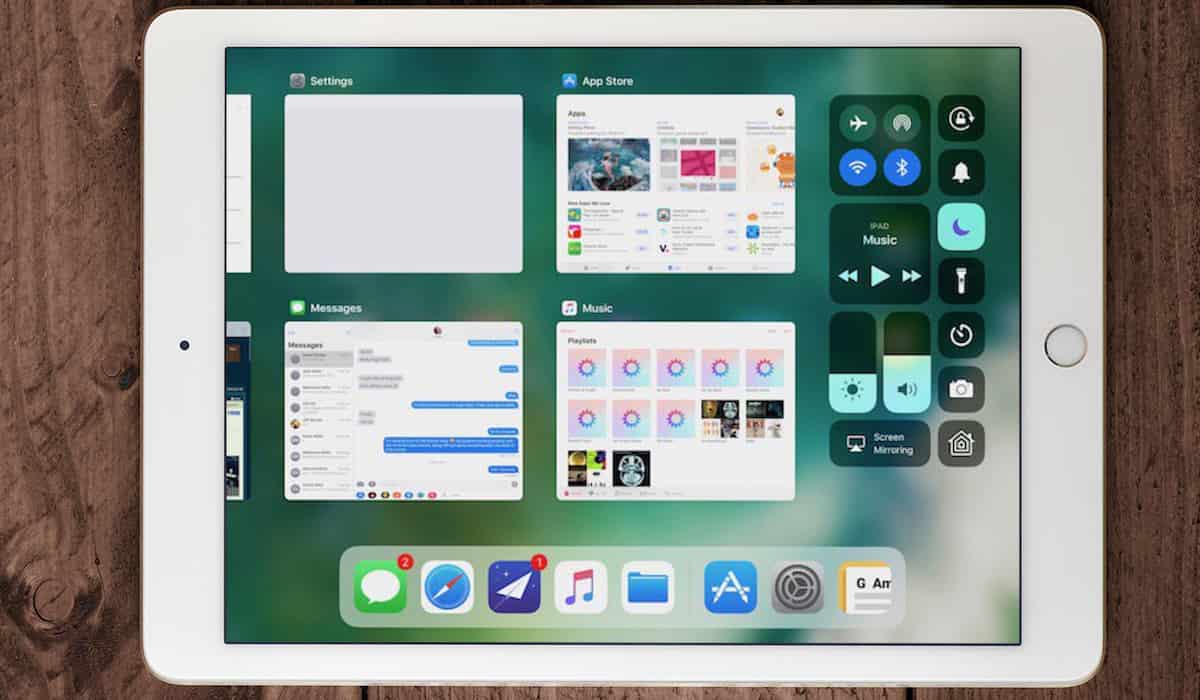
To help ease your transition into some of the new features in iOS 11, I’ll show you how they work. This time I’ll be looking at the new iOS 11 iPad app switcher. I’m used to the new way of switching and force-quitting apps in iOS 11 on the iPad, now. I really like it. I think you will, too. I’m pretty new to the who Side-by-Side multitasking business, but that’s coming along nicely, too.

Two Ways to Access the App Switcher
There are two ways you can access the screen you use to switch to or force-quit running apps. You can either double-tap the Home button, or swipe up from the bottom of the display. You may find yourself having to swipe roughly halfway up the screen in landscape mode. The first few inches of swiping just brings up the Dock.

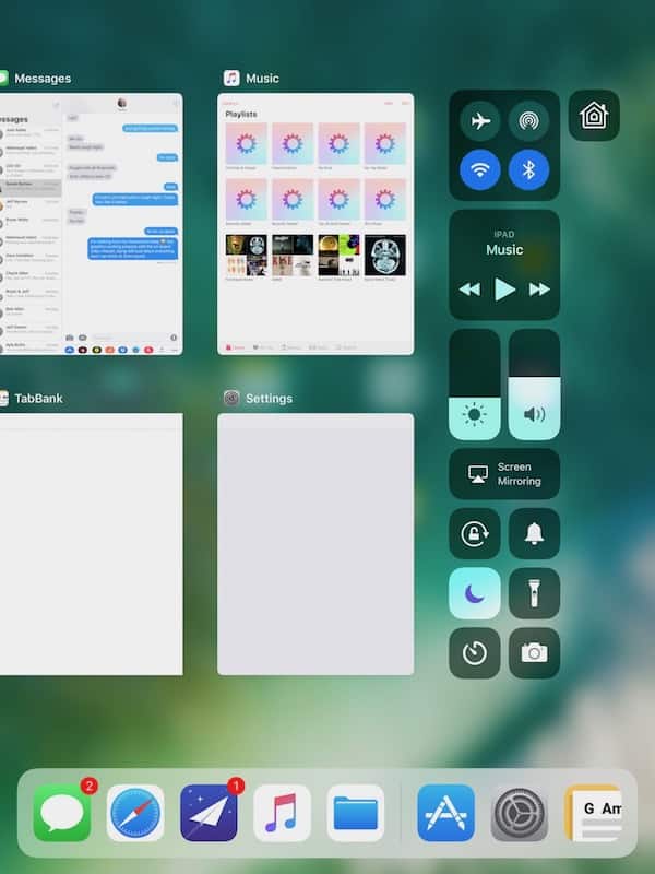
Both of these methods will open up the Control Center on the right, as well as the iOS 11 iPad app switcher on the left. Portrait mode is similar, just narrower.

Using the iOS 11 iPad App Switcher
The operating system tiles the apps, with a preview of what’s going on inside them. This way, you can quickly glance to look for the screen you want, and tap on it. If you want to force-quit the app, simply swipe the tile upwards and it will go away. Before you yell at me about how you’re not supposed to force-quit apps on iOS, have a read of Dave Hamilton’s opinion on the matter. I’m with him.
Once you get the hang of it, this new method is really just as good, if not better, than the old system of switching apps. You get a view of the apps you’re running, and the Control Center on the same screen. It’s much easier to manage the under-the-hood aspects of your iOS tablet that way, and I’m continuously becoming more appreciative of the thought that Apple puts into designing its user interface.
The problem, I think, is that it’s a change. People tend not to like change. The new iOS 11 iPad app switcher—once you’re used to it—is much more efficient. It beats having two gestures or actions to bring up the Control Center and your running apps.
