Gestures on Apple’s mobile devices are a little frustrating because they aren’t consistent. That’s improving in iOS 12, especially if you’re already familiar with gestures on the iPhone X. The iPad, for example, now matches the iPhone X App Switcher and Control Center gestures. Here’s how they work.

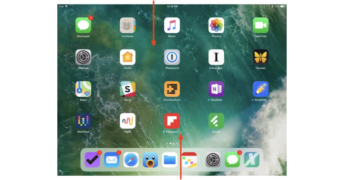
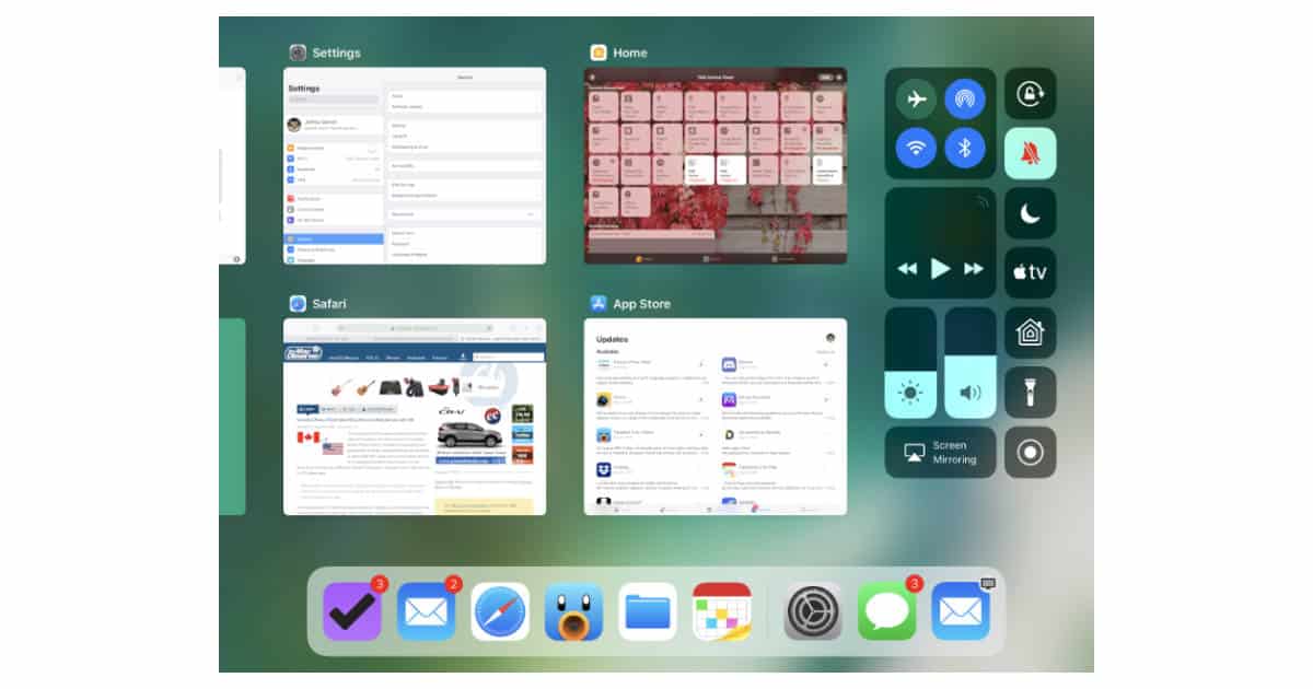
In iOS 11, swiping down on from the top of your iPad display shows Notifications. Swiping up from the bottom shows the Control Center and App Switcher combo view.

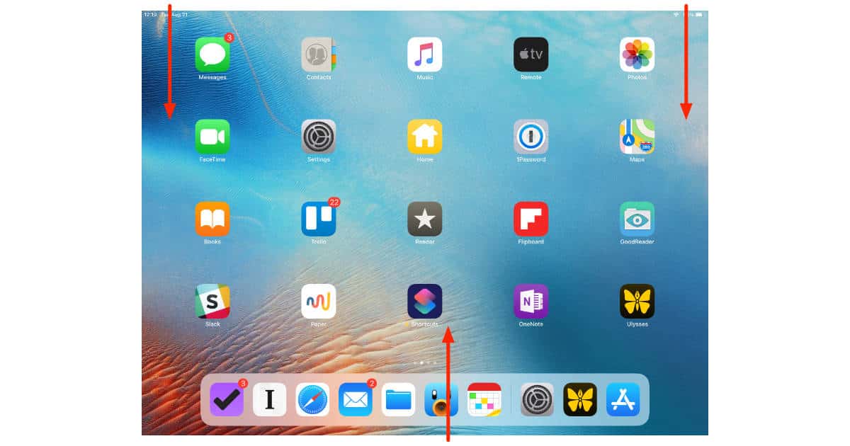
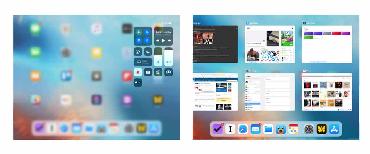
In iOS 12, swiping down from the top left of the iPad display shows Notifications. Swiping up from the bottom shows the App Switcher, and swiping down from the upper right corner shows the Control Center.


That’s a nice change because now we’ll better unified gestures across Apple’s devices, even if they have a Home button. The change may also be a subtle hint to help support rumors that the Home button is going away this fall on the iPad Pro, just as it did last September on the iPhone X.
I found the gestures pretty intuitive when touching and swiping all over the screen. Pretty neat stuff. Gets reasonably complicated when you are dealing with 2 apps at once in a screen and all of that. But YouTube to the rescue to see the gestures in action.