
Apple is planning a dramatic overhaul with the upcoming iOS 19. The tech giant is gearing up for a total visual overhaul with circular app icons, rounded buttons with shadows, refreshing menus, translucent navigation panels, and more. The Apple Watch may also get a visionOS-like redesign, but it’s likely to be less radical than what’s coming to iOS 19.
Honestly, a visionOS-like design could break the classic iPhone and Apple Watch experience. Here are the features that will take the hardest hit.
1. Visual Consistency
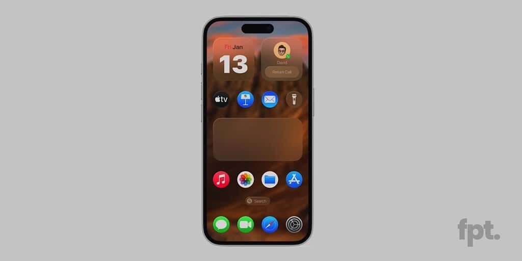
A drastic shift in Apple’s current design philosophy might create visual inconsistency between the app icons and widgets. Apple’s visionOS has circular icons, which won’t work well on iOS because of their inconsistency with widgets. Currently, the giant applies a similar radius for corners of icons and widgets so they complement each other and appear in a visual sync with the user interface.
If Apple plans to introduce circular icons in iOS 19, their radius would be comparatively higher than that of widgets. This could create a sense of imbalance between the elements, potentially affecting the overall aesthetics and iconic iPhone Home Screen experience.
2. Compatibility with Existing UI elements
Unless Apple goes for a full redesign, circular icons in iOS 19 might not make sense and even clash with the existing UI elements. Apple will have to rethink and make serious changes to several elements so everything blends in nicely. This means glyph icons in the Settings app, the layout of the App Library, and notification badges on the Home Screen would require some rework to accommodate the new shape. Not to forget, visionOS uses a completely different circular grid system, whereas iOS relies on the square-based layout. This makes the two visually and structurally out of sync.
3. Accessibility Features
Apple Watch and iPhone are packed with a ton of Accessibility features for vision, voice, hearing, mobility, and more. While visionOS-inspired design may introduce a modern 3D interface, it may also create barriers for some accessibility features. Floating UI elements, reflective glass-like effects, and shadows might not be a welcome change for users with motor impairments, low vision, or cognitive challenges. Honestly, no one does accessibility better than Apple. To maintain that gold standard with the shift toward a visionOS-inspired design, Apple has to think of a well-executed implementation.
4. App Icon Clarity
Let’s face it. Not all app icons are created with circles in mind. Many of them are built around a square format or designed specially to mimic real-world objects. Such icons don’t translate well into a confined circular space. To do so, the icons either need to be shrunk down or completely redesigned to fill up the space.
This could make app icons hard to read or less recognizable at a glance, especially when you view them at a distance. This isn’t the case with just third-party icons. Apple’s first-party apps, such as Camera and Mail, would suffer from the shift.
5. Simplicity and Ease of Use
One of the major concerns with a drastic design is that it would kill the simplicity that iOS and watchOS are known for. For years, users have loved these platforms for their easy-to-use interfaces and simple navigation. A sudden, sweeping shift could feel like a setback. It might also overwhelm users who have grown accustomed to straightforward designs on iPhone and Apple Watch.
Not to forget, extensive updates come with a steep learning curve, and everyone may not like it. For instance, refreshed menus, hidden settings, and brand-new ways to interact with the Home Screen could create confusion. Over time, users have built strong habits and intuitive muscle memory with the iOS and watchOS interfaces. A sudden change could feel like they’re starting from scratch. This could disrupt the experience for longtime iOS and watchOS users.
6. Battery Life
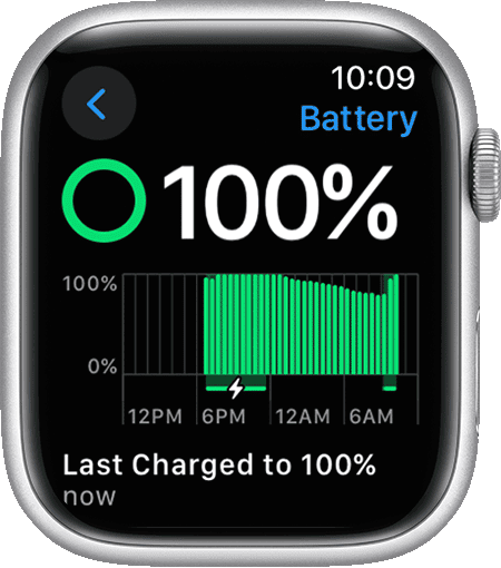
A Vision Pro-like interface, dynamic animations, and other visual changes could significantly impact the battery life of iPhone and Apple Watch. That is because 3D graphics and depth effects require more processing power and higher energy consumption. It will also impact other iPhone and Apple Watch apps and features that rely heavily on visuals. The added strain will force users to either charge more frequently or sacrifice performance by turning some features off. Given that the Apple Watch battery life is already a pain point for most users, an additional impact with watchOS 12 won’t be acceptable.
7. Impact on Eye Health
Apple’s visionOS’s spatial design and immersive 3D UI elements are designed to deliver an incredible viewing experience on a large, life-size canvas. However, it may not be ideal for smaller screens. Prolonged use of 3D effects and other visual enhancements could lead to eyestrain or other eye-related issues, especially for users with excessive screen time. Just imagine this on the small Apple Watch display — the impact could be much more pronounced.
Here are other changes rumored for iOS 19.