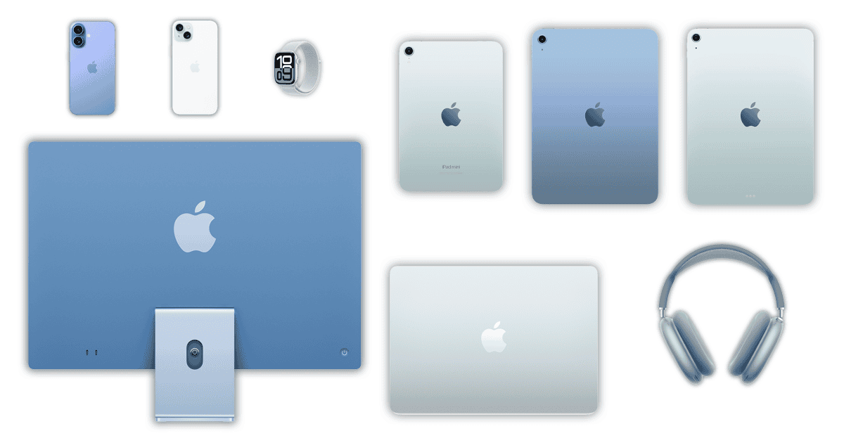
Apple has a long tradition of releasing colorful devices. The company’s first logo (if you don’t count the “Newton badge” from 1976), in fact, was a rainbow-colored apple. The clamshell iBook and the original iMac are, to this day, iconic products due to their cheerful hues. Presently, however, Apple is dealing with what can be called “color confusion,” and it has been that way for a while.
Apple Has a Color Confusion Issue That Can’t Be Denied
Presently, Apple sells 21 different product lines — not counting accessories, like Watch bands or Apple Pencils. With a design team comprising dozens of people, perhaps hundreds, matching all colors perfectly is, understandably, almost impossible.
The issue, however, goes way beyond small mismatches. In many cases, The discrepancy is almost unbelievable. A traditional case of “Steve wouldn’t allow something like that”, if I may add.
Some Plausible Reasons for (Part of) That
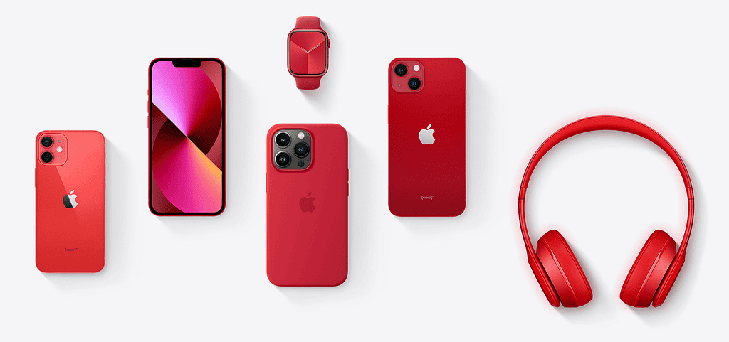
Some significant differences can be excused for a few reasons. For starters, products use different materials. Between the Mac, iPad, Apple TV, iPhone, Apple Watch, and AirPods, among other products, you have different metals, plastic, rubber, fabric, and so on.
Each of those reacts differently with ink, so, even experimenting with various compositions, some variation is to be expected. A unifying “primer coating” isn’t feasible: you wouldn’t want Watch straps feeling similar, to the touch, as a MacBook casing.
Even the ink itself can suffer variations, depending on where it’s made. Using PANTONE tones, e.g., is expensive, in part, because you’re required to match pigments made in a single factory. This allows for a controlled, unvaried palette, which requires strict manufacturing procedures and ingredients.
However, Apple has enough resources to make colors look at least somewhat consistent. And, in many cases, the differences seem to be intentional.
The Three Types of Apple Color Confusion
That’s because there are three main types of color inconsistency among Apple products. In some cases, a single name means (very) different colors, even if the products are made of the same material. In others, it’s noticeable that the intention was to make colors consistent, but the attempt failed. Lastly, there’s what can be described as a “table flip” situation, of various similar (but different) colors with different names.
Same Name, Different Colors
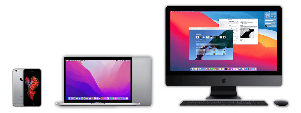
Let’s say you have a 2017 iMac Pro, love its color, and want your next Mac to look the same. If you check its specifications page, you’ll find that the hue is called “Space Gray”. For your usage, a 2022 13-inch MacBook Pro does the trick, so you try to find a “Space Gray” version.
How Gray Is Space Gray?
It exists, but, as you can see in the above image, it’s completely different from the iMac Pro’s paint job. It’s the rightmost color, only shown partially in the lid. If there wasn’t a lighter “Silver” tone, anybody would call this “Space Black” silver without thinking twice.
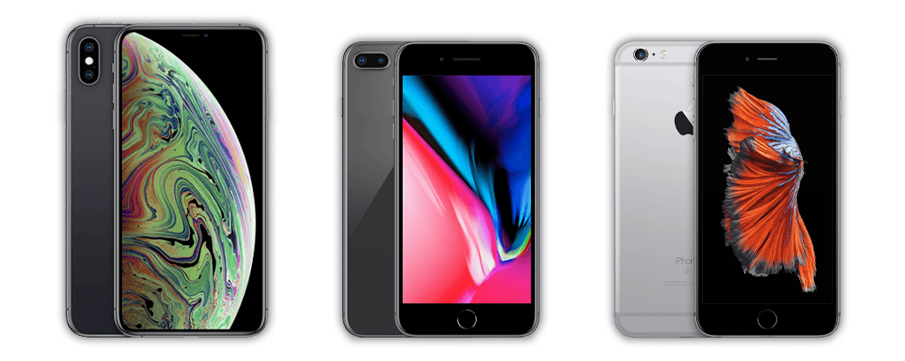
The same applies to other products. The iPhone 6S, the iPhone 8, and the iPhone XS Max are all “Space Gray” models. The situation is so bad it became a meme:
Apple’s Color Department Sruck Gold — Too Many Golds, Actually
The “Gold”/”Rose Gold” (and even “Pink”) situation is similar — and don’t get me started on the “Starlight” subject. Across product lines, generations, and even within the same generation, the only thing consistent is inconsistency.
It all started with the iPhone 5S, in 2012. At launch, it was available in (light) Space Gray, Silver, and Gold. The Gold color was indeed recognizable as gold: the pinkish/reddish accent was barely noticeable if existing at all.
The following year, the iPhone 6 consolidated Gold as a color for Apple products. It was followed by gold versions of the iPad Mini 3 and Air 2.
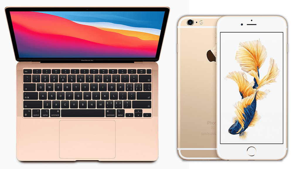
Then, in early 2015, the OG Apple Watches were announced, and things started to get confusing. The Watch Sport had (distinguishable enough) Gold and Rose Gold versions. The super-expensive Watch Edition, too, was available in Gold and Rose Gold. This model, however, was made of actual gold, so you could expect colors to be different.
From there, it all went downhill. Also in 2015, Apple launched the short-lived Retina “MacBook-without-adjectives”. It was the first MacBook ever to be available in colors other than white, black, or silver.
The first generation came in Space Gray (gunmetal), Silver, and Gold — pale, but yellowish, like the iPhone and iPad. In 2016, a Rose Gold option arrived. The third, in 2017, kept the same color varieties — for a while. There was no new model in 2018, but the Gold and Rose Gold hues were replaced by a reddish-gold color.
The 2018 Retina MacBook Air, which retired the vanilla MacBook, had a slightly less reddish-gold hue. That redesign, including colors, was used up to the 2020 M1 model. Current Airs, which look like thinner MacBook Pros, are available in Starlight, which is basically a pale, non-reddish-gold.
Who Needs Color Consistency?
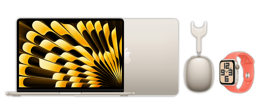
Speaking of Starlight, let’s get to the point of color consistency. In the previous case, colors with the same name varied through the years, which could be excusable under some circumstances. As I stated previously, there’s also the point of colors varying for devices made of different materials. What about varying colors for contemporary products made of the same material?
Presently, Apple sells five products in Starlight: iPad Mini, iPad Air, MacBook Air, AirPods Max, and Apple Watch SE. They’re all made of aluminum.
In the iPad, it’s noticeable the material and hue are the same. The other products, however, all differ. The MacBook Air has a less pale, slightly more saturated color. The AirPods Max tone looks similar to the MacBook Air’s but even darker. In the Apple Watch SE, you’ll have a hard time distinguishing a Starlight unit from a Silver one.
And that’s not to say Apple is incapable of making consistent colors. The three products available in Midnight — AirPods Max, MacBook Air, and Apple Watch SE — all have the same hue. All silver Apple products since the 2008 Unibody MacBook, except titanium or stainless steel devices, sport identical shades as well. Is it poor quality control, poor project management, or a devilish need to trigger its customers’ OCD?
How Many Blues Does it Take To Change a Lightbulb at Apple?

Last, but not least, there’s also the issue of having different shades of the same color, (mostly) under different names. This wouldn’t be much of an issue if we were talking of three or four variations, but… Well, let me give one example.
- You can get the iMac in Blue — which is different from the Blue used a few years ago
- The USB-C AirPods Max also come in Blue, which is almost gray. The Lightning model had a bluer Sky Blue, but that isn’t available anymore.
- Speaking of Sky Blue, you can get this color on the new M4 MacBook Air.
- The new vanilla iPad has a Blue option too, as do the iPad Air and iPad Mini — the last two are the same, but different from the first one.
- The iPhones 16 and 16 Plus are also available in blue, but this one is called Aquamarine. There’s also the completely different Blue in the iPhones 15 and 15 Plus.
- Apple Watch bands have the Periwinkle (loop), Blue Cloud (loop), Navy (alpine loop), Blue (trail loop), Navy (ocean band), Ice Blue (ocean band), Periwinkle (sport band), Aquamarine (sport band), Periwinkle (solo loop), Aquamarine (braided solo loop), Denim (braided solo loop), and Deep Blue (FineWoven modern buckle) options. The Hermès and Nike bands add another five blue variations.
- Accessories for different devices account for 13 other varieties, named Blue, Sky Blue, Sky, Deep Blue, Denim, Periwinkle, Ultramarine, Aquamarine, Marine Blue, Winter Blue, Storm Blue, and Light Blue. Their hues don’t necessarily match other products with the same color name and sometimes match products with different color names.
- There is also the Blue Magic Mouse, two Magic Keyboard versions, the Magic Trackpad, and a power brick cable for the iMac. These can’t be purchased separately.
50 Shades of Space Gray, Almost 40 Shades of Blue
I’ll make the courtesy of ignoring the Ultramarine iPhone 16 and 16 Plus cases since they match the phones’ hues. Also, the Periwinkle loop and solo loop bands are basically the same product, so I’ll count them as one. Even then, there are 35 different blue options. Thirty. Five. Different. Blue. Options. But if you add the Lightning AirPods Max and M1 iMac, that makes 37.
The post below, by the same account that bashed the Space Gray variants, already jokes about 11 blue variants. Well, in fact, they’re almost 40.
Now consider that the same applies to green, yellow, red, purple, orange, brown, and pink. And gray, obviously, Space or not. Now try telling which color is your iPhone’s case, your Apple Watch’s band, or your iPad’s cover.

Now, this may seem like a mindless and needless rant, but I was a designer before becoming a writer. I know color science, and understand they can be used to communicate feelings, cause specific effects, and even make statements. In products, especially items like Apple devices, that connect tightly with their owners’ personalities, they build a sense of self.
In a way, then, it’s not bad to have lots of options available. That means people can choose whatever suits them better. However, consistency is also important for this. You can’t say you like golden MacBooks, e.g., if “golden” can mean a dozen different colors. If you disagree, ask somebody to buy you a blue iPhone case. There’s a high chance it won’t be the “blue” you were expecting to get.
