Apple has been making significant efforts to unify, as much as possible, its devices’ user interfaces. The System Settings app, e.g., has been revamped in macOS Ventura—it now resembles the iOS and iPadOS versions. One thing that has remained, however, is icon inconsistency. I wonder if the rumored iOS 19 redesign will finally clean up Apple’s icon mess.
The iOS/iPadOS 19, macOS 16, watchOS 12, and tvOS 19 Redesign Changes More Than Icons

That’s because many rumors have been pointing to a complete overhaul of the user interface among the company’s products. Leaks and internal sources indicate iOS/iPadOS/tvOS 19, macOS 16, and watchOS 12 will strongly resemble visionOS, visually speaking.
The change for iOS and iPadOS, e.g., will be the most comprehensive since iOS 7 launched in 2013. While macOS has seen more recent changes, they have basically been made so it looks more like its mobile counterparts.
Some clues about the redesign are already out there. The Invites app, for instance, looks like a visionOS app already, even though it’s made for iPhones. Jon Prosser, from fpt, has seen an internal build of the camera app with similar changes.
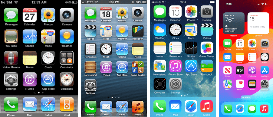
16 Icons I Hope Apple Will Finally Fix With the iOS 19 Redesign
There’s no guarantee Apple will include icons in its redesign of iOS/iPadOS/tvOS 19, macOS 16, and watchOS 12. There is, however, a strong case to do that. Here are some examples.
1. Settings/System Settings
The Settings app is likely the worst offender. Except for iOS and iPadOS, which share all icons between them, each OS has a different version of “the gear”. The confusion is so significant it became a meme.
It’s also worth mentioning the naming issue. On iOS, iPadOS, watchOS, tvOS, and visionOS, the app is simply called “Settings”. On the other hand, macOS has a “System Settings” app — with the exact same functions, except for device-specific options. It can’t be that hard for Apple to remove a single word from a single app, right?
2. Contacts
While the Settings app has the most variations, Contacts likely changed the most. The iOS/iPadOS app features a gray, all-flat visual, while the macOS one is brown, resembling a leather cover. Remnants of pre-iOS 7 skeuomorphism, perhaps?
3. Safari
On iOS and iPadOS, the Safari icon is a round, blue compass, inside a white square with round corners. The square has a gray gradient on macOS, and there are some depth and lighting/shadow effects as well. Not as much of a difference as the Contacts example, but still, a difference.
The visionOS version is flat like the iOS one, but, like all native visionOS app icons, is a circle. And it has no borders, it’s just the blue compass.
4. Calendar
Another very noticeable difference is in the Calendar app icon. The iOS/iPadOS version features an all-white background, with a red week/day and a black month/day. On macOS, the icon looks like a physical wall calendar. There’s a red bar at the top, with the month written in white. The month day is below that, written in black on a white background.
5. Mail
Mail is another app that has a different version for each OS. The blue gradient background is similar (but not the same) in all of them, but the rest varies. On macOS, you get an “actual” letter envelope, with lighting and depth effects.
For iPhones and iPads, the icon looks like a stencil, a rectangle with round corners and line marks over it. The marks form the drawing of an envelope, leaving the background gradient visible through them.
The visionOS version has thinner lines, a more vibrant gradient, and less pronounced round corners — and, as expected, is round. It’s also round in watchOS, but with thicker lines, the gradient has even more contrast, and the corners are square.
6. Flat or Not? Icons That Need a Minor Redesign in iOS 19
The icons below aren’t that much different between OSes, but here’s the thing: some versions are completely flat, others not. Usually, the iOS/iPadOS icons are flatter, but there are exceptions. Let’s hope these icons get uniformized in the iOS 19 redesign, too.
Calculator
All visual elements in the iOS and the (incredibly recent) iPadOS calculator app icons are flat. There’s a light gray background, the calculator itself, its visor, and its buttons.
The macOS icon not only uses gradients for all of these parts, but it also has a different button layout. That’s definitely not the type of design oversight we think Apple would make.
Clock
The differences in the Clock app are quite subtle, but they’re there. Again, on iOS and iPadOS, the icon is completely flat. The macOS version has shadows under the clock’s circumference and hands.
FaceTime
Though not very drastic, the FaceTime icon discrepancy is one that really gets me. The iOS/iPadOS and tvOS versions are completely flat, with a soft green gradient on the background.
The macOS icon, however, features depth effects that don’t make sense. The “camera” in the icon has rounded corners, making it look like, in my opinion, a sideways gas cylinder. Or a HomePod wearing a cone of shame.
Find My
Here, the difference is so subtle I really can’t understand why use different icons at all. The Find My icon is designed to resemble a radar screen, and succeeds in doing so. On macOS, it succeeds with needless depth effects, but that’s it.
Messages
Between the iOS/iPadOS and visionOS versions, the difference (other than the shape) is just a more pronounced gradient. On macOS, the icon looks like it came straight out of 2006, part of a 3D emoticon pack for ICQ.
Music
Another case of “they’re so similar there’s no reason not to use the same icon”. The only difference between iOS, visionOS, and tvOS versions is the shape, properly adapted for each OS. The macOS icon features a completely unnecessary bas-relief effect on the musical note.
There’s also the totally nonsense (design-wise) Apple Music Classical app icon. To be fair, however, the icon is the least of this app’s problems.
Photos
Honestly, I really like the 3D version of the Photos icon used in macOS. So much that I think it should be used in all other OSes. It would be way better than that slightly overdone copy of the Google Photos icon in iOS, visionOS, and tvOS.
Reminders
Apple’s designers felt the need to add a depth effect to a bullet-point list. I don’t think I need to say more than that.
TV/Videos
In this case, the macOS version isn’t “less flat” than the others. There’s no bas-relief, no depth effects, nothing. But, for no known reason, the icon is slightly greenish. The iOS, visionOS, and tvOS versions are properly dark gray, without any rogue colors. Also, that’s another app that needs to have its name streamlined across OSes.
Voice Memos
Another one that’s so similar it’s unexcusable to use different icons. Especially because the macOS version has a depth effect on the “progress mark” line that distinguishes played from unplayed parts. The app itself has no such effect on the actual marker.
Weather
Yeah, once again the macOS icon has a depth effect. The iOS/iPadOS version has one, too — a pretty different one. Instead of lighting/shadows, it has a translucent cloud over the Sun. Weirdly enough, the macOS icon has no translucent elements.
More Than an Icon Redesign: Will iOS 19 Finally Unify the Finder and Files Apps?
This part of the rant is deeper than anything above. There’s a reason to have different icons for the Finder macOS app and the Files app for iOS and visionOS. They’re different apps, with Files being way more limited than Finder. There’s absolutely no reason, however, to have different apps at all.
The lack of features in Files is, apparently, intentional. I could say it’s Apple’s way of telling users they shouldn’t have ever asked for a native iOS file manager.
I know most of the issues I pointed out in this article are nothing more than a pet peeve. I reserve myself the right to them, however, because Apple likes to brag about how their products are so homogeneous. “The user experience is consistent among all product lines”, the company says. Well, not even the icons are, let alone the rest.