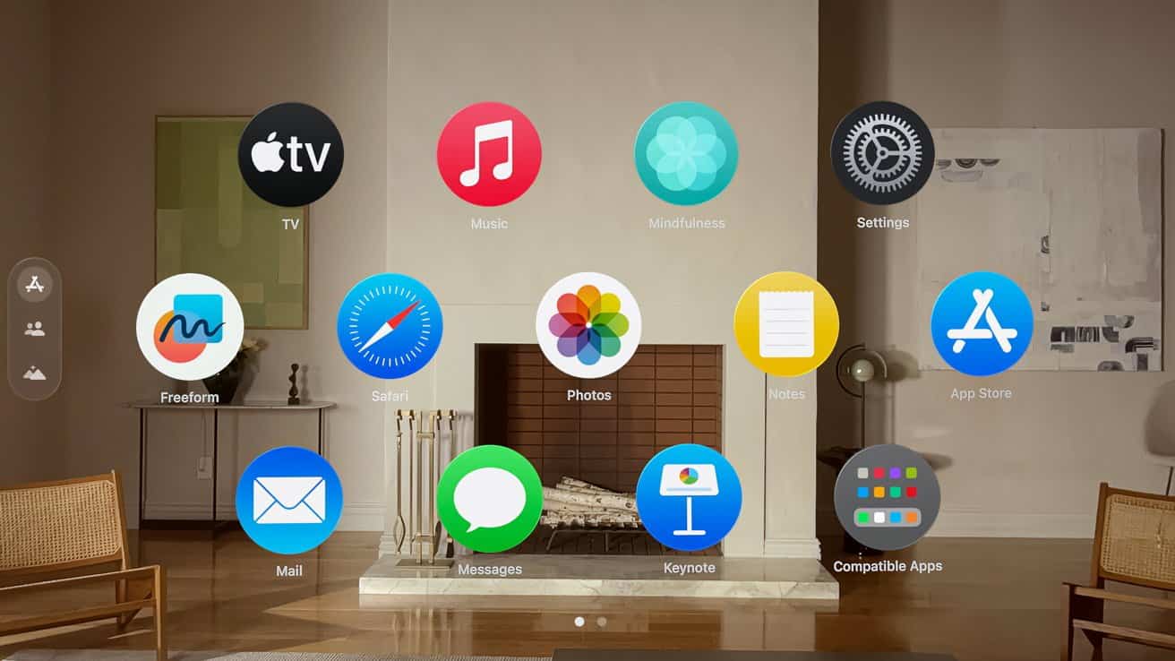
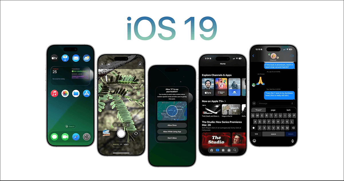
The next major iOS update could bring the biggest design overhaul since Apple adopted a minimalist UI with iOS 7 12 years ago. Although the prospect of a new visionOS-inspired look on iPhone seems exciting, there are several reasons why this might not be practical. Let’s look at four ways the visionOS look could break iOS 19 and shift Apple’s software design philosophy as we know it.
1. Inconsistency Between Icons and Widgets
Circular icons, like the ones found on visionOS, won’t work well on iOS due to their inconsistency with widgets. Apple uses a similar radius for corners of icons and widgets so that they visually complement each other. In case iOS 19 adopts circular icons, their radius would be significantly higher compared to that of widgets. This could create a visual disconnect between both the elements on the Home Screen.
2. Incompatibility With Existing UI Elements

Circular icons on iOS 19 won’t blend well with the existing UI elements without a complete redesign. Several elements, like the glyph icons in the Settings app, notification badges on the Home Screen and the App Library, would need to be reworked to work with circular icons. Upon that, visionOS places the circular icons in a completely different grid style compared to iOS, which places them on a square grid.
3. Reduced Size and Legibility of App Icons
Not all icons are designed the same. Many app icons that are based on a square design or ones that try to represent a real-world object would need to be shrunk down or redesigned from the ground up to fill up the finite space within a circle. This could make the icons illegible and harder to spot from a distance. This is true even for many of Apple’s own icons, including the ones for Invites, Mail, Camera, and so on.

4. A Glassy Design Will be Resource Intensive

iOS 7 marked a positive shift in Apple’s design language from skeuomorphism to minimalism. However, Apple’s move to a visionOS-inspired design can be resource-intensive. As per Jon Prosser, iOS 19 may introduce a new effect that will cause the on-screen elements to shimmer as you move an iPhone. The use of such effects with translucent elements can make the new update feel clunky on older iPhones.
