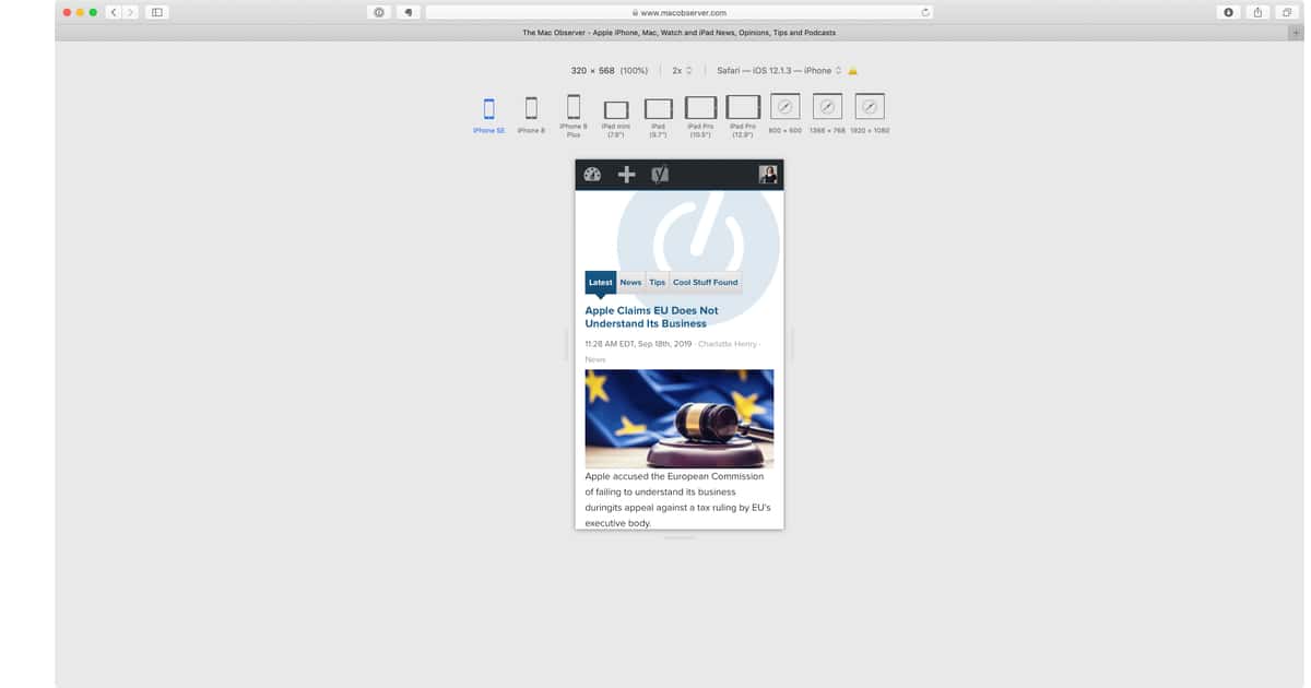
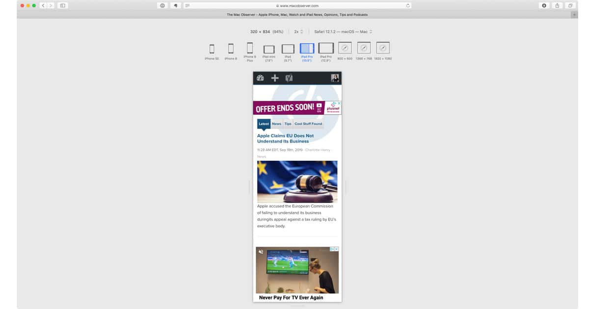
Anyone building a website, from high-end developers to those making a quick blog site at home, need to test how it looks. It is crucial to see what your website will look like on different kinds of devices. Luckily, there is a really easy shortcut for doing this in Safari, known as Responsive Design Mode.
Entering Responsive Design Mode
The first thing to do is turn on the ‘Develop’ menu, if you have not done so already. This is done by going to: Safari > Preferences > Advanced and ticking the box that says “Show Develop menu in menu bar”. Then press CTL + CMD + R. This brings up Responsive Design Mode. From there you can see your website on different devices, by selecting them at the top of the page.

If you are viewing a mobile device and want to see what the website looks like in both portrait and landscape, click on the device to rotate it.

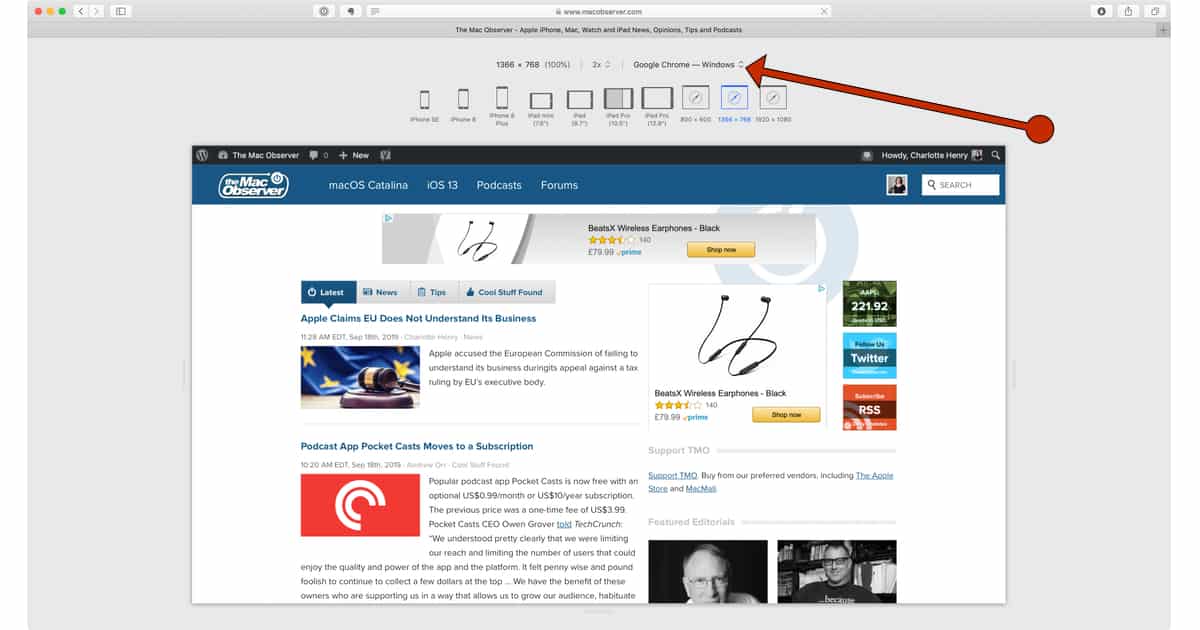
You can also view the website in a number of different browsers via dropdown menu:

To exit Responsive Design Mode press CTL + CMD + R again.
The article summary says “There is a really easy shortcut for entering responsive design mode in Safari and testi how your website likes on different devices.”.
Please tell me, what does “testi” mean? …And I don’t believe my website can actually “like” on a device.
Outstanding tip. I’m surprised I didn’t know that. Thanks